





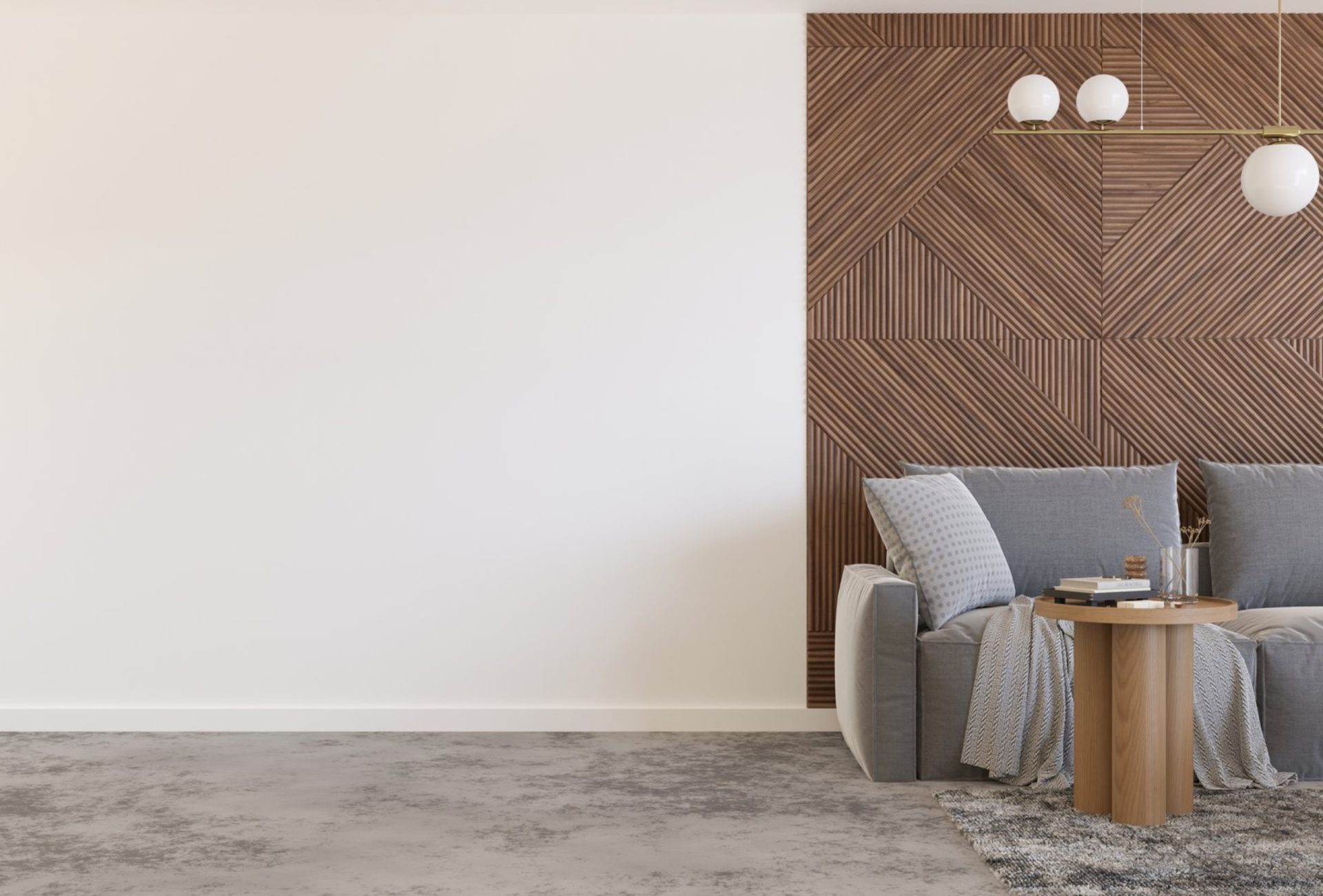
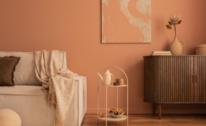

Spring is the perfect season to refresh your home’s interior. After months of cold, gray winter days in Chicagoland, bringing vibrant, cheerful colors into your living spaces can completely transform the atmosphere. Whether you want to energize your kitchen, add serenity to your bedroom, or modernize your living room, choosing the right paint colors is crucial. This guide explores the top interior colors for spring, explains color psychology, and provides tips to ensure your seasonal update is both beautiful and lasting.
Why Color Matters for Your Spring Update
The colors you choose for your home do more than just beautify walls — they influence mood, perception, and even productivity. Spring is associated with growth, energy, and renewal, and your color choices can reflect that.
- Mood Enhancement – Soft blues and greens create calm, while bright yellows and corals boost energy.
- Light Reflection – Lighter shades make rooms feel airy and open, especially useful as days lengthen and sunlight increases.
- Seasonal Harmony – Coordinating colors with spring décor (flowers, textiles, and accessories) enhances visual cohesion and appeal.
Top Interior Colors for Spring
Here are the most popular and effective colors for spring interior updates, particularly for homes in the Chicagoland area:
1. Soft Pastels
- Pale Blue: Evokes clear spring skies and pairs beautifully with white trim or wood accents. Ideal for bedrooms, bathrooms, and home offices.
- Mint Green: Refreshing and modern, mint green adds a light, airy feel while promoting relaxation and calmness.
- Blush Pink: A subtle, warm pink works well in living areas and dining rooms, adding a touch of sophistication without overwhelming the space.
2. Earthy Neutrals
- Warm Beige: A timeless choice that complements natural light and spring décor.
- Taupe and Greige: A combination of gray and beige provides a neutral, versatile base that pairs well with brighter spring accent colors.
- Creamy White: Ideal for ceilings, trim, and walls to create a crisp, clean look that highlights colorful furniture or artwork.
3. Bright and Cheerful Tones
- Sunny Yellow: Perfect for kitchens, mudrooms, or breakfast nooks, yellow energizes spaces and evokes springtime warmth.
- Soft Coral or Peach: These colors introduce warmth and vibrancy without being overpowering, making them great for accent walls.
- Aqua or Turquoise: Refreshing and playful, these shades work well in bathrooms, playrooms, and feature walls.
4. Sophisticated Modern Hues
- Sage Green: Combines the calming qualities of green with an earthy elegance, ideal for living rooms and bedrooms.
- Dusty Blue: A muted blue that brings serenity and pairs beautifully with natural wood furniture.
- Lavender or Lilac: Soft purples add a touch of luxury and create a soothing ambiance in personal spaces.
Tips for Choosing Spring Colors
Selecting the perfect spring colors goes beyond trends — consider how the color interacts with your space, lighting, and décor.
1. Test Before Committing
- Purchase small sample cans and paint swatches on multiple walls.
- Observe them at different times of the day, considering both natural sunlight and artificial lighting.
- Check how the color looks with existing furniture and flooring.
2. Balance Bold and Neutral
- Use bold colors on accent walls or in small areas to create interest.
- Pair with neutral shades to maintain balance and avoid overwhelming the space.
- For example, combine a blush pink wall with neutral beige furniture and trim.
3. Consider Room Function
- Bedrooms: Soft, calming colors like pale blue, lavender, or mint green promote relaxation.
- Living Areas: Warm tones such as light coral, cream, or earthy taupes encourage conversation and social energy.
- Kitchens: Bright, cheerful colors like yellow or aqua enhance mood and complement natural light.
- Bathrooms: Crisp whites, soft blues, or light greens create a fresh, clean environment.
4. Layer With Décor
- Integrate spring textiles, curtains, rugs, and accessories to enhance the chosen color palette.
- Seasonal décor like floral cushions or pastel artwork complements your paint choice without additional work.
Combining Colors for a Cohesive Look
Color coordination is key for creating a harmonious interior:
- Monochromatic Palette: Use variations of one color across walls, trim, and accents for a serene and unified look.
- Complementary Colors: Pair opposite colors on the color wheel, like soft blue with coral accents, for lively contrast.
- Analogous Colors: Choose neighboring colors on the wheel, such as mint, green, and soft yellow, for a natural, calming flow.
Local Chicagoland Considerations
Spring in Chicago has a mix of sunny, rainy, and occasionally windy days. These factors can influence color perception:
- Lighting: North-facing rooms receive less direct sunlight, so choose warmer tones to brighten the space.
- Weather Reflection: Exterior colors seen through windows can influence interior perception; coordinating with your exterior palette helps maintain harmony.
- Material Compatibility: Painted trim, cabinetry, and furniture finishes should complement seasonal interior colors for a polished, professional look.
Professional Advice for Spring Interior Painting
Even with the best colors and planning, proper execution is key:
- Surface Prep: Clean walls, fill holes, and sand rough patches to ensure smooth application.
- Quality Paint: Invest in high-quality, low-VOC paints for a healthier indoor environment and long-lasting finish.
- Expert Application: Hiring professional painters ensures even coverage, crisp edges, and minimal mess.
- Accent Walls & Details: Professionals can help execute complex designs, two-tone walls, or textured finishes to enhance your spring update.
Top Spring Interior Trends for 2026
- Soft Pastel Accents: Minimalist rooms with one pastel wall as a focal point.
- Nature-Inspired Palettes: Greens, earthy beiges, and soft blues to reflect outdoor spring landscapes.
- Mixing Matte and Satin Finishes: Matte walls with satin trims for subtle texture contrast.
- Eco-Friendly Paints: Increased use of low-VOC, eco-conscious paints to align with sustainable living trends.
Final Checklist for a Spring Interior Refresh
- Evaluate walls and ceilings for scuffs, cracks, or stains
- Choose seasonal colors that match mood and function of each room
- Test paint swatches in natural and artificial light
- Balance bold accent walls with neutral tones
- Prep surfaces properly for smooth, durable results
- Consider professional painting services for speed, quality, and long-term durability
- Add seasonal décor to enhance the color palette
Conclusion
Spring is the perfect time to breathe new life into your Chicagoland home. Choosing the right interior colors can dramatically improve your home’s ambiance, mood, and aesthetic appeal. From soft pastels to energizing bright tones, your spring painting projects can transform your spaces and create a fresh, welcoming environment. By planning carefully, selecting complementary shades, and considering professional painting services, your home will be ready to shine all season long.
Transform your interiors this spring with expert guidance — contact Chicagoland Paint Pro today and discover the perfect colors for your home.