

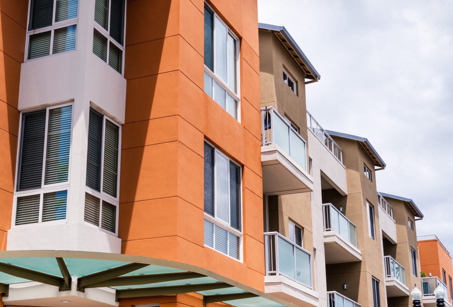



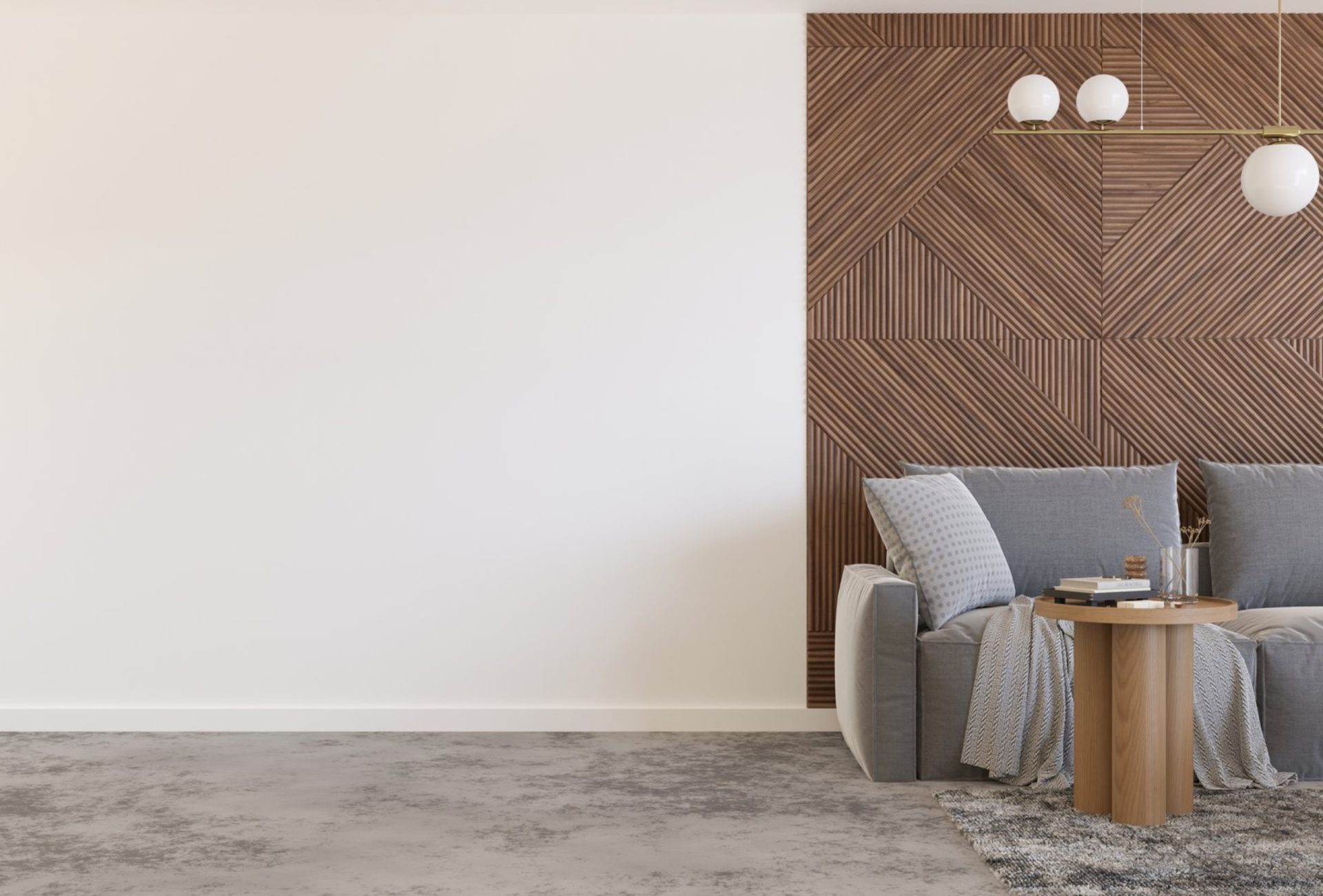
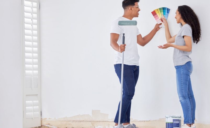

When managing rental properties, one of the most important decisions is choosing the right paint colors. Color impacts tenant satisfaction, unit appeal, and even rental pricing. A well-chosen palette makes apartments feel fresh, spacious, and inviting, while poor color choices can limit interest and reduce perceived value.
This guide explores the best paint colors for rental units, helping property managers make smart, long-term decisions.
Why Paint Color Matters in Rentals
- Tenant Appeal: Neutral and universally appealing colors attract a wider pool of potential tenants.
- Perceived Space: Light colors make smaller apartments feel larger and more open.
- Versatility: Neutral shades complement various furniture styles, décor, and personal tastes.
- Maintenance: Proper paint colors show less wear and dirt, reducing touch-up frequency.
- Resale or Re-Rent Value: Units painted in modern, appealing colors maintain higher long-term market value.
Neutral Colors: The Safest Choice
Neutral shades are the most common choice for rental units. They provide a clean, timeless look that appeals to most tenants.
- Whites and Off-Whites:
- Create brightness and a sense of space.
- Serve as a blank canvas for tenants’ décor.
- Example shades: Cream, Ivory, Soft White.
- Light Grays:
- Offer a modern, elegant look without being overpowering.
- Hide minor wall imperfections better than bright whites.
- Pair well with both warm and cool furniture tones.
- Beige and Taupe:
- Warm, inviting tones that work well in living rooms and bedrooms.
- Neutral enough to complement varied décor choices.
Accent Colors: Adding Interest Without Overpowering
While neutral walls are preferred, subtle accent walls or trim colors can enhance appeal:
- Soft Blues: Calming and universally liked; ideal for bedrooms or offices.
- Muted Greens: Bring a touch of nature indoors without being overwhelming.
- Warm Grays or Greige: Adds sophistication while maintaining neutrality.
Tip: Limit accent colors to one wall or specific areas like niches, alcoves, or kitchen backsplashes to avoid clashing tastes.
High-Traffic Area Colors
Certain areas in rental units experience more wear and tear, requiring careful color choice:
- Kitchens: Neutral whites, soft grays, or warm beige tones.
- Bathrooms: Light blues, soft greens, or crisp whites; these reflect cleanliness.
- Hallways and Entryways: Medium grays or taupes that resist visible scuffs and dirt.
Using slightly darker shades in high-traffic areas minimizes touch-ups while maintaining a clean, professional appearance.
Consider Paint Finish
Color selection goes hand-in-hand with paint finish, which affects durability and maintenance:
- Matte or Eggshell:
- Great for bedrooms and living rooms.
- Hides minor wall imperfections.
- Satin or Semi-Gloss:
- Ideal for kitchens, bathrooms, and trim.
- Easier to clean and more resistant to moisture.
- Avoid High-Gloss on Large Surfaces:
- Reflects light and highlights imperfections.
- Best reserved for doors, trim, and cabinetry.
Seasonal and Lighting Considerations
- Natural Light: Rooms with limited sunlight benefit from lighter shades to brighten space.
- Artificial Lighting: Consider warm vs. cool lighting when choosing colors; it can dramatically alter the perceived hue.
- Seasonal Appeal: Neutral shades work year-round, but subtle warm tones feel inviting in colder months, while cooler tones feel refreshing in summer.
Modern Color Trends for Rentals
While neutral tones remain top choices, modern rental properties can benefit from trendy yet versatile palettes:
- Greige: Combines gray and beige for a modern, timeless look.
- Soft Pastels: Light blush or powder blue for subtle character without alienating tenants.
- Muted Earth Tones: Sage green, warm taupe, or soft terracotta for a contemporary feel.
These colors can make your rental stand out in listings while remaining widely acceptable.
Professional Tips for Property Managers
- Consistency Across Units: Maintain similar neutral palettes across multiple units to simplify touch-ups and repainting.
- Test Swatches: Paint small sample areas before committing to a color to observe lighting effects.
- Balance Neutral with Character: Use trims, moldings, or subtle accent walls to add sophistication without compromising broad appeal.
- Invest in Quality Paint: High-quality paints resist stains, scuffs, and fading, reducing long-term maintenance.
- Plan for Turnover: Choose colors that allow quick touch-ups between tenants without noticeable color mismatches.
Chicagoland Paint Pro Recommendations
Chicagoland Paint Pro works with property managers to select paint colors that:
- Maximize tenant appeal
- Reduce touch-up needs
- Stand up to high-traffic use
- Complement Chicago’s climate and interior lighting
Our expertise ensures your rental units look fresh, modern, and move-in ready—every season.
Conclusion
Choosing the right paint colors for rental units is a crucial step in property management. Neutral shades, complemented by subtle accent tones and durable finishes, ensure tenant satisfaction, minimize maintenance, and enhance overall property value.
By partnering with Chicagoland Paint Pro, property managers can confidently select and apply colors that maintain a professional, attractive, and long-lasting appearance in every apartment unit.