





Color is one of the most powerful tools in commercial design. It influences mood, customer behavior, and employee productivity. At Chicagoland Paint Pro, we specialize in color transformations that turn ordinary commercial spaces into visually appealing, brand-aligned environments.
How Color Impacts Commercial Spaces
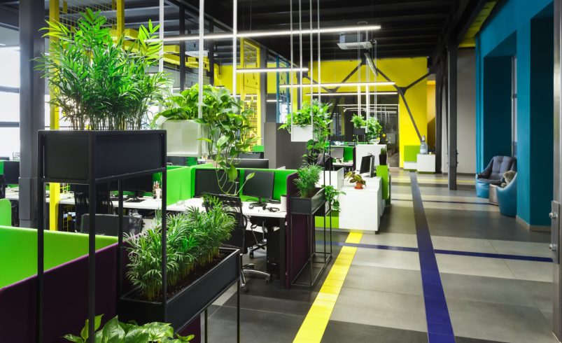
- Offices: Calming blues and neutrals promote focus, while pops of energetic color boost creativity.
- Retail Stores: Bright accent walls or brand colors attract attention, guide traffic, and highlight key products.
- Restaurants & Cafes: Warm tones create a welcoming, cozy atmosphere.
Choosing the Right Color Scheme
- Consider your brand and target audience.
- Evaluate natural and artificial lighting. Colors appear differently in varied lighting conditions.
- Balance bold and neutral tones to avoid overwhelming the space.
Inspiring Transformations
Example 1: Tech Office
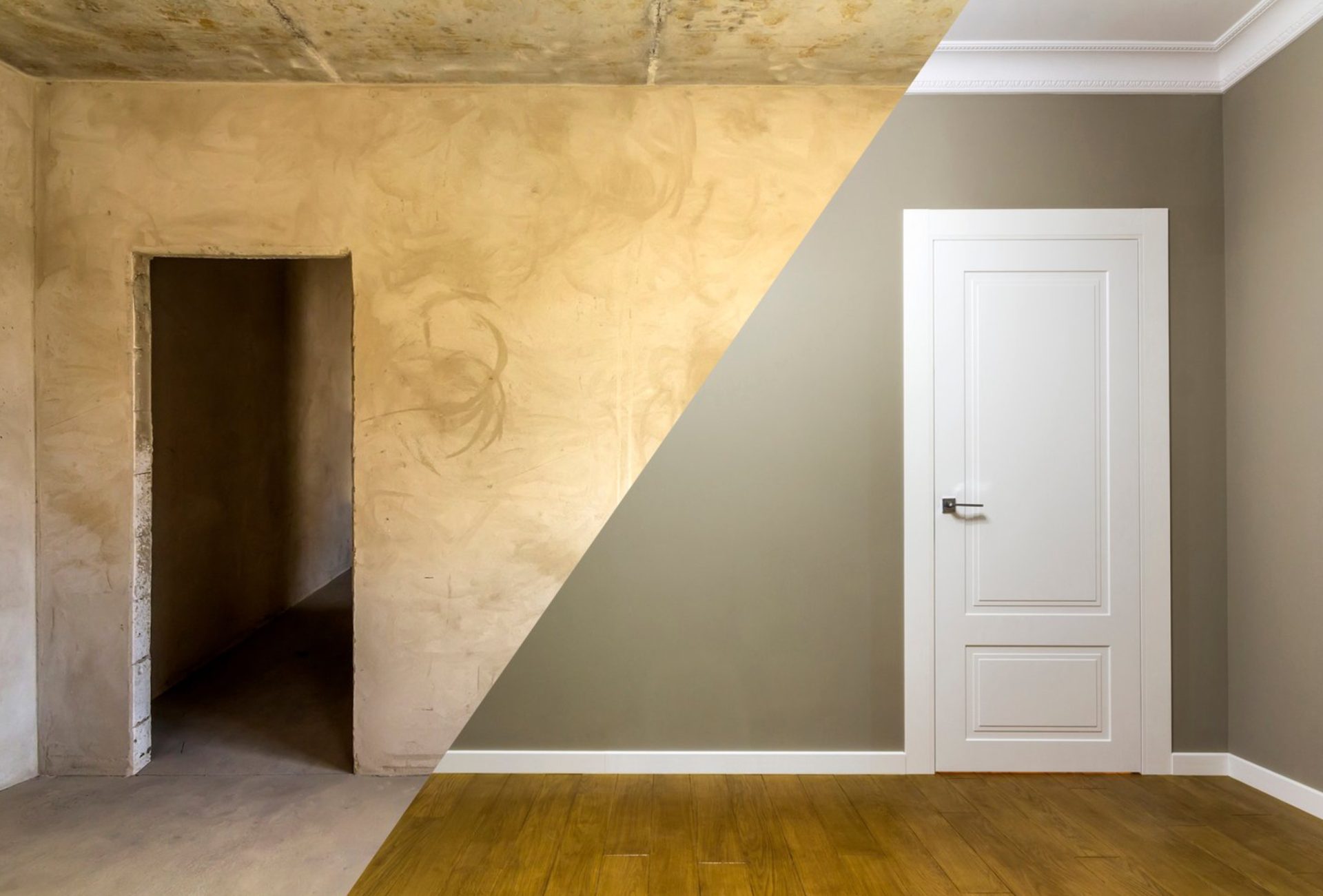
Before: Beige, uninspiring walls
After: Soft grey with cobalt accent walls to encourage creativity and collaboration
Example 2: Fashion Retail Store
Before: Whitewashed interior lacking personality
After: Bold black feature walls and bright signage colors. The store now attracts customers and showcases products effectively
Example 3: Medical Office
Before: Sterile and plain walls
After: Calming mint green with warm neutrals. The space now feels welcoming and reduces patient anxiety
Tips for a Successful Color Transformation
- Test samples in different lighting before final selection.
- Use color strategically to define zones or highlight products.
- Consider durable, washable paints for long-lasting results in commercial spaces.
Final Thoughts
Color can completely redefine commercial environments. Chicagoland Paint Pro brings expertise in selecting and applying colors that improve aesthetics, reinforce branding, and enhance the overall experience. From bold transformations to subtle updates, professional color strategies create lasting impressions.