





Accent colors can dramatically elevate your home’s style, but using them incorrectly can overwhelm a room and create visual chaos. The key is balance—introducing bold colors strategically while maintaining harmony with the existing palette. From walls and furniture to décor and accessories, careful placement ensures your accents enhance rather than dominate your space.
1. Follow the 60-30-10 Rule
- 60%: Dominant color (usually neutral, like gray, beige, or white)
- 30%: Secondary color (a complementary neutral or muted shade)
- 10%: Accent color (bold or vibrant tone)
Why It Works: Ensures bold colors remain impactful without overpowering the space.
Pro Tip: Apply your accent color in small, intentional areas—pillows, rugs, or a single wall.
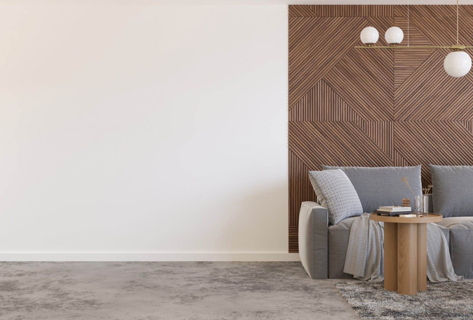
2. Use Accent Walls Wisely
- Choose one wall to highlight instead of painting the entire room in a bold color.
- Ideal walls: behind the bed, sofa, or a prominent architectural feature.
- Keep remaining walls neutral to balance intensity.
Pro Tip: Consider texture or finish variations (matte, satin, or semi-gloss) for added sophistication.
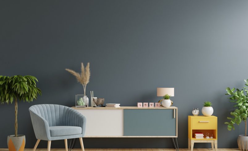
3. Accent Furniture and Cabinets
- Bold-colored furniture or cabinetry can serve as functional focal points.
- Example: A deep navy dresser in a soft gray bedroom or emerald green kitchen cabinets with neutral walls.
- Balance with neutral surroundings to avoid visual overcrowding.
Pro Tip: Smaller pieces like chairs, side tables, or shelving units are excellent for experimenting with bold colors.
4. Accessories as Accents
- Decorative items such as cushions, curtains, artwork, and rugs are low-risk ways to introduce bold colors.
- Rotate accents seasonally to refresh your look without repainting.
- Ensure accessories are proportionate to room size to avoid clutter.
Pro Tip: Layering patterns and textures in accent colors adds depth without overwhelming.
5. Contrast With Neutrals
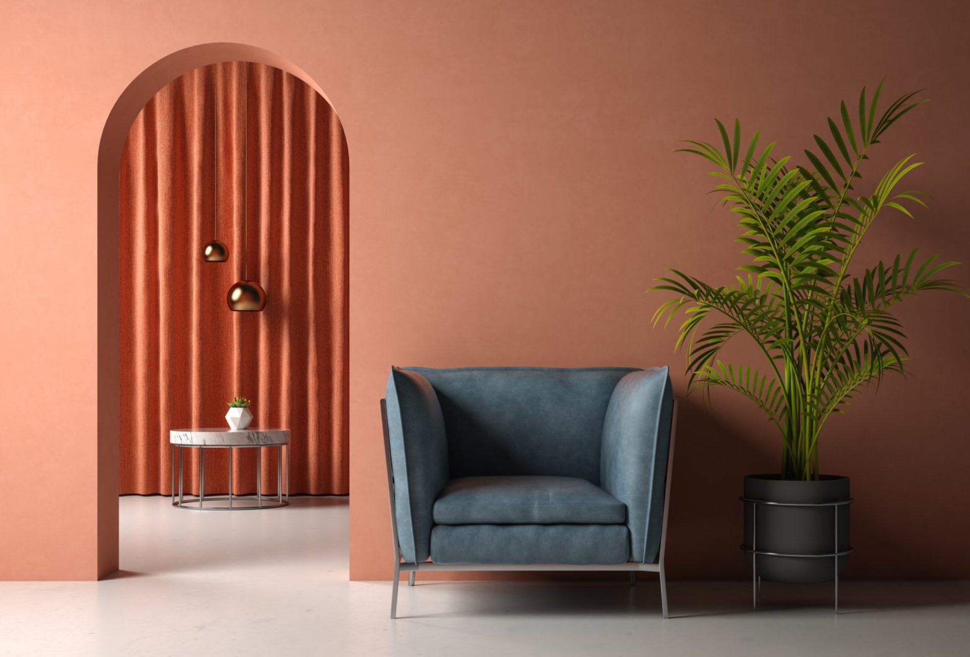
- Pairing bold colors with neutral backgrounds creates a strong visual impact without excess intensity.
- Examples: Mustard yellow with taupe walls, deep red against soft gray, or navy accents on white surfaces.
- This technique ensures your accent color pops while the space remains balanced.
Pro Tip: Avoid pairing multiple competing bold colors unless designing a highly eclectic or modern space.
6. Consider Room Function and Mood
- Living Room: Bold accents energize social spaces; reds, oranges, and jewel tones work well.
- Bedroom: Calming bold shades like navy or emerald create a cozy yet stylish environment.
- Office: Accent colors like blue or green improve focus and creativity.
- Kitchen/Dining: Warm tones encourage appetite and conversation.
Pro Tip: Align your accent color choice with the emotional effect you want for each room.
7. Strategic Placement in Small Spaces
- Small rooms can easily feel cluttered with too much bold color.
- Solutions:
- Paint only one wall or architectural feature.
- Use accessories and furniture for pops of color.
- Stick to a limited palette of one bold color per space.
Pro Tip: Lighter neutrals on surrounding walls help maintain a sense of openness.
8. Exterior Use Without Overdoing It
- Accent colors can enhance curb appeal through doors, shutters, and trim.
- Keep main siding neutral; use bold shades sparingly for focal points.
- Example: Bright red front door on a soft gray house or navy shutters on a cream exterior.
Pro Tip: Bold accents on the exterior should complement landscaping and architectural style.
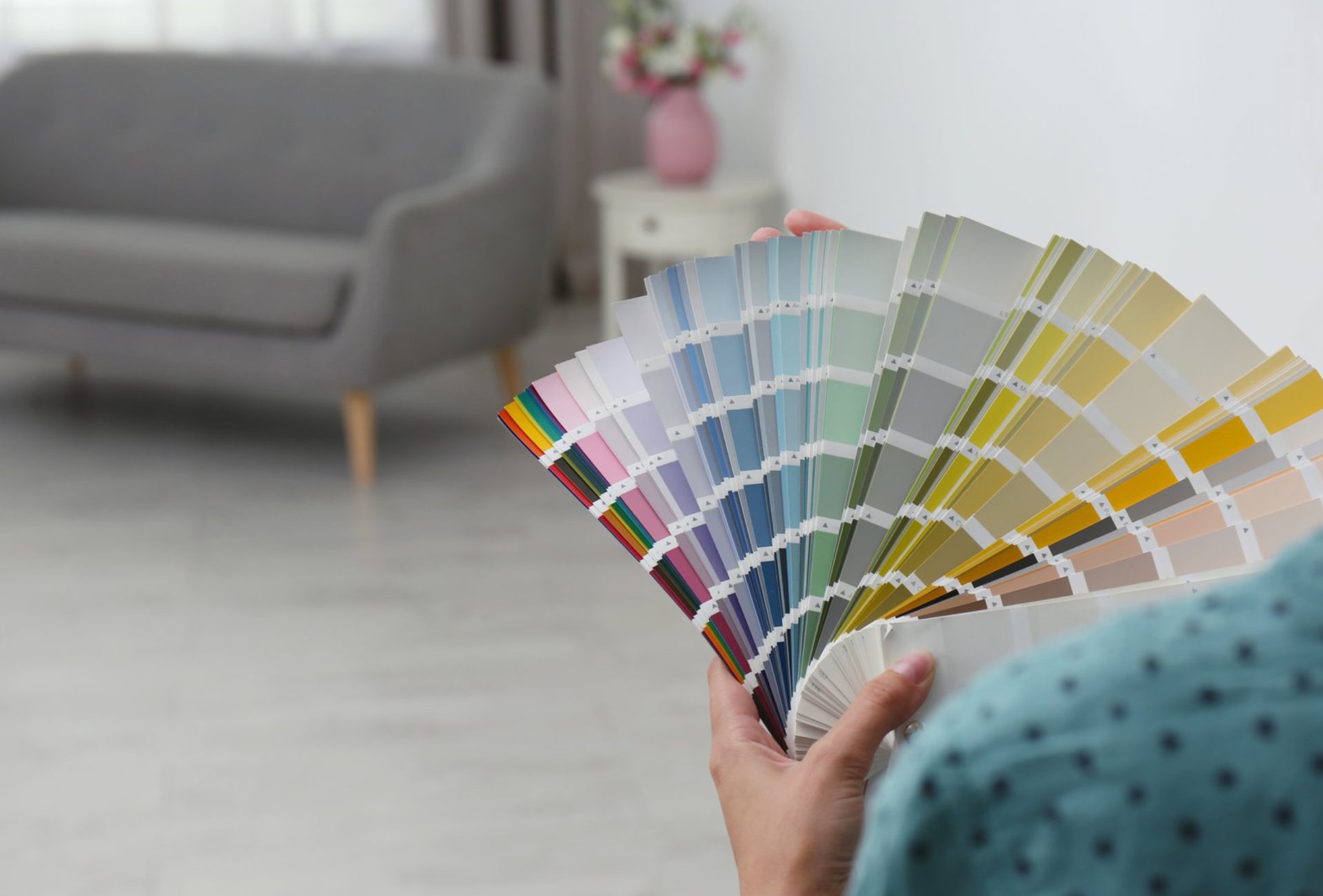
9. Testing Before Committing
- Use sample swatches on walls or furniture before final application.
- Observe how the color appears at different times of day and under artificial lighting.
- Small trials prevent overwhelming the space with the wrong intensity or shade.
Pro Tip: High-quality paint ensures accurate color, longevity, and a polished finish.
Conclusion
Bold accent colors add personality, vibrancy, and visual interest to any home, but careful application is essential to maintain balance. By following strategies like the 60-30-10 rule, using accent walls, furniture, and accessories strategically, and balancing with neutral tones, homeowners can enjoy dramatic color without overwhelming their space. Chicagoland Paint Pro provides professional color consultation and painting services to help you use bold accents effectively, transforming rooms into stylish, balanced, and inviting spaces.