




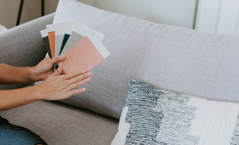

Choosing paint colors that complement your existing furniture and décor is essential for a harmonious and stylish home. The right color palette can enhance your furnishings, create balance, and reflect your personal style. Whether your home features modern, classic, or eclectic décor, professional guidance ensures a cohesive look that elevates every room.
1. Assess Your Existing Elements
- Furniture: Take note of wood tones, upholstery colors, and finishes.
- Rugs and Curtains: Patterns and textures influence which wall colors will work best.
- Artwork and Accessories: Consider prominent colors in decorative items.
- Flooring: Hardwood, tile, or carpet colors affect overall room harmony.
Pro Tip: Creating a visual inventory of your elements helps identify complementary color options.
2. Identify a Dominant Color
- Choose one main color from your furniture, décor, or a favorite accent piece.
- Use this as the foundation to guide wall and trim color choices.
- Dominant colors anchor the room and set the tone for secondary colors.
Pro Tip: Avoid choosing multiple dominant colors; focus on one to maintain balance.
3. Select Complementary Colors
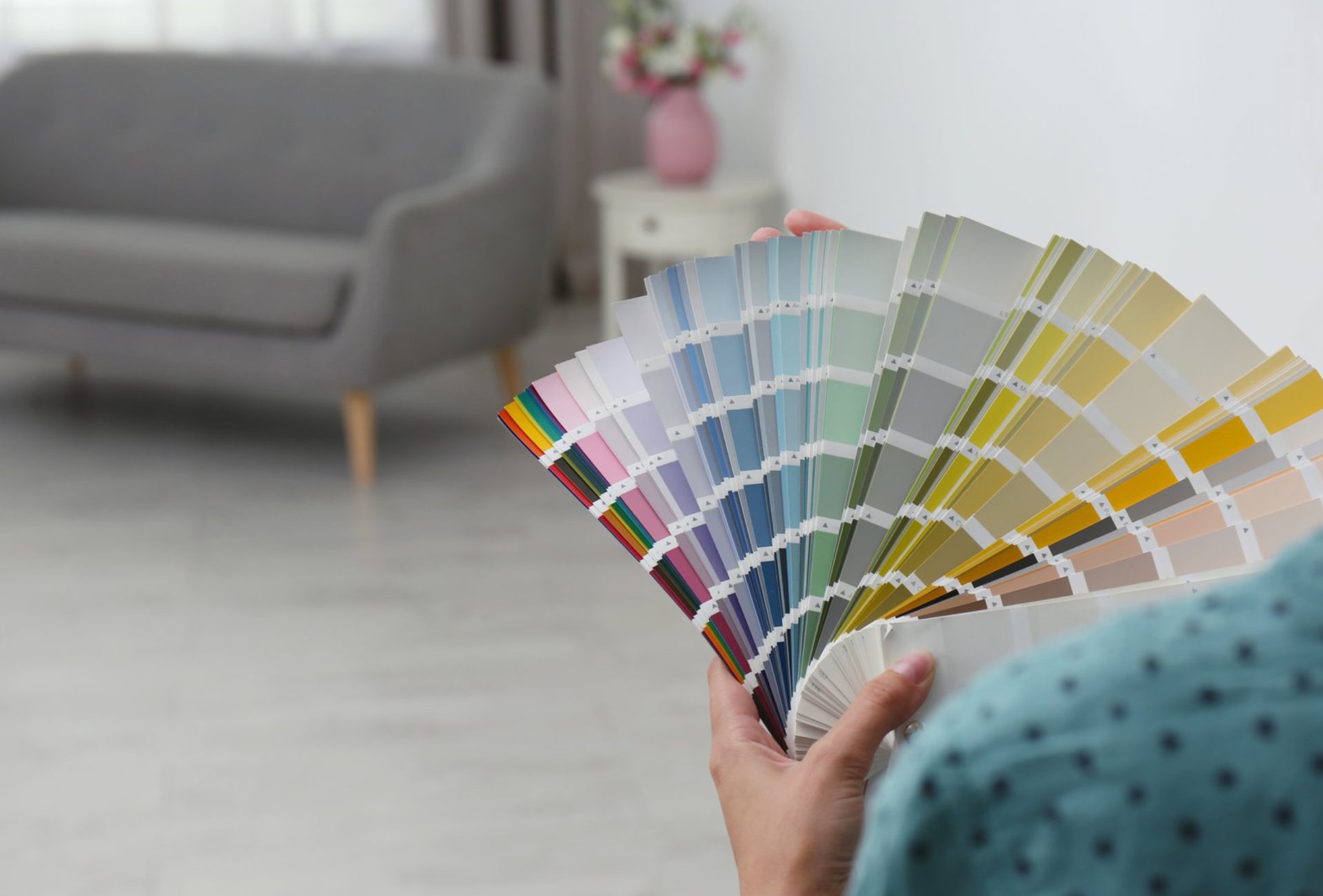
- Use the color wheel to find hues that harmonize with your dominant color.
- Analogous Colors: Colors next to your dominant hue create a serene, coordinated look.
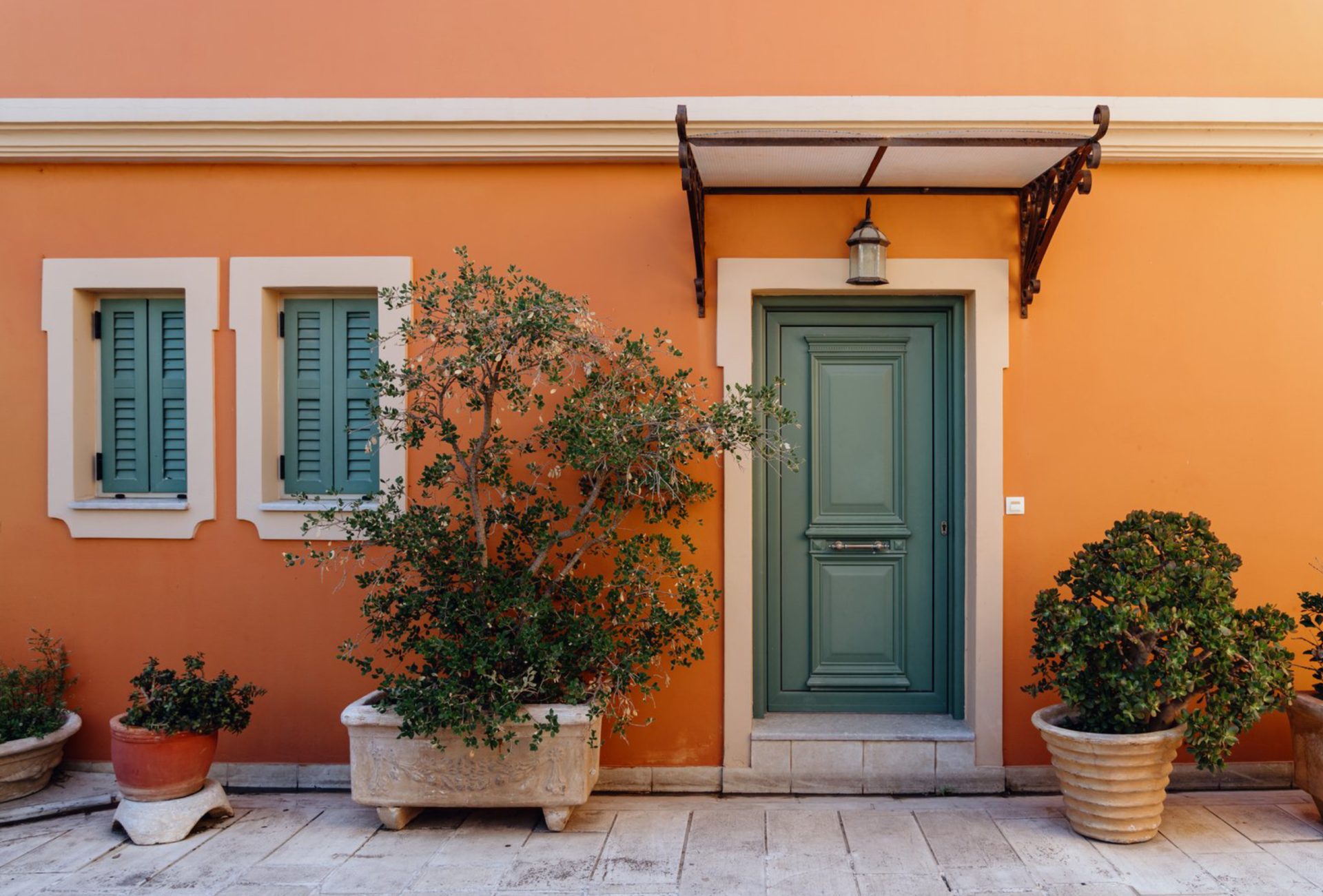
- Complementary Colors: Colors opposite on the wheel create contrast and visual interest.
- Neutral Colors: Beige, grey, and white provide a balanced backdrop for bold furniture.
Pro Tip: A professional color consultant can simplify this process and prevent mismatched schemes.
4. Consider Undertones
- Paint colors have subtle undertones (warm, cool, neutral) that affect harmony.
- Match warm-toned furniture (reds, golds, browns) with warm wall colors.
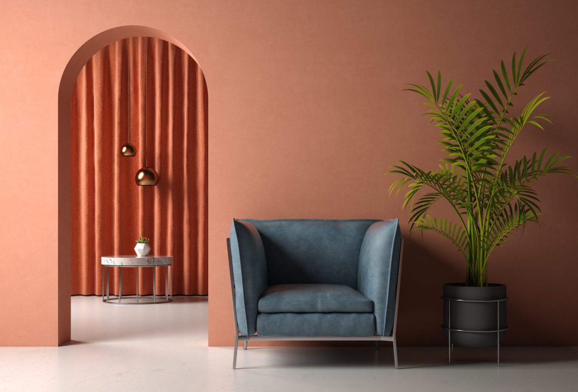
- Pair cool-toned furniture (blues, greys, silvers) with cool wall colors.
- Neutral undertones are versatile and work with most furniture styles.
Pro Tip: Testing small swatches in your room ensures undertones complement furniture correctly.
5. Balance Bold and Neutral Elements
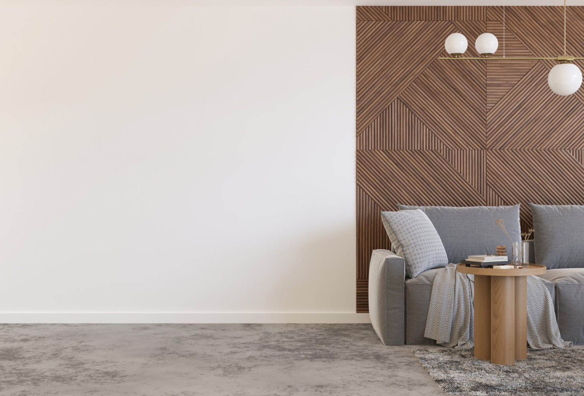
- Bold furniture or décor pieces may benefit from neutral walls to prevent visual clutter.
- Neutral furniture allows for bolder wall colors or accent walls.
- Consider the scale of your room: smaller spaces may feel cramped with overly dark or bold colors.
Pro Tip: Balance is key to creating a room that feels inviting and visually appealing.
6. Harmonize with Textures and Patterns
- Fabric, rugs, and wall textures influence color perception.
- Smooth surfaces reflect color differently than textured ones.
- Mix solid and patterned fabrics with complementary wall colors to enhance style.
Pro Tip: Test colors alongside patterned furniture or rugs before painting large areas.
7. Lighting Considerations
- Natural and artificial lighting affect how colors appear.
- Warm lighting enhances reds, yellows, and earthy tones.
- Cool lighting enhances blues, greens, and greys.
- Always view paint samples at different times of the day.
Pro Tip: Proper lighting ensures colors harmonize with your furniture under all conditions.
8. Use Accent Colors Strategically
- Accent walls, furniture, or décor in complementary shades add depth and interest.
- Highlight architectural features with contrasting colors.
- Use accessories like cushions, lamps, and rugs to reinforce the color palette.
Pro Tip: Accents allow flexibility and seasonal updates without repainting the entire room.
9. Avoid Common Mistakes
- Ignoring Existing Furnishings: Colors that clash with furniture disrupt the room’s harmony.
- Overcomplicating Palettes: Stick to 3–5 colors for cohesion.
- Choosing Trend Over Fit: Popular colors may not complement your furniture or décor.
- Skipping Samples: Always test colors in the actual room before committing.
Pro Tip: Planning and testing prevent costly repainting and frustration.
10. Professional Guidance Enhances Results
- Expert color consultation simplifies the decision-making process.
- Professionals provide recommendations tailored to your furniture, décor, and lighting.
- Visual mockups or digital renderings allow you to preview the final result.
- The outcome is a cohesive, stylish, and personalized home that feels comfortable and intentional.
Pro Tip: Working with a professional ensures your color choices enhance your home’s existing elements perfectly.
Conclusion
Choosing colors that match your furniture and décor creates a balanced, cohesive, and inviting home. By considering dominant hues, complementary shades, textures, lighting, and professional guidance, you can achieve a polished, stylish look in every room. Chicagoland Paint Pro provides expert interior color consultation to help homeowners select paint colors that harmonize with furniture and décor, creating beautiful spaces that last.