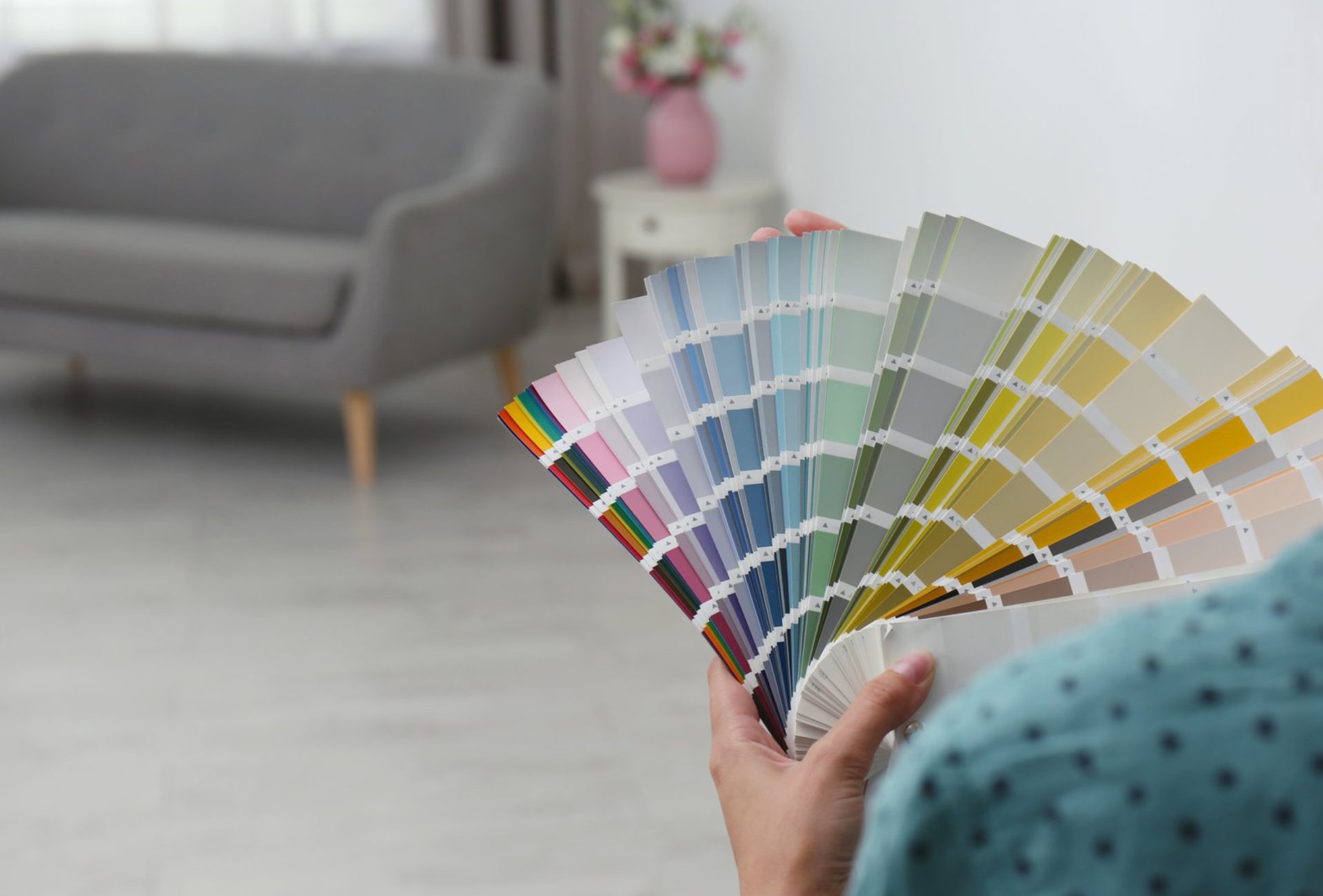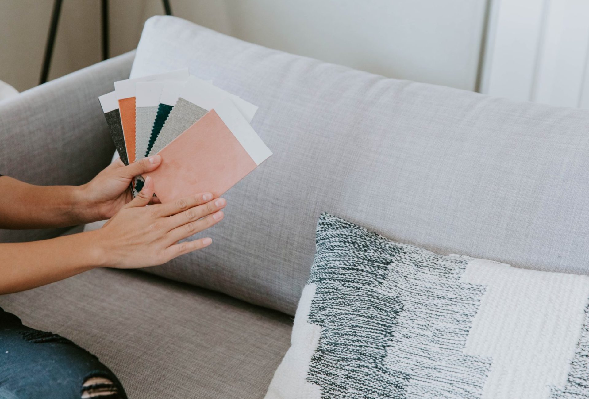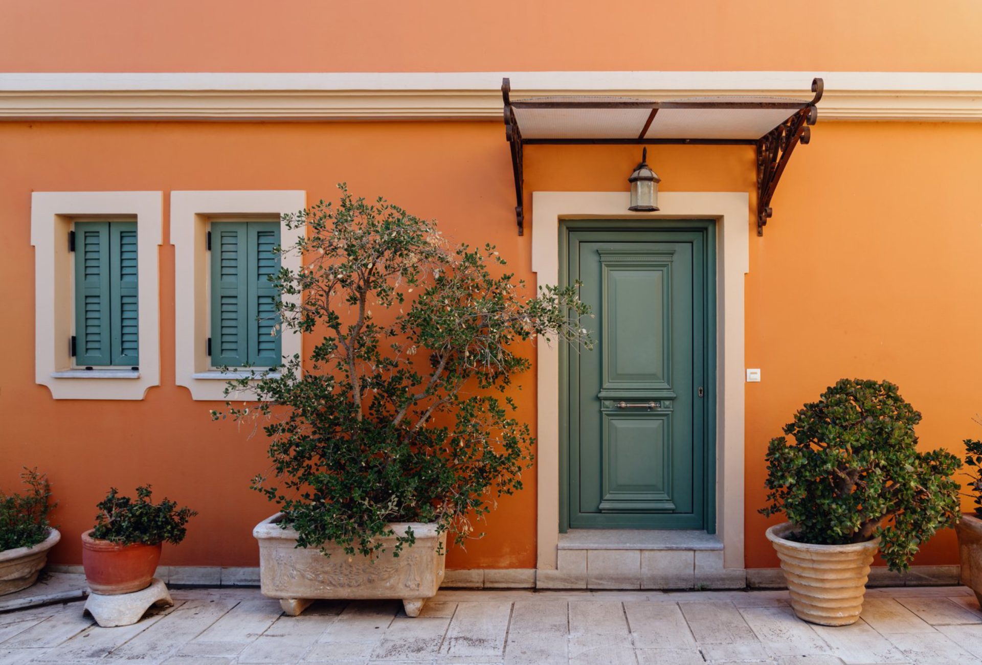

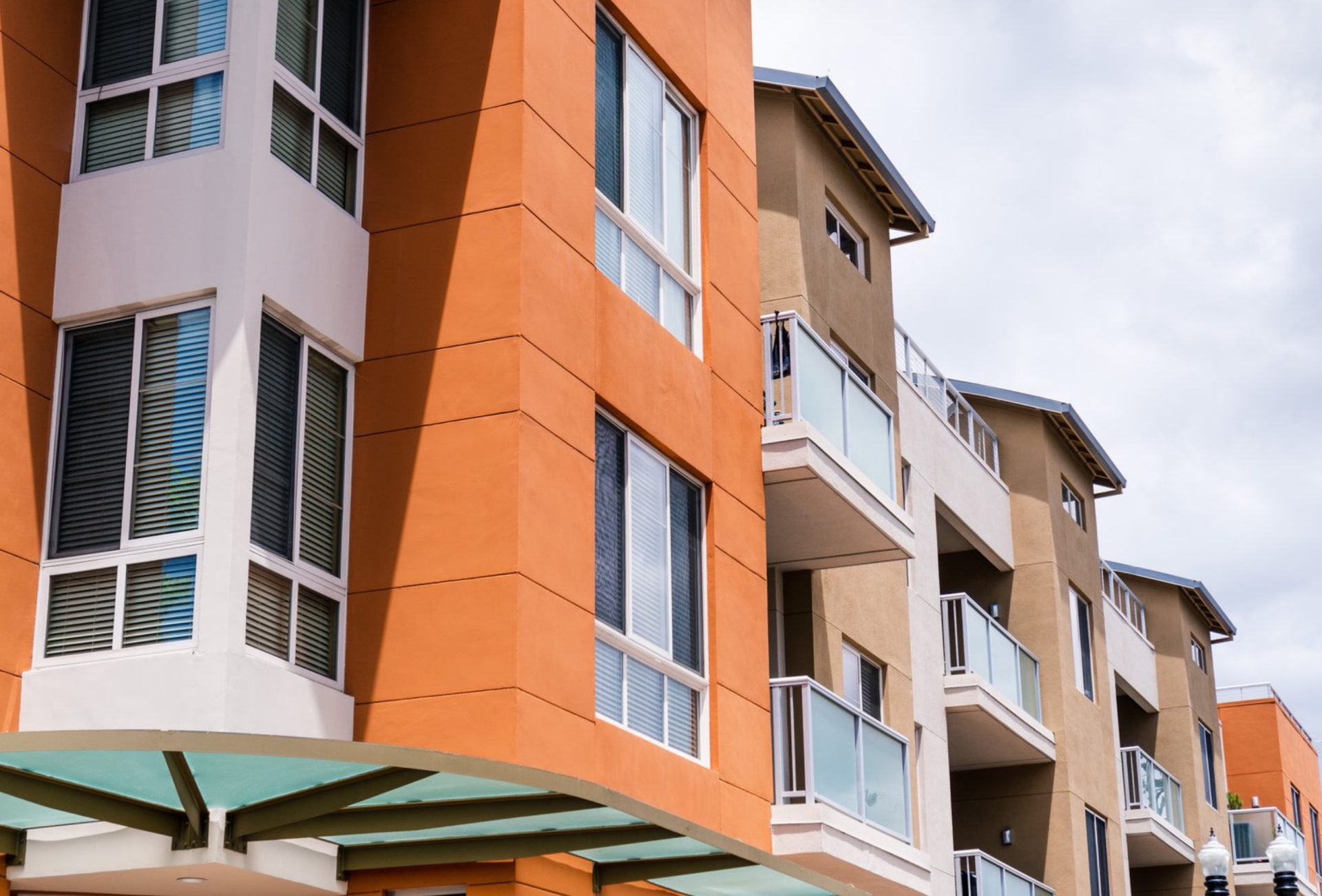


Each year brings new interior color trends that inspire homeowners to refresh their spaces. In 2026, colors focus on warmth, calm, and a connection to nature while balancing modern sophistication with timeless appeal. Knowing the latest trends can help you select paint colors that enhance your home’s style, comfort, and resale value.
1. Warm Neutrals
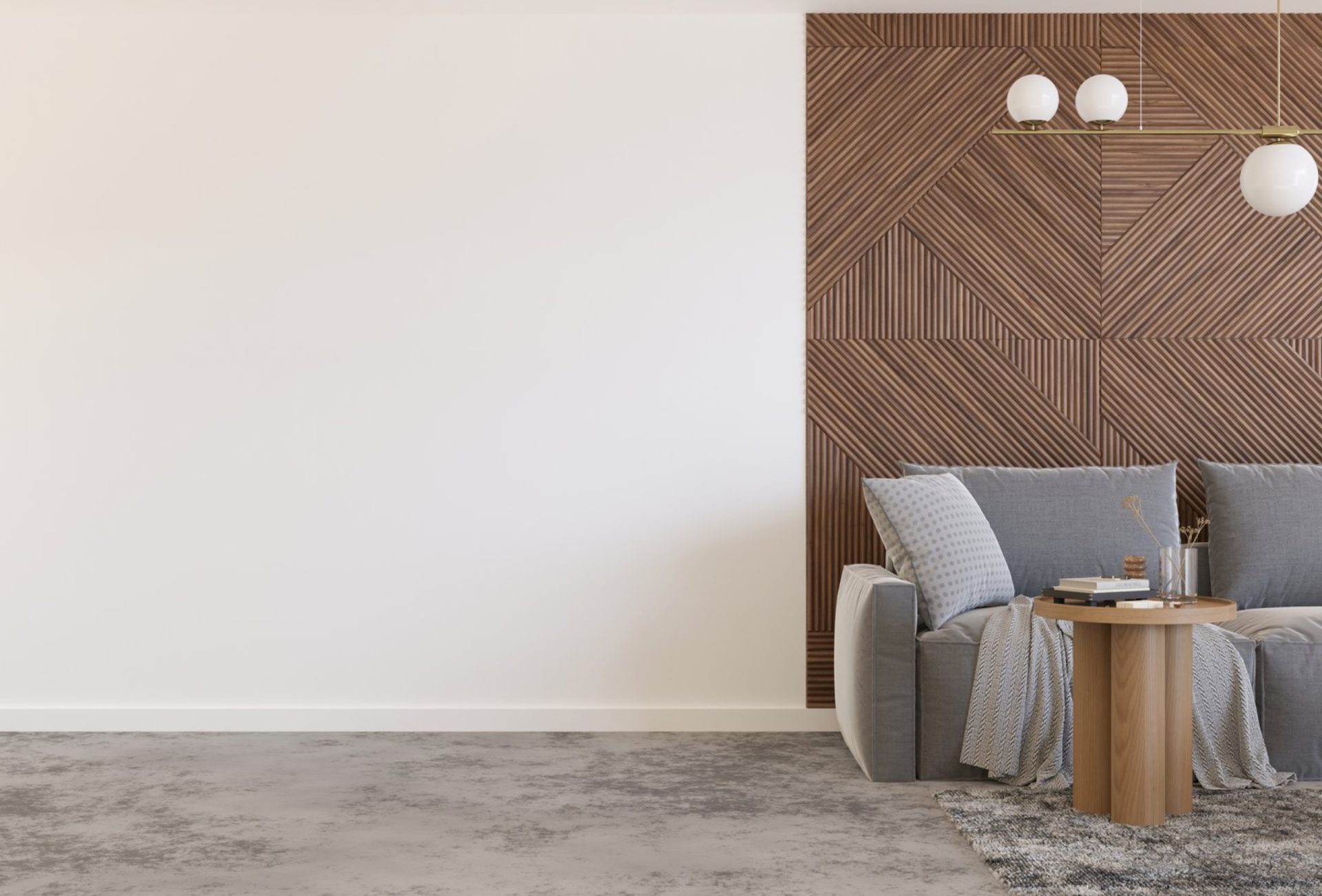
- Overview: Beige, taupe, warm greys, and soft browns dominate interiors in 2026.
- Why They’re Popular: These shades create cozy, inviting spaces that pair well with natural textures and materials.
- How to Use: Apply on walls as a neutral base, then layer with colorful accents through furniture, artwork, and textiles.
Pro Tip: Warm neutrals work in virtually any room and complement both traditional and modern décor.
2. Soft Terracotta & Earth Tones
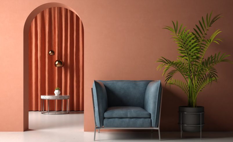
- Overview: Terracotta, clay, rust, and muted ochre tones bring warmth and a natural feel indoors.
- Why They’re Popular: They evoke earthy calm, connection to nature, and timeless elegance.
- How to Use: Feature as accent walls, kitchen cabinetry, or decorative elements to create a grounded yet modern atmosphere.
Pro Tip: Pair these tones with soft whites or light wood finishes for a balanced, airy feel.
3. Muted Sage & Botanical Greens
- Overview: Soft sage, moss, and olive shades are trending in living areas, kitchens, and bedrooms.
- Why They’re Popular: Green represents tranquility, wellness, and a connection to the outdoors.
- How to Use: Accent walls, cabinetry, or trim bring freshness without overwhelming a space.
Pro Tip: Complement greens with warm neutrals or muted yellows for a harmonious color palette.
4. Deep, Moody Blues
- Overview: Navy, midnight blue, and slate tones add sophistication and depth to interiors.
- Why They’re Popular: Dark blues create cozy, dramatic spaces ideal for bedrooms, dining rooms, and offices.
- How to Use: Use for accent walls, built-in shelves, or large furniture pieces. Pair with brass or gold accents for a luxurious feel.
Pro Tip: Balance deep blues with lighter neutral tones to prevent spaces from feeling too heavy.
5. Soft Pastels for Calm Interiors
- Overview: Blush pinks, powder blues, and lavender shades offer gentle, calming interiors.
- Why They’re Popular: These colors create soothing environments perfect for bedrooms, bathrooms, and home offices.
- How to Use: Incorporate pastels in walls, textiles, and accessories. Pair with white trim for a clean, airy effect.
Pro Tip: Pastels are versatile and can serve as accent tones or main wall colors depending on the space.
6. Contrasting Dark & Light Combinations
- Trend: Combining dark shades like deep greens, blues, or charcoal with light neutrals creates visual interest.
- How to Use: Dark lower walls with light upper walls, or dark furniture against light walls, creates depth and modernity.
Pro Tip: Use contrast sparingly in small spaces to avoid overwhelming the room.
7. Natural and Organic Influence
- Trend: Wood tones, natural stone-inspired hues, and earthy textures complement wall colors.
- Why It Works: Biophilic design connects interiors to nature, promoting calmness and comfort.
- How to Use: Combine paint colors with wood accents, stone countertops, and woven textiles.
Pro Tip: This trend emphasizes sustainability and timeless appeal rather than fleeting fads.
8. Warm Metallic Accents
- Trend: Gold, brass, and copper complement the 2026 color palette, adding subtle luxury.
- How to Use: Use metallics on lighting fixtures, cabinet hardware, or décor elements to elevate muted or neutral tones.
Pro Tip: Metallic accents pair beautifully with deep blues, warm neutrals, and terracotta shades.
9. Tips for Incorporating Trends into Your Home
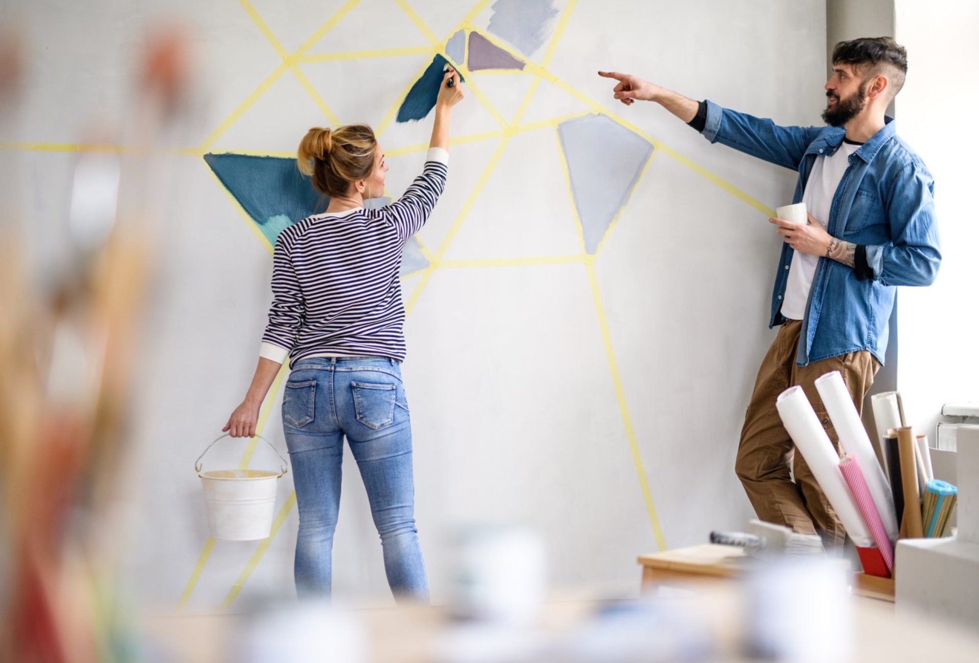
- Test paint samples in multiple lighting conditions.
- Use trending colors as accents before committing to large areas.
- Blend new shades with existing furniture and décor for continuity.
- Consult a color expert for a cohesive palette tailored to your home.
Pro Tip: Expert guidance ensures your home reflects trends while remaining timeless and personalized.
10. How Professional Color Consultation Helps
- Identifies the best trending shades for your space.
- Ensures harmony between walls, furniture, and décor.
- Prevents costly mistakes and repainting by previewing colors virtually or in-person.
- Provides a curated palette for a balanced, modern, and stylish home.
Pro Tip: Professional consultations combine trends with practical guidance to maximize your home’s aesthetic and value.
Conclusion
2026’s interior color trends emphasize warmth, tranquility, and sophistication, blending natural tones with deep, bold shades. By understanding these trends and applying them thoughtfully, you can transform your home into a stylish, inviting space. Chicagoland Paint Pro offers expert interior color consultation to help homeowners choose colors that are both trendy and timeless, ensuring your home looks beautiful today and for years to come.