


Townhouse interiors are evolving, with modern homeowners prioritizing style, functionality, and cohesion across multiple levels. The right interior colors can make compact spaces feel larger, create flow between rooms, and reflect a contemporary aesthetic that enhances both comfort and resale value.
Whether you have a two-story urban townhouse or a multi-level suburban unit, understanding current color trends helps you make design choices that are stylish, timeless, and practical.
Why Interior Color Trends Matter for Townhouses
- Visual Flow: Townhouses often have connected or narrow spaces, making cohesive color schemes essential.
- Natural Light Optimization: Colors can enhance or compensate for natural light in stairwells, living areas, and kitchens.
- Resale Value: Buyers are drawn to modern, neutral, or thoughtfully accented interiors.
- Personal Expression: Trends inspire creativity without overwhelming your home’s architecture.
Chicagoland Paint Pro Tip: Trendy colors should be paired with classic neutrals for balance, especially in shared or multi-level spaces.
1. Soft, Neutral Palettes
Neutral tones remain a top choice for townhouse interiors due to their versatility and timeless appeal.
Popular Neutrals for 2026
- Warm Gray: Adds sophistication without feeling cold.
- Soft Taupe: Neutral yet inviting; works well with wood and metal accents.
- Creamy Whites: Brightens compact spaces and provides a clean canvas for décor.
Where to Use: Living rooms, kitchens, hallways, and open-concept areas.
Pro Tip: Layer neutrals with texture—rugs, textiles, or accent furniture—to avoid flatness.
2. Bold Accent Colors
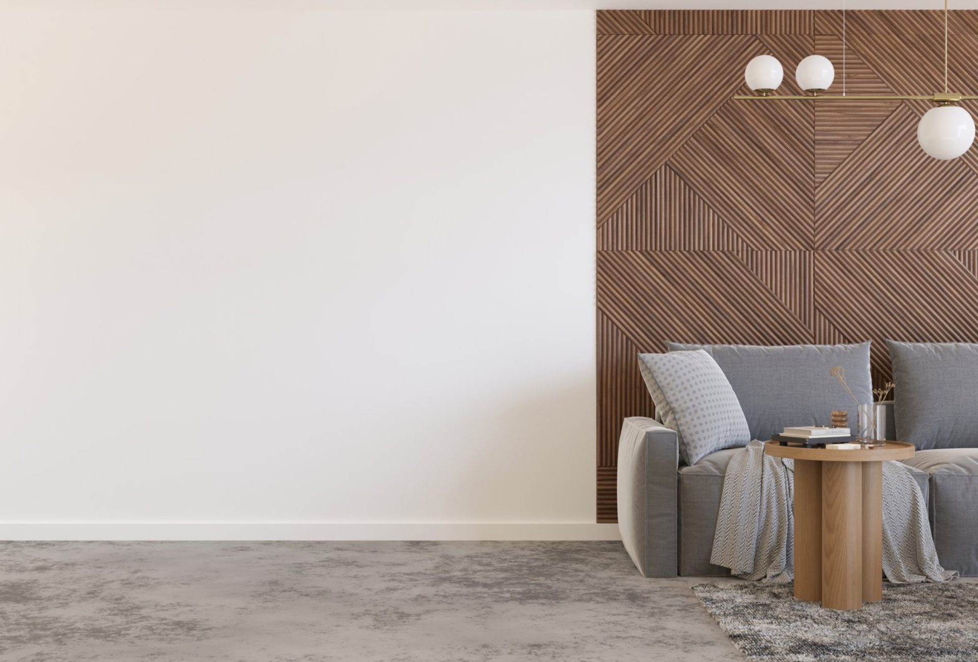
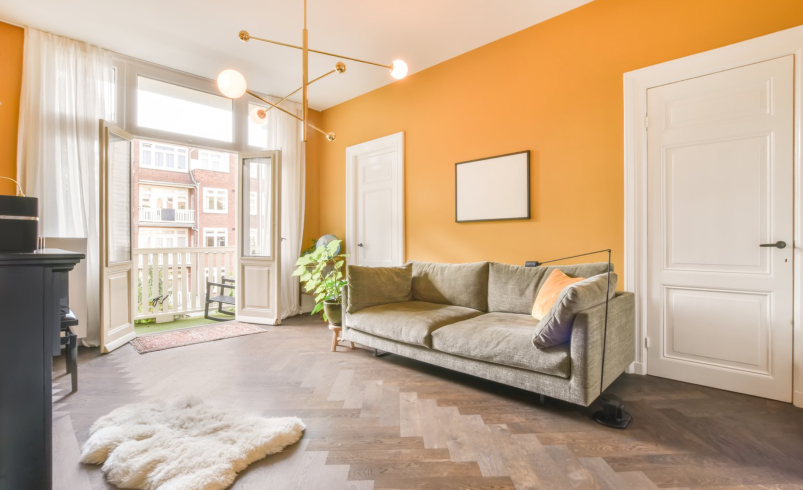
Accent walls remain popular for adding personality without overwhelming rooms.
Trending Accent Colors
- Deep Navy
- Forest Green
- Charcoal or Slate Gray
- Terracotta or Rust
Best Practices:
- Limit to one wall per room for impact.
- Complement neutral base colors for cohesion.
- Ideal for bedrooms, living areas, or feature walls near staircases.
3. Earthy and Organic Tones
As sustainable living gains traction, earthy hues inspired by nature are increasingly popular.
Examples:
- Olive and Sage Green
- Warm Browns and Beiges
- Soft Clay or Sand tones
Benefits:
- Creates calm, welcoming interiors
- Pairs well with natural materials like wood, stone, and woven textiles
- Suitable for multi-functional townhouse spaces like home offices or open kitchens
4. Muted Pastels
Pastel colors are making a subtle comeback, offering soft sophistication without feeling childish.
Popular Shades:
- Blush Pink
- Powder Blue
- Soft Lavender
- Mint Green
Where to Use: Bedrooms, bathrooms, and reading nooks.
Pro Tip: Pair with neutral furnishings to keep spaces modern and grounded.
5. Dark and Moody Tones
Dark, dramatic walls add a sense of luxury and depth when used strategically.
Popular Dark Tones:
- Charcoal or Graphite
- Deep Teal
- Navy Blue
- Rich Plum
Best Practices:
- Use in rooms with ample natural light
- Highlight with lighter trims, doors, or furniture
- Creates cozy atmospheres for bedrooms or dens
6. Transitional Color Palettes
Transitional colors blend traditional and contemporary styles, perfect for townhouses with classic architecture but modern interiors.
Examples:
- Warm Grays with Cool Accents
- Beige with Soft Blue or Green
- Taupe with Deep Charcoal
Benefits: Offers flexibility to mix modern furniture with classic features like molding or wood floors.
Tips for Applying Trends in Townhouses
- Consistency Across Levels: Maintain a cohesive palette for multi-story units.
- Consider Lighting: Light levels vary; test paint in different rooms and times of day.
- Combine Textures: Use paint with materials like wood, metal, and fabric for depth.
- Neutral Anchors: Trendy colors work best when paired with neutral bases.
- Future-Proofing: Choose shades that remain stylish beyond short-term trends.
Finishes for Townhouse Interiors
- Flat/Matte: Ceilings and walls with minimal imperfections.
- Eggshell/Satin: Perfect for high-traffic areas like hallways and living rooms.
- Semi-Gloss/Gloss: Doors, trims, and cabinetry for durability and easy cleaning.
Chicagoland Paint Pro Tip: Satin finishes balance durability with a soft sheen, ideal for multi-level townhouses.
Common Mistakes to Avoid
- Using too many bold colors in small spaces
- Ignoring natural light variations
- Overlooking trim and door color coordination
- Following trends without testing samples
- Choosing high-contrast colors for adjoining townhouse walls
Final Thoughts
Townhouse interior color trends for 2026 focus on a balance of neutrals, earthy tones, bold accents, and muted pastels. Thoughtful application of these colors can make compact or multi-level spaces feel expansive, stylish, and cohesive.
By integrating modern trends with personal style and practical considerations like light, flow, and furniture, your townhouse interiors can achieve a fresh, contemporary look that enhances both comfort and long-term value.