





Paint color is never static—it changes depending on the light it’s exposed to. Both natural sunlight and artificial lighting influence how colors appear on walls, ceilings, and cabinetry. Understanding these effects is crucial for selecting paint that looks perfect at every time of day, avoids unwanted hues, and enhances your home’s atmosphere.
1. The Role of Natural Light
- North-Facing Rooms: Receive soft, cool light that can make colors appear muted or bluish. Warm colors like yellows, soft reds, and warm neutrals help balance this effect.
- South-Facing Rooms: Receive bright, warm sunlight that enhances colors, making them appear more vibrant and true. Deep tones like navy or forest green pop beautifully here.
- East-Facing Rooms: Morning sunlight creates warm, energizing light. Colors may appear brighter in the morning and softer in the afternoon.
- West-Facing Rooms: Afternoon and evening sunlight is warm and golden, enhancing warm tones and softening cooler shades.
Pro Tip: Always test paint samples at different times of the day to see how natural light affects the hue.
2. The Effect of Artificial Lighting
- Incandescent Bulbs: Produce warm, yellow-toned light that enhances warm colors but may make cool colors look dull or slightly greenish.
- Fluorescent Bulbs: Often emit cool, bluish light that can wash out warm colors or make them appear colder.
- LED Lighting: Available in various color temperatures; warm LED lights mimic incandescent tones, while cool LEDs resemble natural daylight.
Pro Tip: Consider the bulb type in each room before finalizing your paint color to ensure consistent appearance.
3. Light Intensity Matters
- Brighter light amplifies paint colors, making them appear more vibrant.
- Dim lighting softens colors, potentially making deep tones appear flat or muted.
- Tip: In rooms with low natural light, choose lighter shades to prevent spaces from feeling dark or cramped.
Pro Tip: Semi-gloss and satin finishes reflect light, brightening low-light spaces, while matte finishes absorb light for a softer, subtler look.
4. Color Temperature and Mood
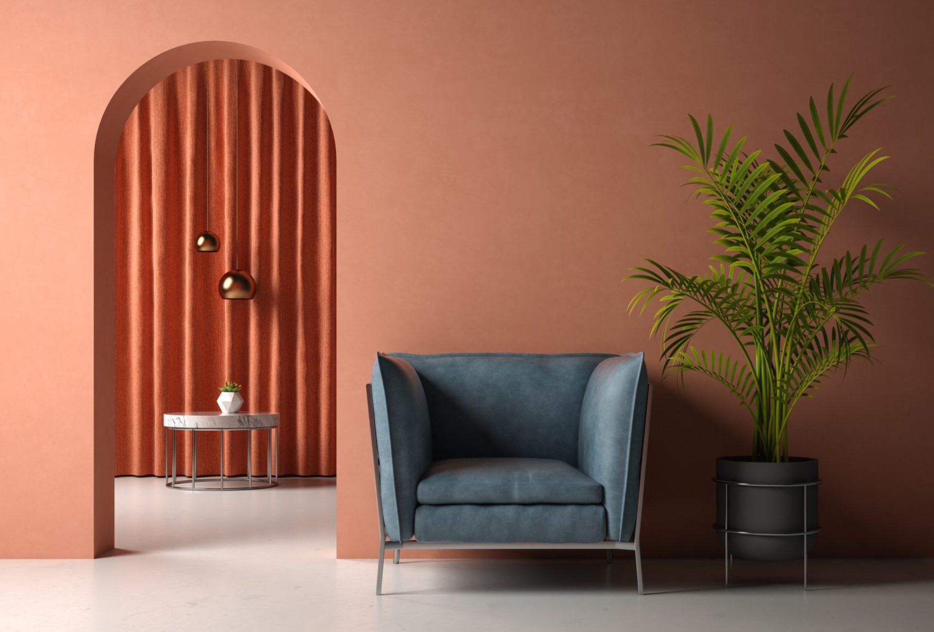
- Warm light (yellow/orange) enhances cozy, inviting hues like warm beige, terracotta, and soft yellows.
- Cool light (blue/white) brings out clarity in blues, greens, and cool neutrals.
- Tip: Align your color choice with the desired mood of each room—warm and welcoming or calm and modern.
Pro Tip: Layer lighting—overhead, task, and accent lighting—to highlight paint colors effectively throughout the day.
5. Room Function and Lighting Impact
- Living Rooms: Natural light can highlight feature walls or accent colors. Consider warm tones for family-friendly, inviting spaces.
- Kitchens: Bright, even lighting ensures vibrant colors appear true and clean.
- Bedrooms: Warm, soft light enhances relaxation; choose colors that maintain calm under low light.
- Bathrooms: Cool lighting can highlight blues and greens, but warm accents soften the environment.
Pro Tip: Consider reflective surfaces like mirrors and glossy finishes, which interact with both natural and artificial light.
6. Testing Paint in Real Conditions
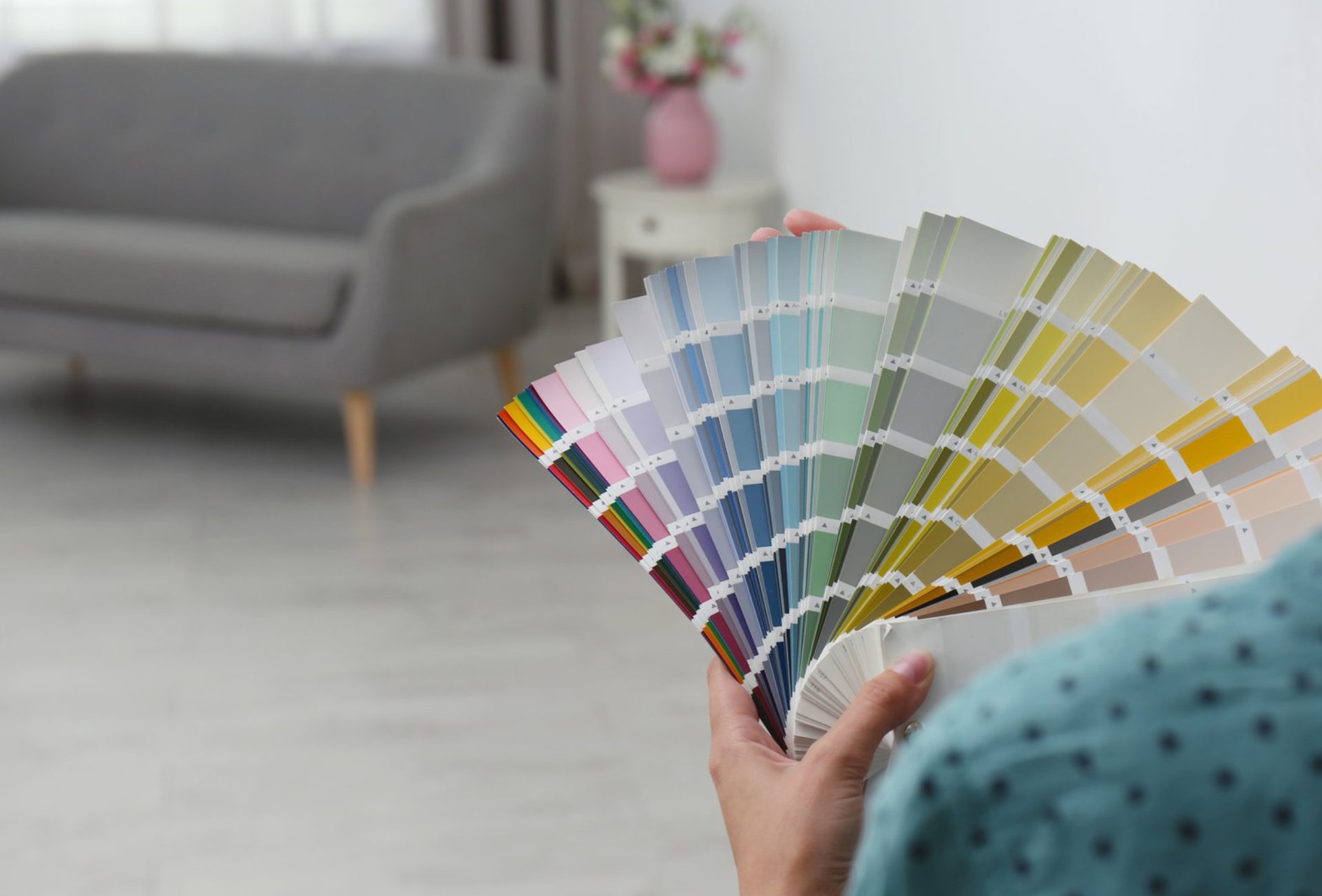
- Paint large sample patches on walls, not just swatches.
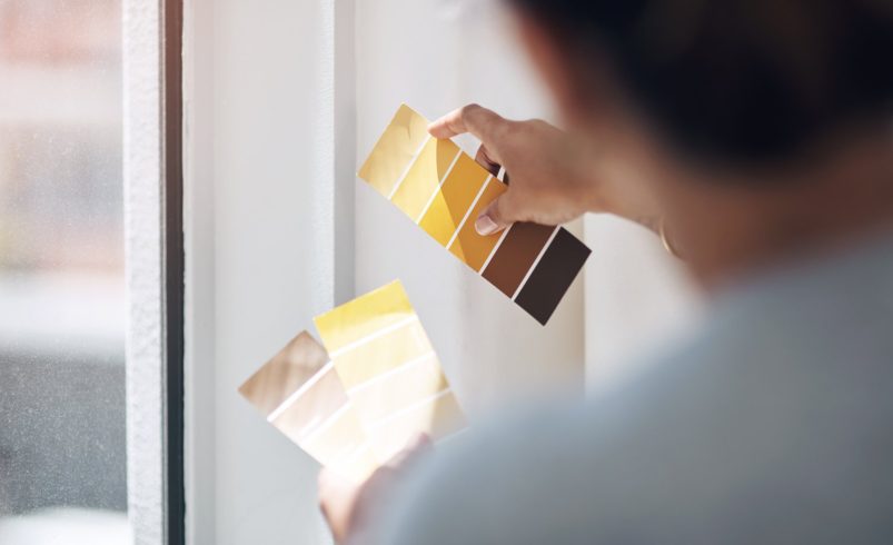
- Observe at different times: morning, afternoon, evening, and under artificial lights.
- Note undertones that may shift depending on the light source.
Pro Tip: Keep the room empty during testing if possible; furniture and décor can affect how the paint looks.
7. Combining Light and Color for Impact
- Use lighter shades in darker rooms to maximize brightness.
- Darker or bold colors in naturally lit rooms create drama without overwhelming.
- Layered lighting helps maintain color consistency and highlights accent walls, trim, or architectural features.
Pro Tip: Professional color consultation can help predict how natural and artificial light will affect your specific paint choices.
Conclusion
Lighting is a key factor in how paint colors are perceived. By understanding the effects of natural and artificial light, considering light intensity, color temperature, and room function, homeowners can select colors that consistently look their best. Testing paint in real lighting conditions ensures accurate results and avoids costly mistakes. Chicagoland Paint Pro offers expert guidance and professional painting services to help Chicago homeowners choose and apply colors that shine beautifully under every light, creating vibrant, inviting, and well-balanced spaces.