



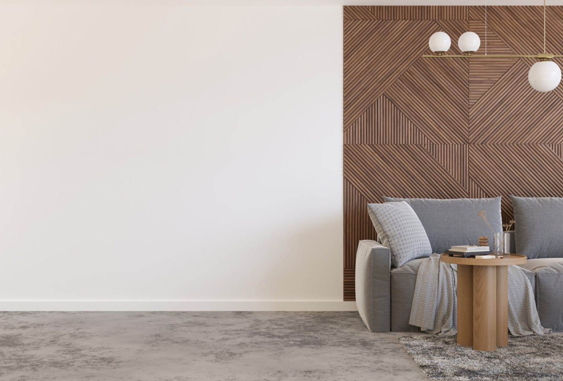
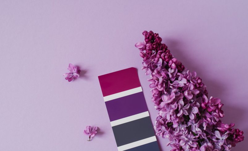

Creating a contemporary home isn’t just about choosing trendy colors—it’s about how you combine them. Mixing and matching colors the right way can transform your space into a cohesive, stylish environment that feels modern and inviting. Whether you’re updating interiors or refreshing your home’s exterior, understanding color balance, contrast, and harmony is key to achieving a polished contemporary look.
1. Start with a Neutral Base
- Popular Neutrals: White, off-white, beige, greige, and soft gray.
- Why It Works: Neutral tones provide a clean foundation that allows other colors to stand out.
- Where to Use: Walls, large surfaces, and exterior siding.
Pro Tip: A neutral base ensures flexibility, making it easy to update accents over time.
2. Follow the 60-30-10 Rule
- 60% Dominant Color: Main wall color or exterior siding.
- 30% Secondary Color: Furniture, cabinetry, or trim.
- 10% Accent Color: Decorative pieces, doors, or feature elements.
Why It Works: This rule creates balance and prevents spaces from feeling overwhelming or chaotic.
Pro Tip: Stick to this ratio to maintain a structured and visually appealing design.
3. Combine Warm and Cool Tones
- Pair warm tones (beige, taupe, warm whites) with cool shades (blues, greens, grays).
- This contrast creates depth and keeps the space from feeling flat.
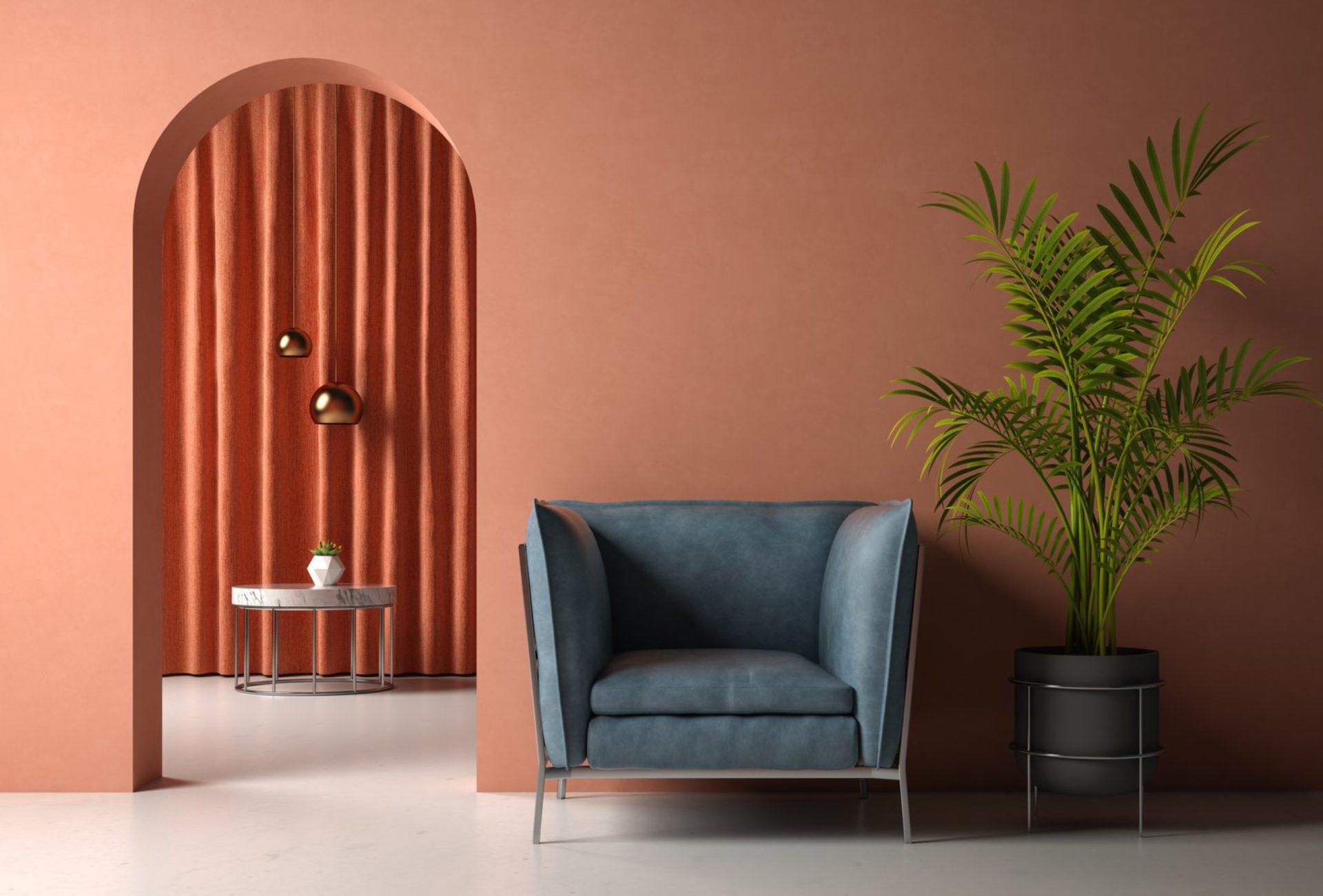
Example: Warm beige walls with cool blue accents create a balanced contemporary vibe.
Pro Tip: Keep one tone dominant to avoid clashing.
4. Use Contrast for Visual Interest
- Light walls with dark trim or dark cabinets with light countertops.
- Exterior example: Dark siding with white trim for a bold modern appearance.
Why It Works: Contrast highlights architectural features and adds sophistication.
Pro Tip: High contrast works best in modern and contemporary designs.
5. Stick to a Cohesive Color Family
- Choose colors within the same undertone (warm or cool).
- Avoid mixing too many unrelated shades that can disrupt harmony.
Example: Combine shades of gray, blue, and white for a clean, modern palette.
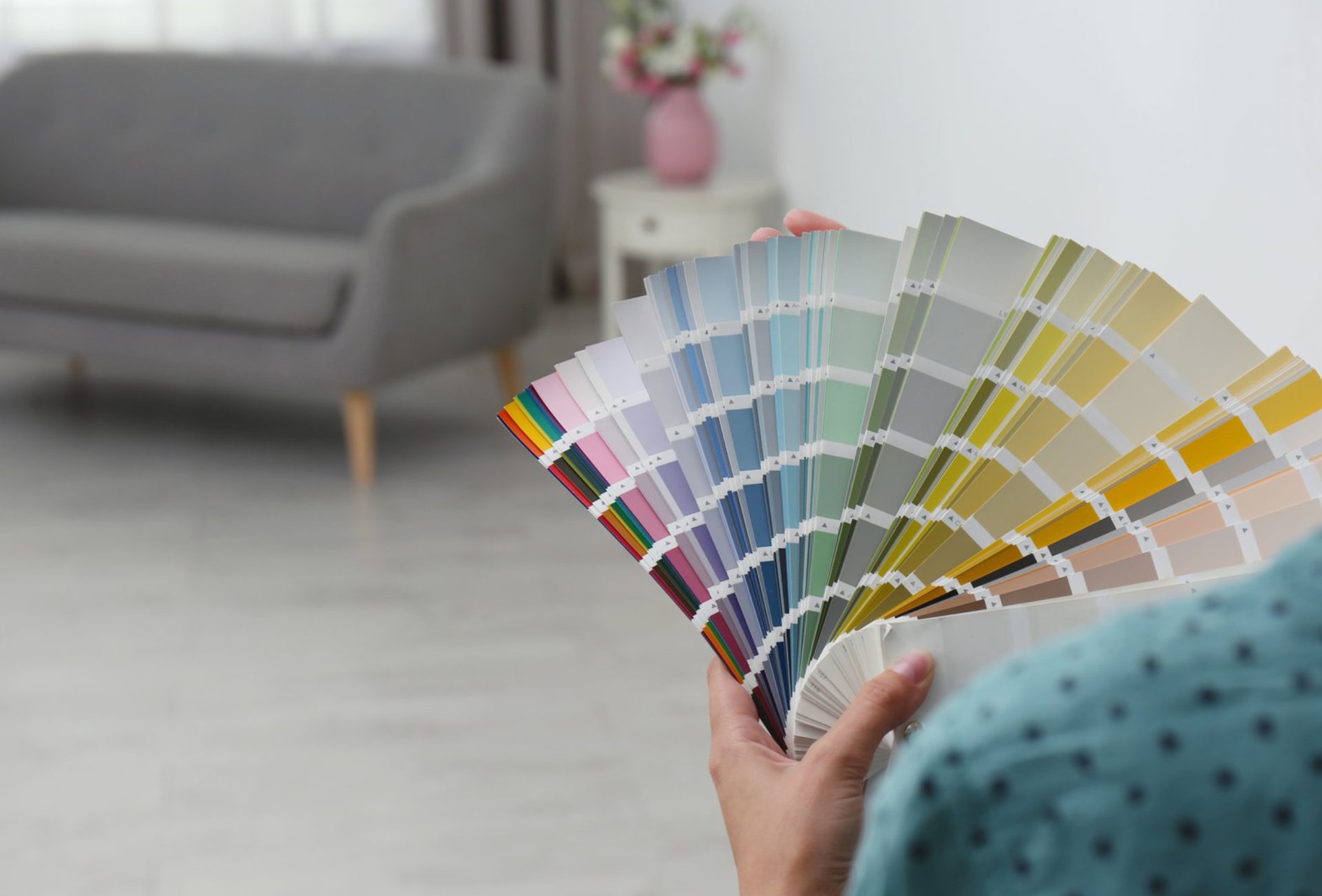
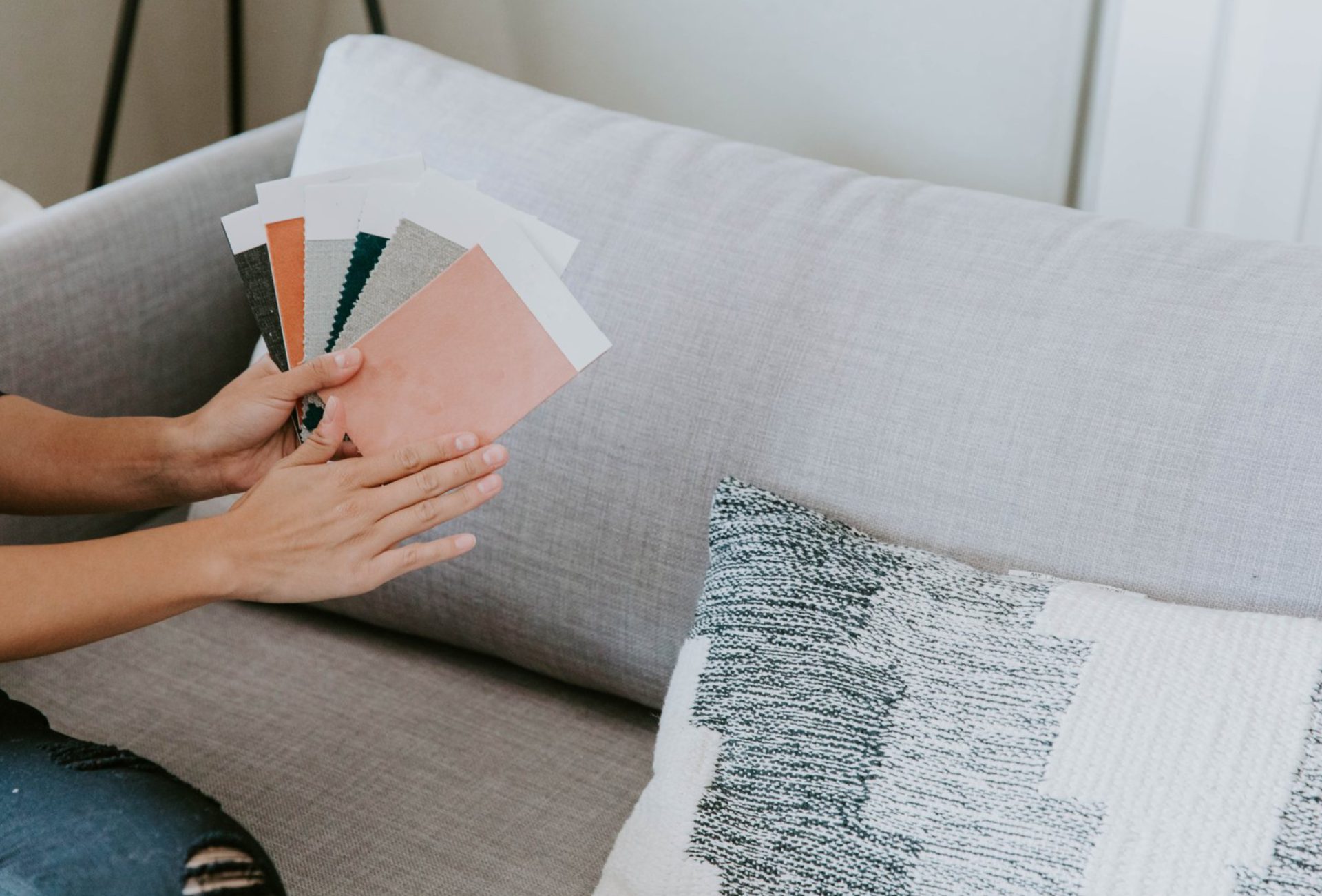
Pro Tip: Use color swatches to ensure tones complement each other before applying.
6. Add Accent Colors Strategically
- Use bold colors sparingly for maximum impact.
- Popular accents include mustard yellow, navy blue, forest green, and burnt orange.
Where to Use:
- Interior: Cushions, rugs, artwork, cabinets.
- Exterior: Front doors, shutters, trim.
Pro Tip: One or two accent colors are enough to create a focal point without overwhelming the design.
7. Consider Lighting and Space
- Natural and artificial lighting can change how colors appear.
- Dark colors may make small spaces feel smaller, while light colors open up a room.
Pro Tip: Always test colors in your space at different times of the day.
8. Balance Textures and Materials
- Combine colors with materials like wood, metal, glass, and stone.
- This adds dimension and enhances the modern look.
Example: Matte walls paired with glossy cabinets or natural wood accents.
Pro Tip: Texture can make even simple color palettes feel rich and dynamic.
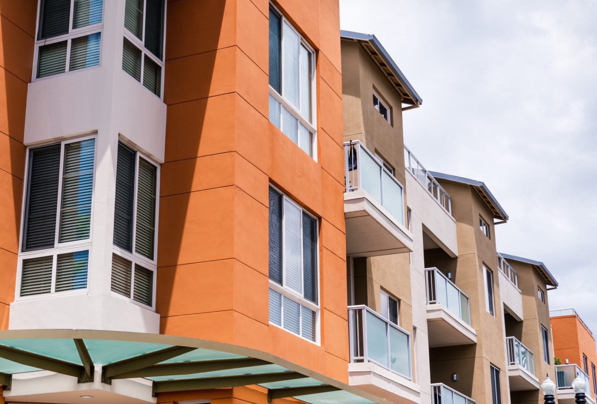
9. Coordinate Interior and Exterior Colors
- Ensure your interior palette complements your exterior color scheme.
- This creates a seamless, cohesive look throughout your home.
Pro Tip: Use similar tones or accents to connect indoor and outdoor spaces.
10. When to Seek Professional Help
- If you’re unsure about combinations or undertones.
- When working with multiple rooms or large exterior areas.
- To ensure long-lasting, trend-forward results.
Pro Tip: Professional color consultation saves time and helps avoid costly mistakes.
Conclusion
Mixing and matching colors for a contemporary look is all about balance, contrast, and cohesion. By starting with a neutral base, following proven design rules, and using accents strategically, you can create a modern space that feels both stylish and comfortable. Whether updating interiors or exteriors, thoughtful color combinations can completely transform your home. Chicagoland Paint Pro provides expert guidance to help homeowners achieve perfectly balanced, contemporary color schemes that elevate both beauty and functionality.