




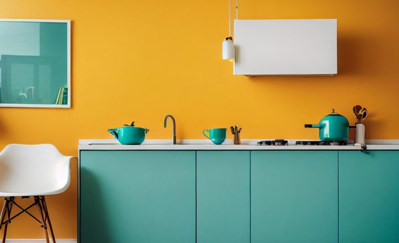

Choosing the perfect cabinet color is more than picking a favorite hue—it’s about harmonizing your kitchen’s design, lighting, and overall style. The right color can enhance your kitchen’s mood, highlight architectural features, and make the space feel inviting. In this guide, we’ll walk you through expert strategies to select a cabinet color that complements your kitchen décor perfectly.
1. Consider Your Kitchen Style
Your kitchen style should guide your cabinet color choice:
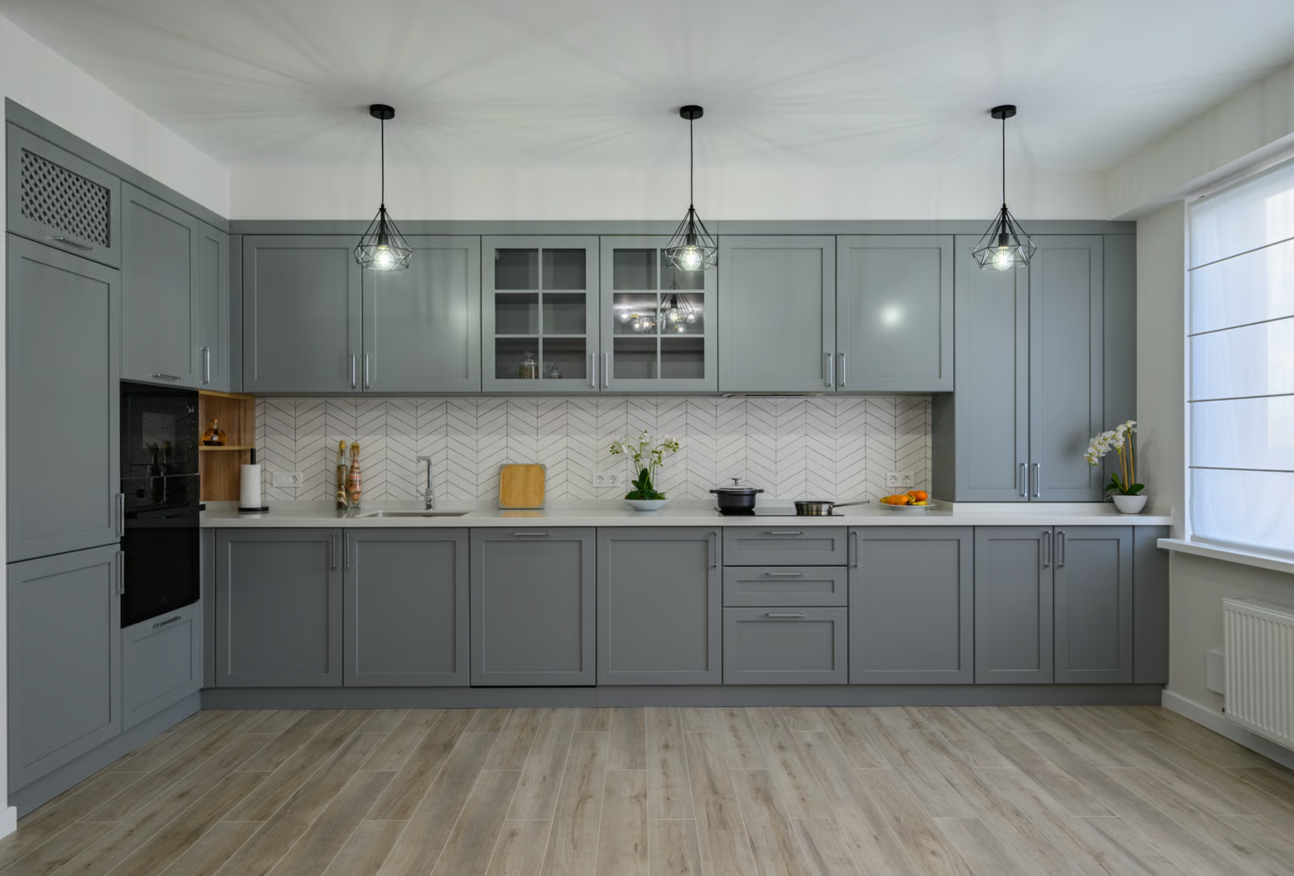
- Modern Kitchens: Neutral shades like gray, white, or black work best. Bold colors like navy or emerald can create a contemporary statement.
- Traditional Kitchens: Warm wood tones, cream, or soft neutrals suit classic designs.
- Rustic/Farmhouse Kitchens: Earthy hues, soft greens, and distressed finishes complement natural wood elements.
- Eclectic or Contemporary: Vibrant colors like teal, mustard, or burgundy can add personality.
Pro Tip: Your cabinet color should reinforce your kitchen’s style, not clash with it.
2. Factor in Lighting
Lighting dramatically affects how color appears:
- Natural Light: Rooms with lots of sunlight can handle darker or bolder colors without feeling cramped.
- Artificial Light: Warm lighting enhances earthy tones, while cool lighting pairs well with gray, blue, or green cabinets.
- Mix of Lights: Consider both day and night lighting to see how colors shift throughout the day.
Pro Tip: Always test color samples in your actual kitchen lighting conditions.
3. Coordinate With Countertops and Backsplash
Cabinet color should harmonize with your countertops and backsplash:
- Neutral Countertops: Allow for bolder cabinet colors.
- Patterned or Colorful Countertops: Choose a complementary or neutral cabinet color to avoid visual overload.
- Backsplash Influence: Your backsplash can either contrast or complement the cabinet color—use it to create balance.
Pro Tip: Hold large paint swatches against your countertops and backsplash to visualize the final look.
4. Balance Bold and Neutral Tones
- If you love bold colors but don’t want them to overwhelm the space, consider two-tone cabinets:
- Bold lower cabinets with neutral upper cabinets.
- Bold island cabinets with neutral perimeter cabinets.
- Neutrals like white, gray, and beige provide a clean canvas for statement pieces.
Pro Tip: Two-tone designs allow you to experiment with bold colors while maintaining visual balance.
5. Consider the Flooring
Cabinet color should complement, not clash with your floor:
- Light floors pair well with dark cabinets for contrast.
- Dark floors often look best with lighter or medium-toned cabinets to keep the kitchen feeling open.
- Matching warm wood floors with similar-tone cabinets can create a seamless, cohesive design.
Pro Tip: Don’t forget rugs or mats—they can subtly influence the perceived color harmony in your kitchen.
6. Understand Color Psychology
Colors affect mood and perception:
- Blues and Greens: Calming, relaxing, and sophisticated.
- Reds and Oranges: Energetic, warm, and inviting.
- Neutrals (Gray, White, Beige): Clean, versatile, timeless.
- Yellow and Gold: Cheerful, bright, and welcoming.
Pro Tip: Consider how you want to feel in your kitchen—your cabinet color can reinforce that mood.
7. Use Paint Samples and Test Panels
- Purchase sample sizes of your top choices.
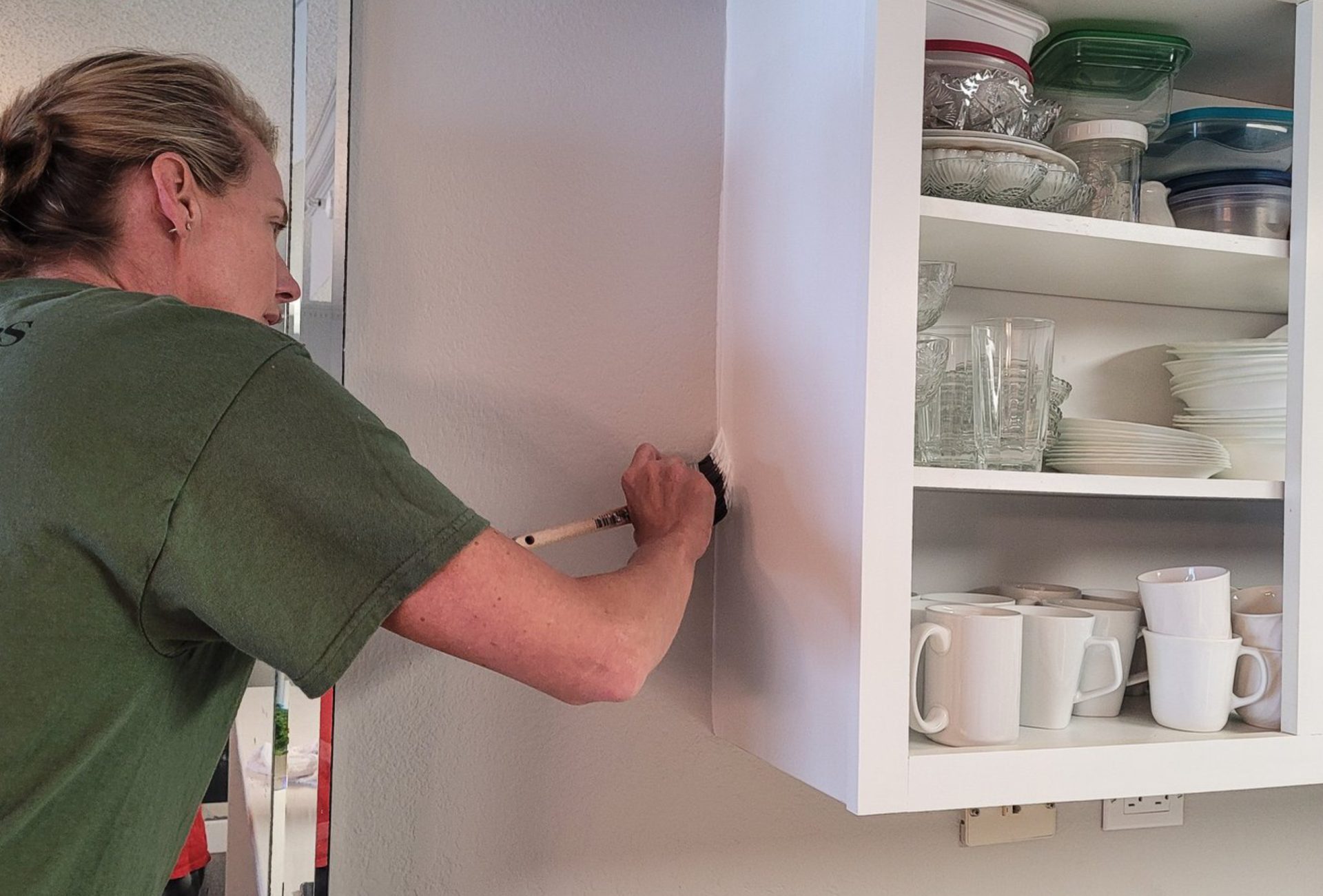
- Apply samples to a cabinet door or a piece of scrap wood.
- Observe them under different lighting conditions and times of day.
Pro Tip: Viewing color samples on large surfaces prevents surprises and ensures satisfaction with the final result.
8. Match or Complement Existing Elements
- Consider hardware, appliances, and décor accents:
- Silver, bronze, or gold hardware can enhance certain cabinet colors.
- Stainless steel appliances pair well with cool tones and neutrals.
- Warm appliances (like copper or brass) complement earthy tones and warm hues.
Pro Tip: Aim for cohesion rather than exact matching—complementary contrasts often look more intentional and designer-like.
9. Consider Future Flexibility
- Choose a color that will age well with changing trends.
- Neutral or muted bold shades allow for easy décor updates without repainting.
- Vibrant accent cabinets can be changed more easily in the future if needed.
Pro Tip: Trendy colors are fun, but classic shades ensure longevity and resale value.
10. Professional Advice for Color Selection
- Professional painters or designers can provide expert recommendations.
- They can create digital mockups to visualize the color in your kitchen.
- Expert guidance helps prevent costly mistakes and ensures your cabinet color enhances your entire space.
Pro Tip: Consulting a professional is especially valuable for bold colors, intricate designs, or large-scale projects.
Conclusion
Picking a cabinet color that matches your kitchen décor involves careful consideration of style, lighting, countertops, flooring, and personal preferences. Balancing bold and neutral tones, testing samples, and understanding color psychology ensures your cabinets elevate the kitchen’s look and feel. For expert guidance and flawless application, Chicagoland Paint Pro provides professional advice to help you select the perfect cabinet color that harmonizes beautifully with your kitchen.