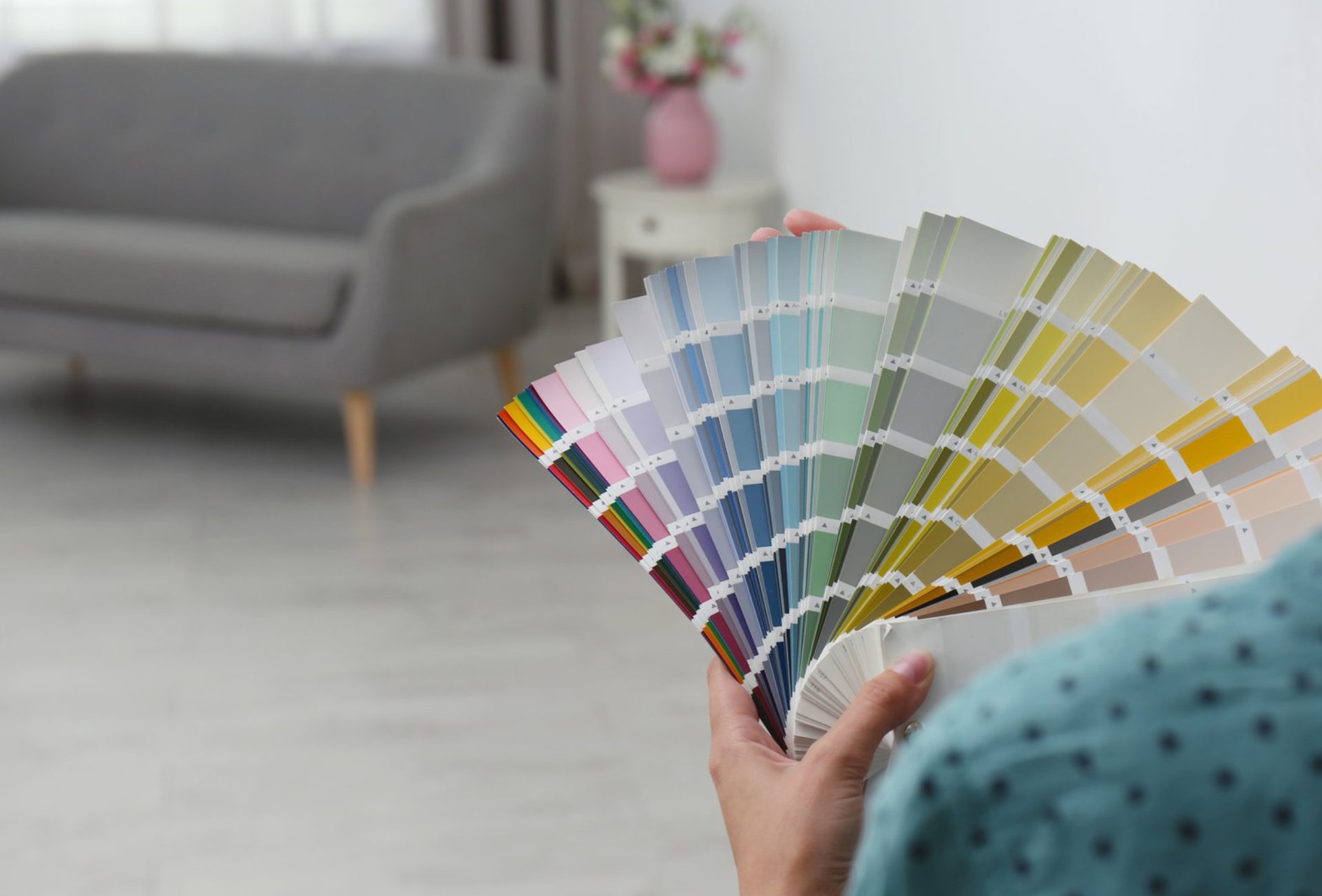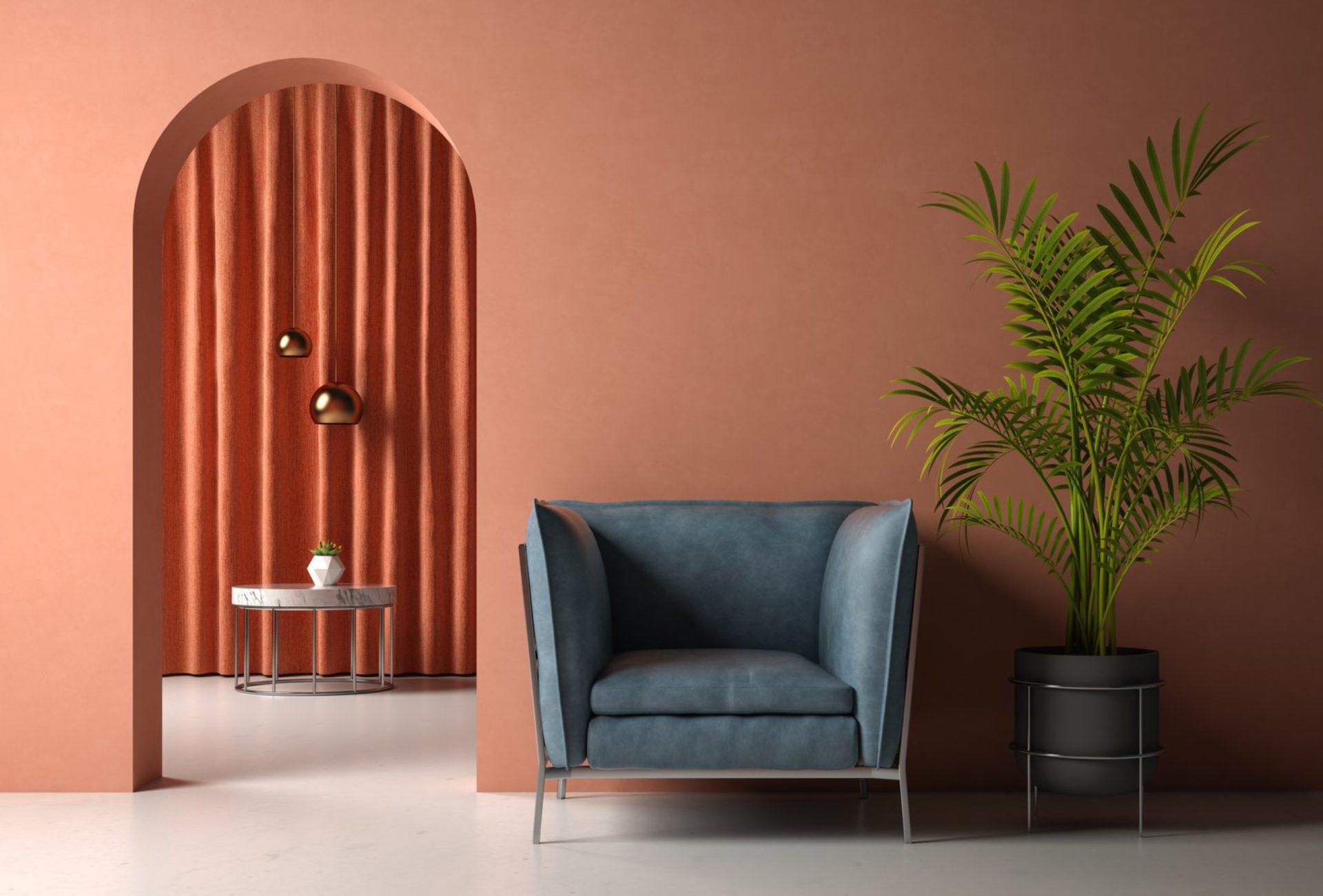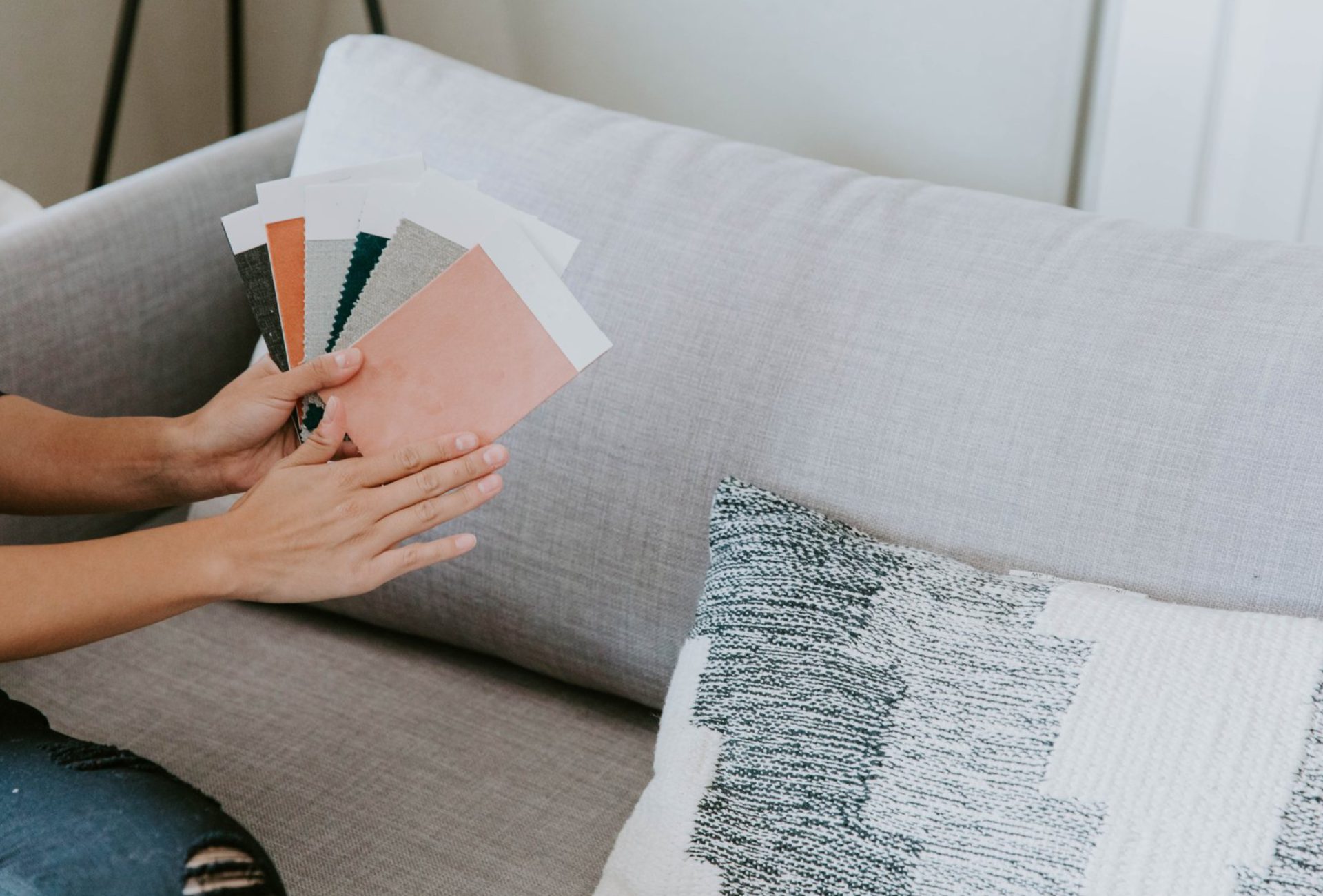




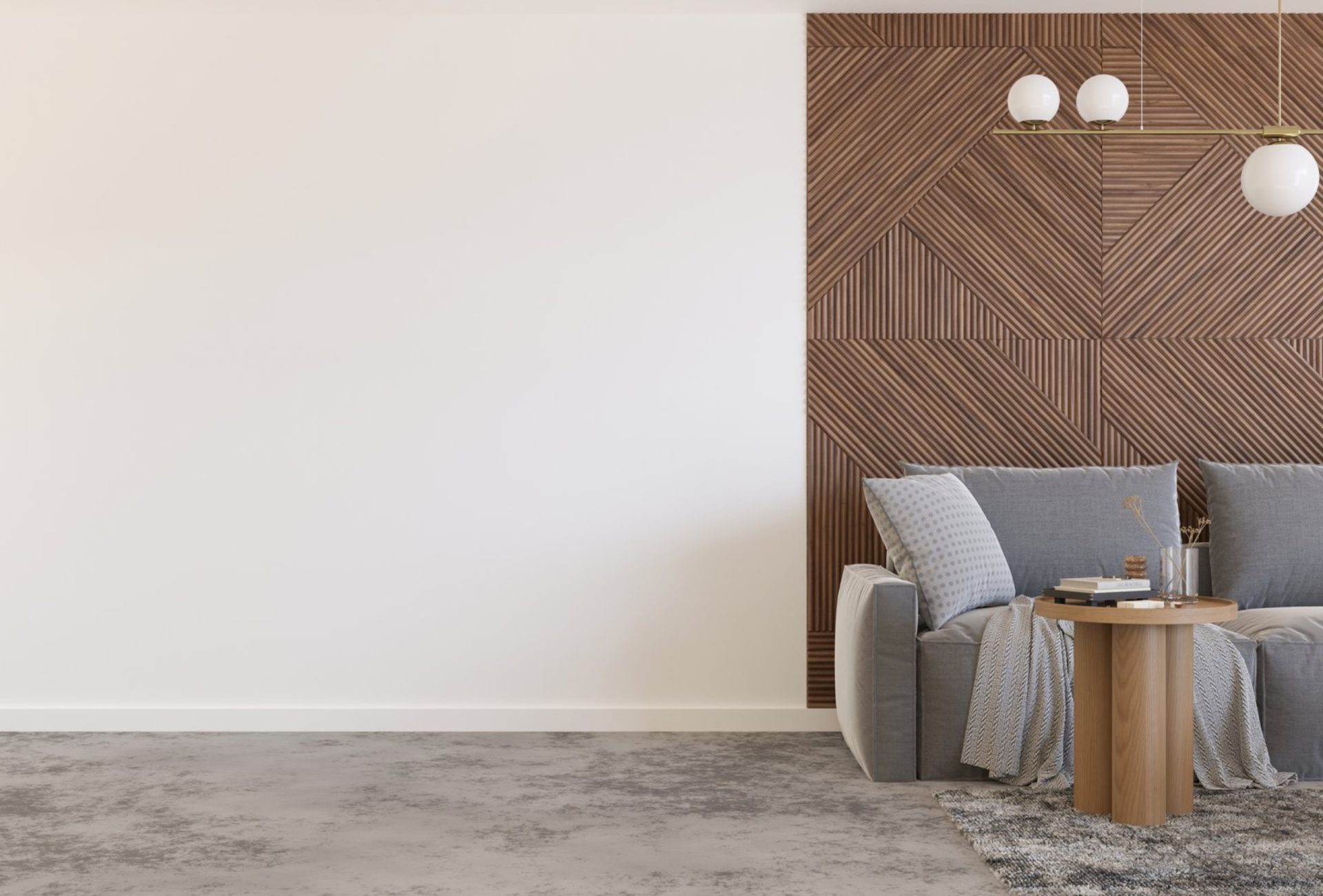
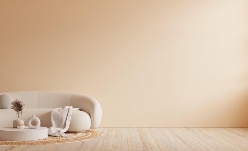

Neutral colors are not only timeless—they’re also powerful tools for creating the illusion of space. Light, soft shades can make rooms feel larger, brighter, and more open, while carefully chosen contrasts add depth and dimension. Whether your goal is to enhance a small living room, bedroom, or kitchen, understanding how to use neutral colors strategically will transform your home into a more inviting and expansive space.
1. Light Neutrals to Open Up Space
- Popular Shades: Soft white, cream, pale beige, and light gray.
- Why It Works: Lighter tones reflect more natural and artificial light, making spaces feel airy and open.
- Best For: Small rooms, hallways, and interiors with limited windows.
Pro Tip: Pair light neutrals with white trim or ceiling to maximize brightness.
2. Monochromatic Palettes for Seamless Flow
- Using variations of the same neutral shade across walls, ceilings, and trim creates a continuous, unbroken look.
- This seamless approach visually expands the room and reduces harsh divisions.
Example: Light gray walls with slightly darker gray furniture and white trim.
Pro Tip: Introduce textures and patterns to prevent the space from feeling flat.
3. Strategic Contrast for Depth
- Combine light neutrals with subtle darker shades to create depth and dimension.
- Dark accent walls or trims can make the room feel taller or longer.
Example: A pale beige room with medium taupe trim or furniture for balance.
Pro Tip: Use contrast sparingly to avoid breaking the room’s openness.
4. Reflective Surfaces to Amplify Space
- Neutrals paired with mirrors, glossy finishes, and glass surfaces can further enhance spatial perception.
- White or light-colored glossy cabinets, countertops, or flooring amplify natural light and create the illusion of more room.
Pro Tip: Avoid overly dark neutrals in small spaces; they can shrink the perceived area.
5. Consistency Between Rooms
- Using a consistent neutral palette throughout connected rooms creates a flow that makes the entire home feel larger.
- Slight variations in tone between rooms can maintain interest without breaking continuity.
Pro Tip: Consider the transition from one room to another—avoid abrupt color changes in small homes.
6. Neutral Accents and Accessories
- Incorporate furniture, rugs, curtains, and décor in soft neutral shades to extend the feeling of openness.
- Natural textures like wood, linen, and stone enhance the modern neutral aesthetic while keeping the space cozy.
Pro Tip: Layer neutrals with subtle pops of color in cushions or wall art for personality without overcrowding.
7. Vertical and Horizontal Techniques
- Vertical: Light neutrals on walls with darker accents on ceilings or vertical features make rooms feel taller.
- Horizontal: Lighter floors with slightly darker walls create a sense of width.
Pro Tip: Match trim, baseboards, and ceilings with your chosen neutral palette to avoid visual fragmentation.
8. Exterior Spaces
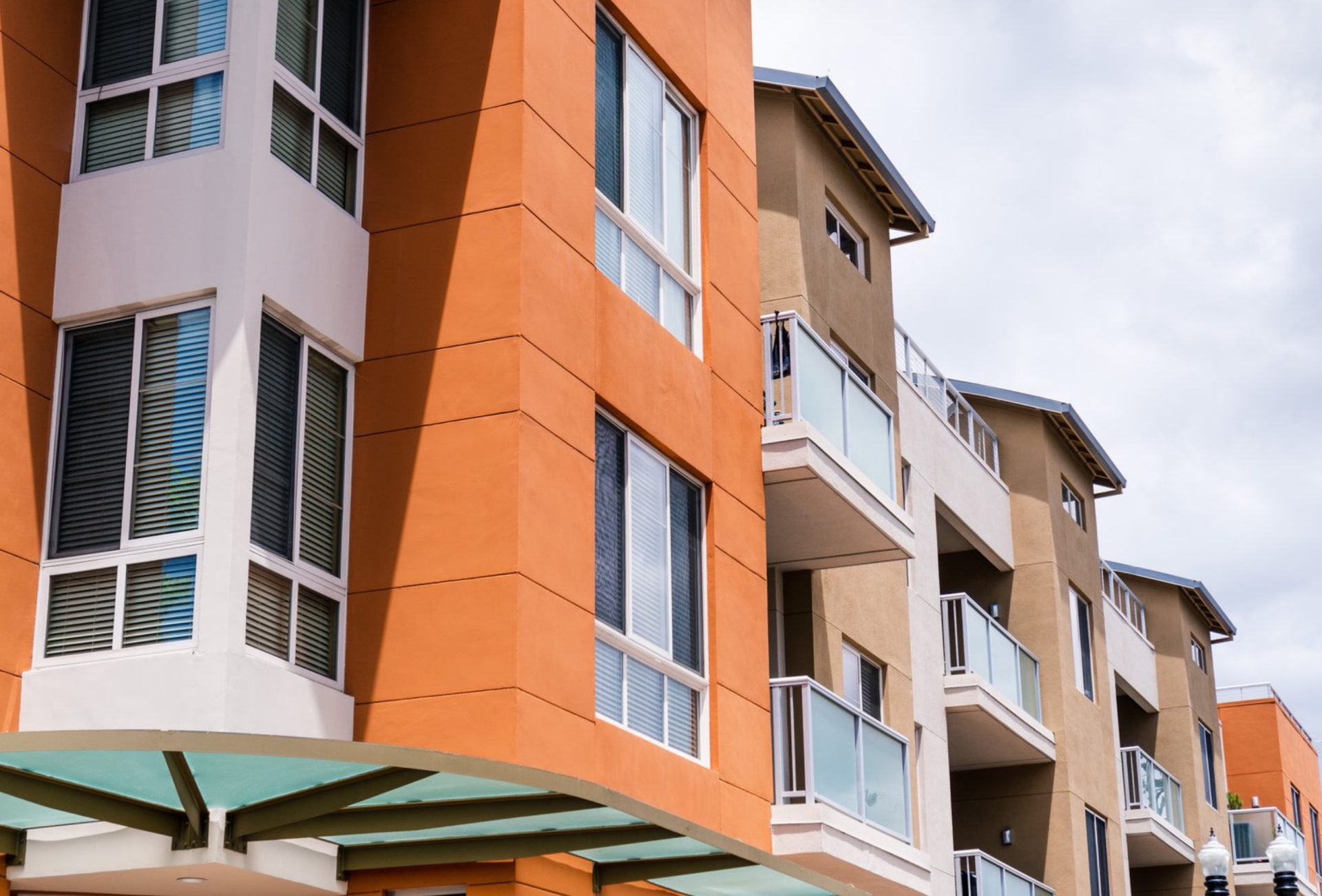
- Neutral tones aren’t just for interiors. Soft beige, off-white, and gray exteriors make homes appear larger and more cohesive.
- Pair with white trim and natural landscaping for a spacious, welcoming curb appeal.
Pro Tip: Light neutral siding combined with reflective windows visually enlarges the home.
9. Benefits of Using Neutral Colors to Expand Space
- Makes small rooms feel larger and more open
- Provides a clean, uncluttered canvas for décor
- Enhances natural light and improves ambiance
- Works with any interior style, from modern to classic
Pro Tip: Neutral palettes increase the perception of space while remaining flexible for design updates.
Conclusion
Using neutral colors effectively can dramatically enhance the perception of space in any home. By combining light shades, monochromatic schemes, subtle contrasts, and reflective surfaces, homeowners can create interiors that feel open, airy, and modern. From walls and furniture to floors and exteriors, neutrals provide both timeless elegance and the illusion of roominess. Chicagoland Paint Pro offers expert painting and color consultation services to help homeowners select neutral palettes that make their spaces look larger, brighter, and more inviting.