




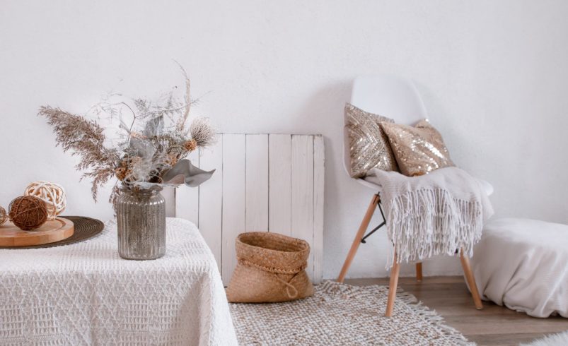

Neutral color schemes have remained a timeless choice for homeowners seeking elegance, versatility, and long-lasting appeal. Whether used in modern, traditional, or transitional homes, neutral tones create a balanced foundation that adapts to changing trends and personal styles. From soft whites to warm beiges and sophisticated grays, neutral palettes offer endless design possibilities for both interiors and exteriors.
1. What Are Neutral Color Schemes?
Neutral colors include shades that are subtle, understated, and easy to pair with other tones. Common neutral shades include:
- White and off-white
- Beige and taupe
- Gray and greige
- Soft browns and creams
Why They Work: Neutral colors create a calm, clean, and cohesive look that suits any design style.
2. Timeless Appeal of Neutral Colors
- Never go out of fashion, making them a safe long-term choice.
- Adapt easily to changing décor trends.
- Appeal to a wide range of tastes, especially for resale value.
Pro Tip: Neutral palettes are ideal if you want a home that feels stylish for years without frequent repainting.
3. Versatility in Design
- Neutral colors act as a blank canvas for furniture, artwork, and décor.
- Easily combine with bold or subtle accent colors.
- Work well in both small apartments and large homes.
Example: A beige living room can be refreshed with colorful cushions, rugs, or wall art.
4. Popular Neutral Color Combinations
- White + Gray: Clean and modern
- Beige + Cream: Warm and inviting
- Greige + White: Balanced and contemporary
- Taupe + Soft Brown: Cozy and elegant
Pro Tip: Mixing different neutral tones adds depth while maintaining simplicity.
5. Neutral Colors for Interiors
- Living Rooms: Soft gray or beige walls create a relaxing atmosphere.
- Bedrooms: Warm neutrals promote comfort and calmness.
- Kitchens: White and cream tones create a fresh, clean look.
- Bathrooms: Light neutrals enhance brightness and cleanliness.
Pro Tip: Use layered neutrals to avoid a flat or dull appearance.
6. Neutral Colors for Exteriors
- Beige, gray, and off-white are popular for siding.
- White or dark trim adds contrast and highlights features.
- Neutral exteriors blend well with landscaping and surroundings.
Pro Tip: Choose weather-resistant paint to maintain the color’s beauty over time.
7. Creating Depth with Neutrals
- Combine light and dark shades within the same palette.
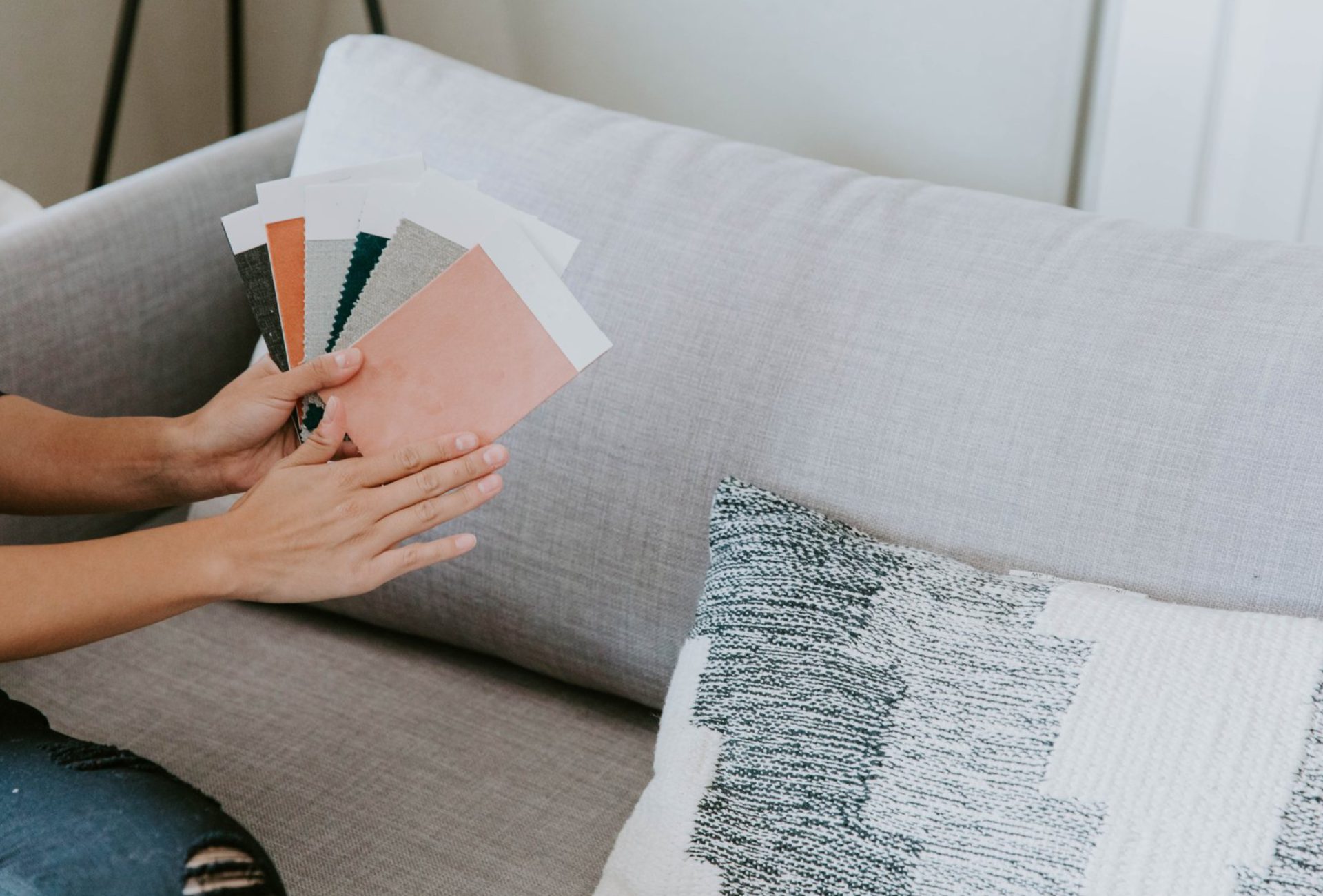
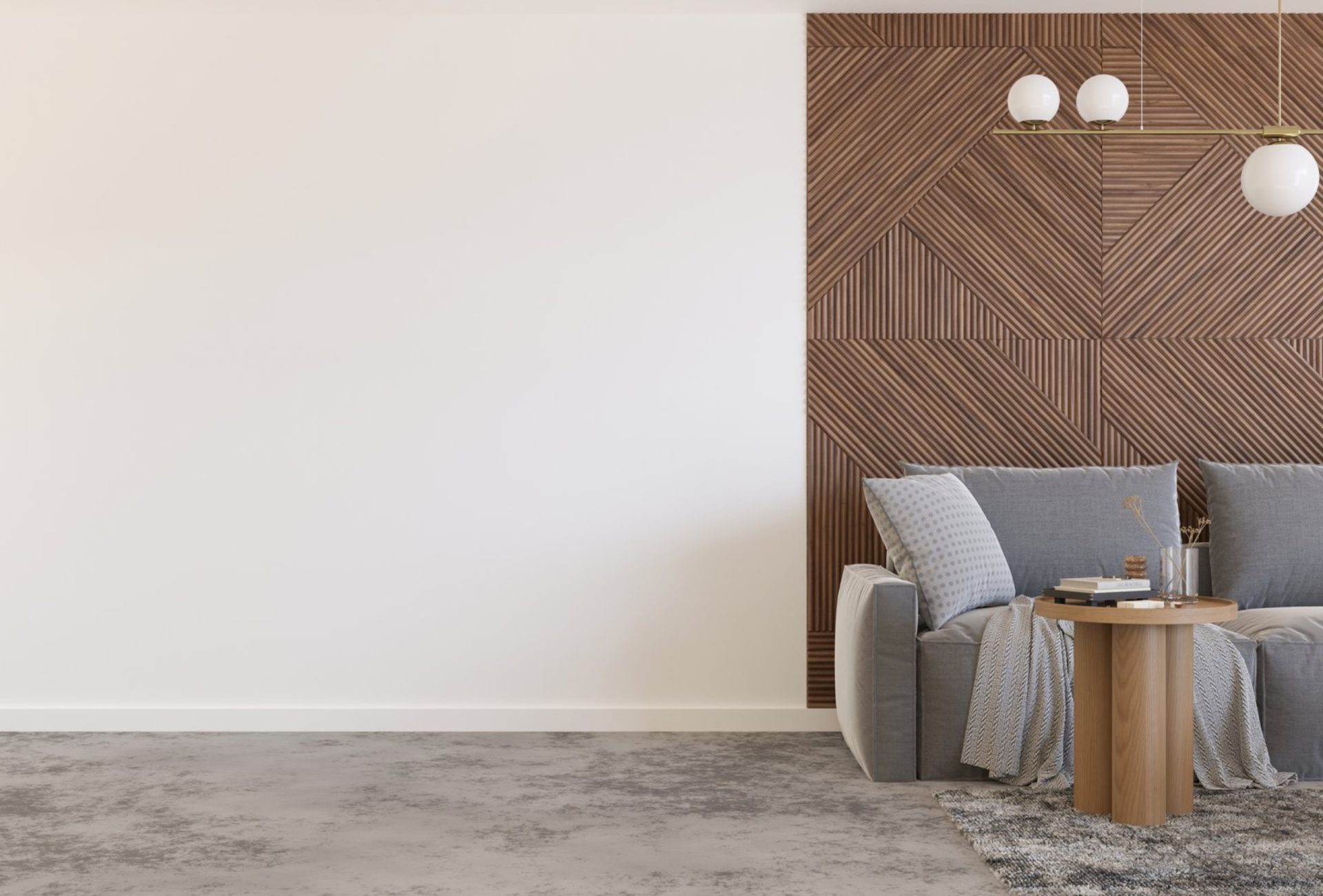
- Use textures like wood, metal, or fabric to add dimension.
- Incorporate patterns subtly for visual interest.
Pro Tip: Layering textures is key to making neutral spaces feel rich and inviting.
8. Neutral Colors and Lighting
- Natural light enhances the warmth or coolness of neutral tones.
- Artificial lighting can shift how colors appear.
- Test colors in different lighting conditions before finalizing.
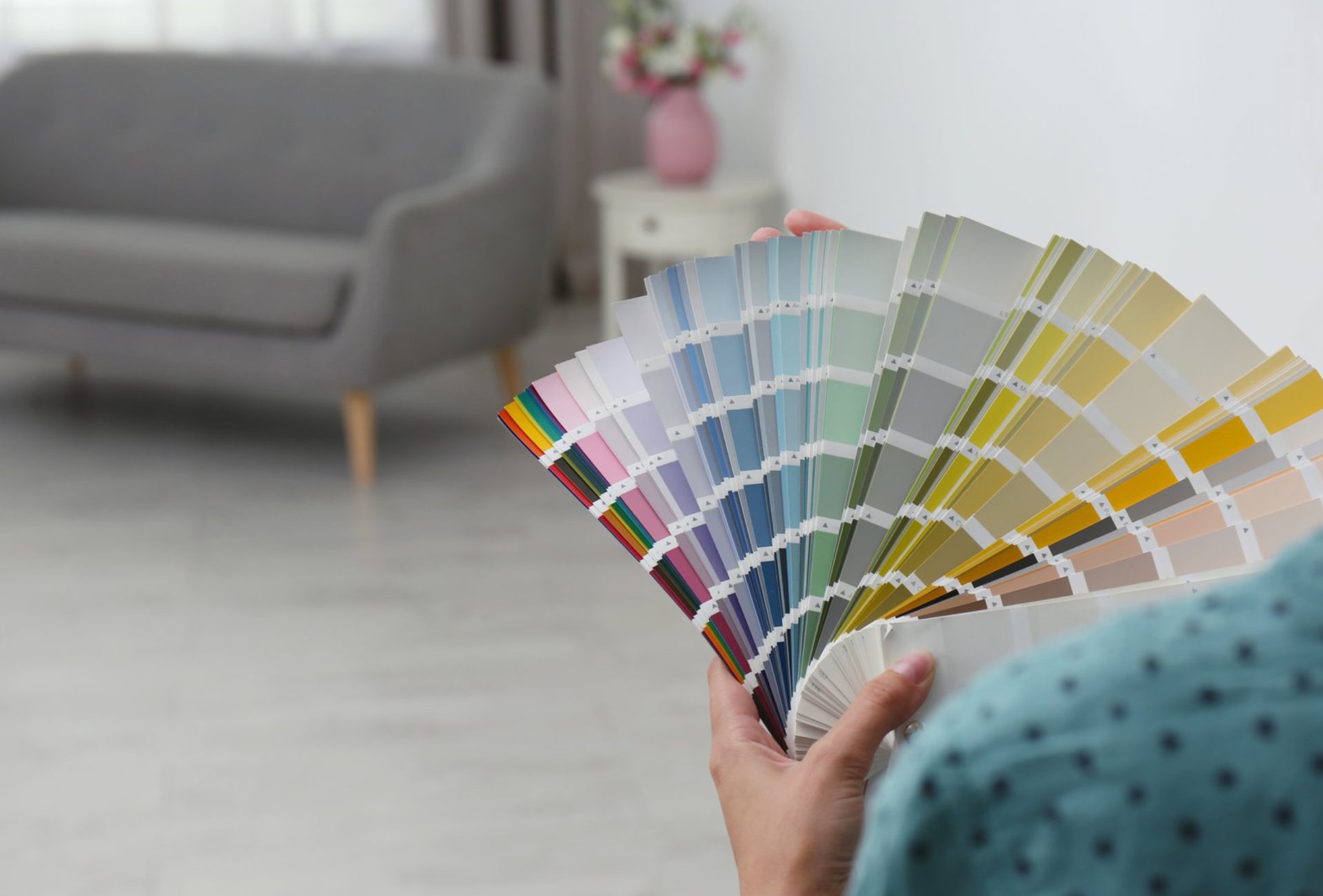
Pro Tip: Always sample paint on walls to see how it looks throughout the day.
9. Benefits of Neutral Color Schemes
- Timeless and elegant appearance
- Easy to update with new décor
- Enhances property value and buyer appeal
- Creates calm and inviting environments
Pro Tip: Neutral colors are a smart investment for both comfort and resale.
Conclusion
Neutral color schemes remain a top choice for homeowners who value timeless design, versatility, and sophistication. By combining shades like white, beige, gray, and taupe, you can create a space that feels both modern and classic. Whether updating interiors or exteriors, neutral palettes provide a foundation that evolves with your style. Chicagoland Paint Pro offers expert painting and color consultation services to help you achieve the perfect neutral look that enhances your home’s beauty and value.