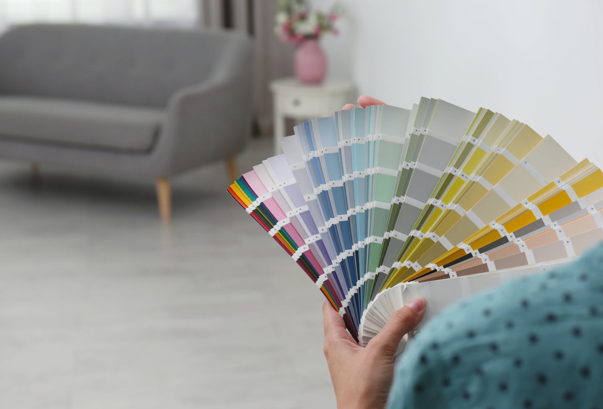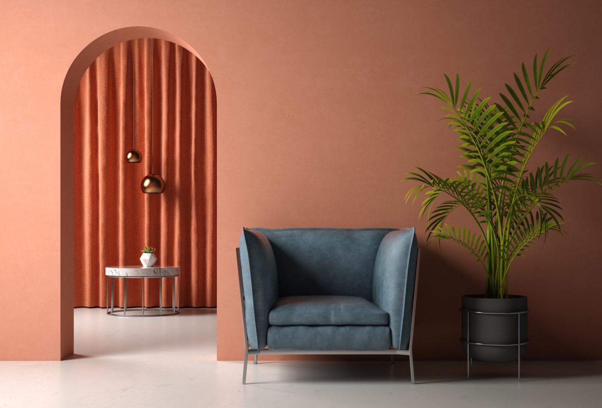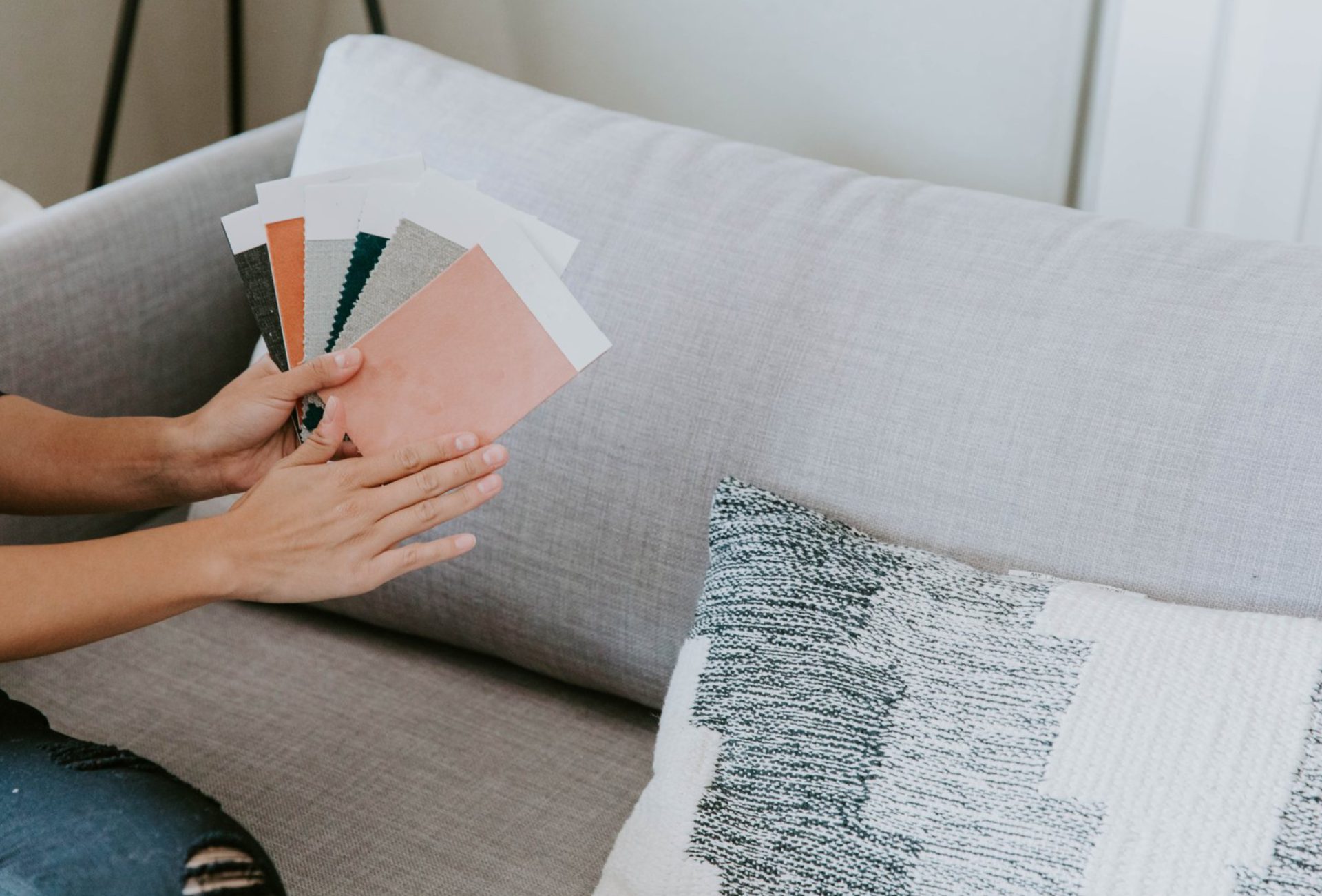





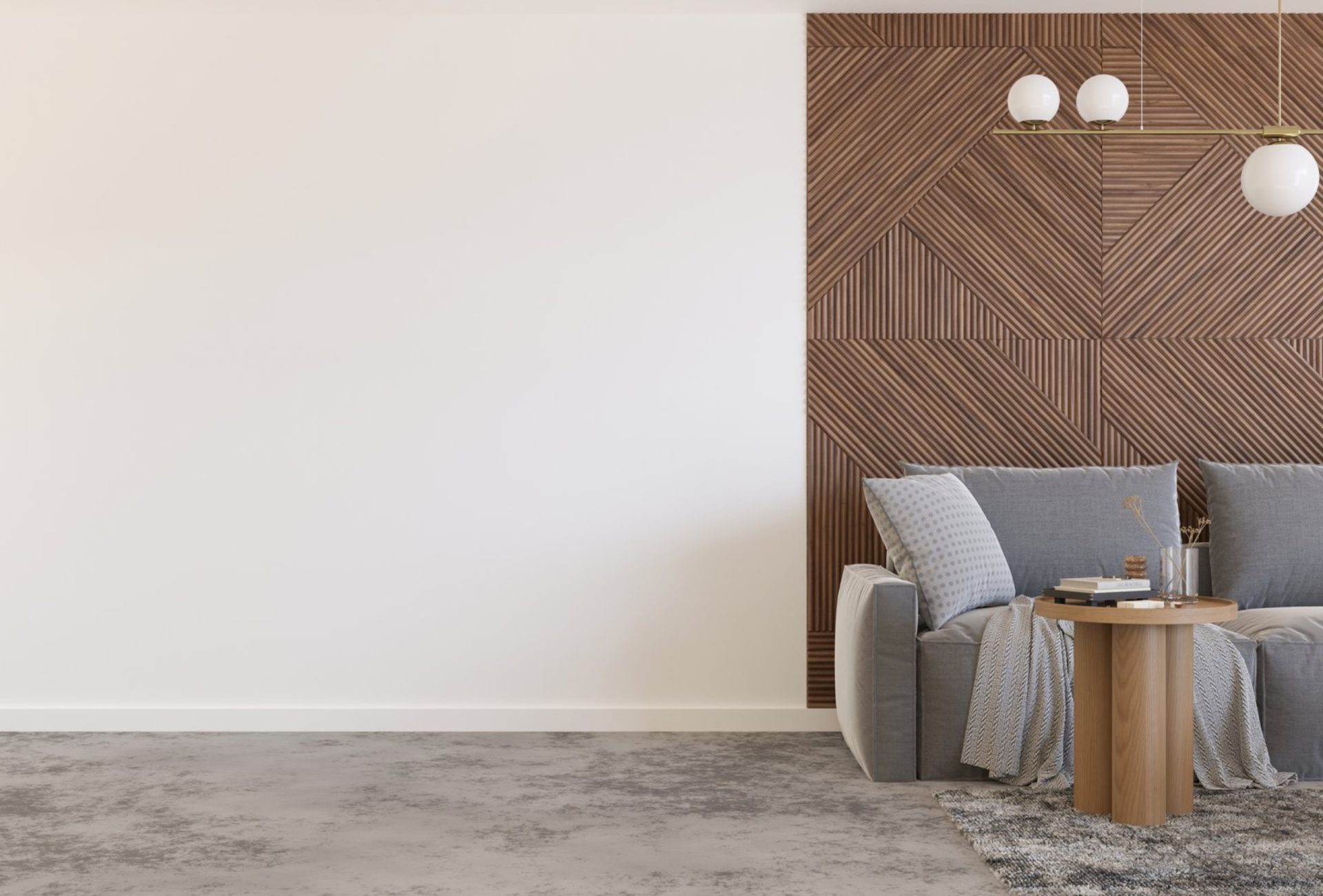
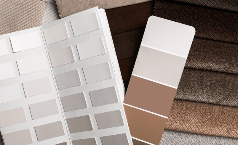

Neutral colors are one of the most versatile tools in home design. They provide a timeless, clean, and cohesive look that works in every room. From cozy living rooms to serene bedrooms and functional kitchens, choosing the right neutral shades can enhance your home’s aesthetic, make spaces feel larger, and complement any décor style.
1. Living Room
- Recommended Colors: Soft gray, beige, greige, or off-white.
- Why It Works: Creates a calm and inviting environment suitable for relaxing, entertaining, or reading.
- Tips:
- Add texture through rugs, curtains, and furniture to avoid a flat appearance.
- Use darker neutral accents, like charcoal pillows or taupe throws, for depth.
Pro Tip: Pair neutral walls with bold accent furniture for a modern and balanced living room.
2. Bedroom
- Recommended Colors: Warm taupe, soft cream, muted gray, or blush neutrals.
- Why It Works: Neutral shades promote relaxation, comfort, and restful sleep.
- Tips:
- Layer bedding, pillows, and curtains in varying neutral shades.
- Incorporate soft lighting to highlight the warmth of neutral tones.
Pro Tip: Neutral bedrooms create a versatile backdrop, allowing you to easily refresh with seasonal décor.
3. Kitchen
- Recommended Colors: White, off-white, light gray, or greige cabinets and walls.
- Why It Works: Light neutrals make kitchens appear larger, brighter, and cleaner.
- Tips:
- Combine neutral cabinetry with darker countertops for contrast.
- Add natural wood accents for warmth and texture.
Pro Tip: Neutrals provide flexibility—changing wall art, backsplashes, or accessories won’t clash with permanent surfaces.
4. Bathrooms
- Recommended Colors: Soft whites, cream, light gray, or pale beige.
- Why It Works: Neutral tones enhance brightness and create a spa-like atmosphere.
- Tips:
- Pair with reflective surfaces like mirrors, glass, or glossy tiles.
- Use metallic accents for a modern, polished feel.
Pro Tip: Neutral bathrooms are timeless and easy to refresh with colorful towels or décor.
5. Home Office
- Recommended Colors: Cool grays, warm taupes, or soft whites.
- Why It Works: Neutral shades minimize distractions and provide a professional, clean workspace.
- Tips:
- Add subtle accent colors in décor or office accessories for inspiration.
- Use layered lighting to complement neutral walls and maintain focus.
Pro Tip: Neutral walls help promote productivity while allowing flexibility in furniture and accessory choices.
6. Dining Room
- Recommended Colors: Warm beige, taupe, greige, or muted gray.
- Why It Works: Creates an elegant, welcoming space for family meals and entertaining guests.
- Tips:
- Highlight neutral walls with bold artwork or statement lighting.
- Use darker chairs or wooden tables to anchor the space.
Pro Tip: Neutral dining rooms provide a sophisticated backdrop that suits seasonal décor changes.
7. Hallways & Entryways
- Recommended Colors: Off-white, soft gray, or beige.
- Why It Works: Light neutral tones make small or narrow spaces feel open and inviting.
- Tips:
- Use contrasting trim or moldings to add depth.
- Incorporate reflective surfaces or mirrors to enhance the feeling of space.
Pro Tip: Hallways with neutral palettes provide continuity between rooms and improve overall flow.
8. Exterior Spaces
- Recommended Colors: Soft white, gray, beige, or greige for siding; white or black trim for contrast.
- Why It Works: Neutral exteriors are timeless, enhance curb appeal, and complement landscaping.
- Tips:
- Highlight architectural features with slightly darker trim or accent colors.
- Combine with natural textures like stone, wood, or brick for visual interest.
Pro Tip: Neutral exteriors paired with bold doors or shutters make homes stand out without being overpowering.
Conclusion
Neutral colors are the ultimate solution for creating versatile, timeless, and cohesive spaces in every room of your home. From soft grays and warm taupes to crisp whites and greiges, these shades enhance comfort, elegance, and functionality. By carefully selecting neutral tones, homeowners can achieve modern, spacious, and inviting interiors while maintaining flexibility for décor changes. Chicagoland Paint Pro provides expert painting and color consultation services to help you select the perfect neutral palette for every room, ensuring a harmonious and visually stunning home.