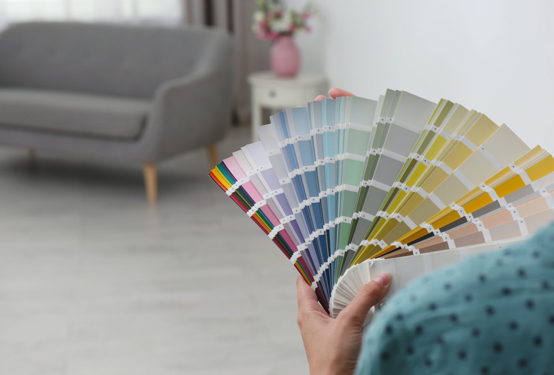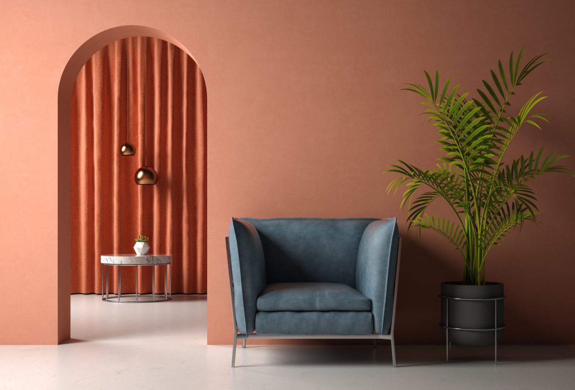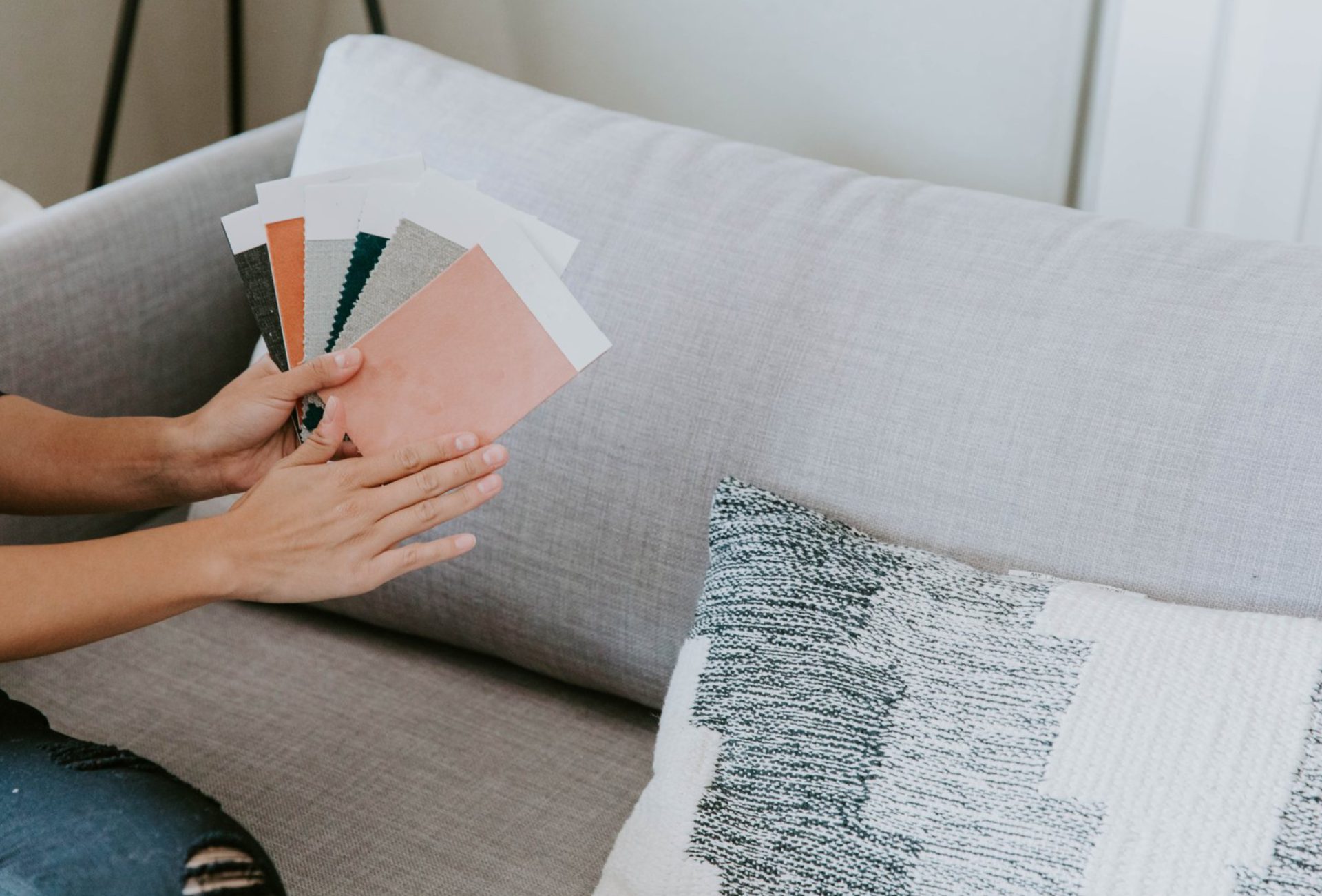





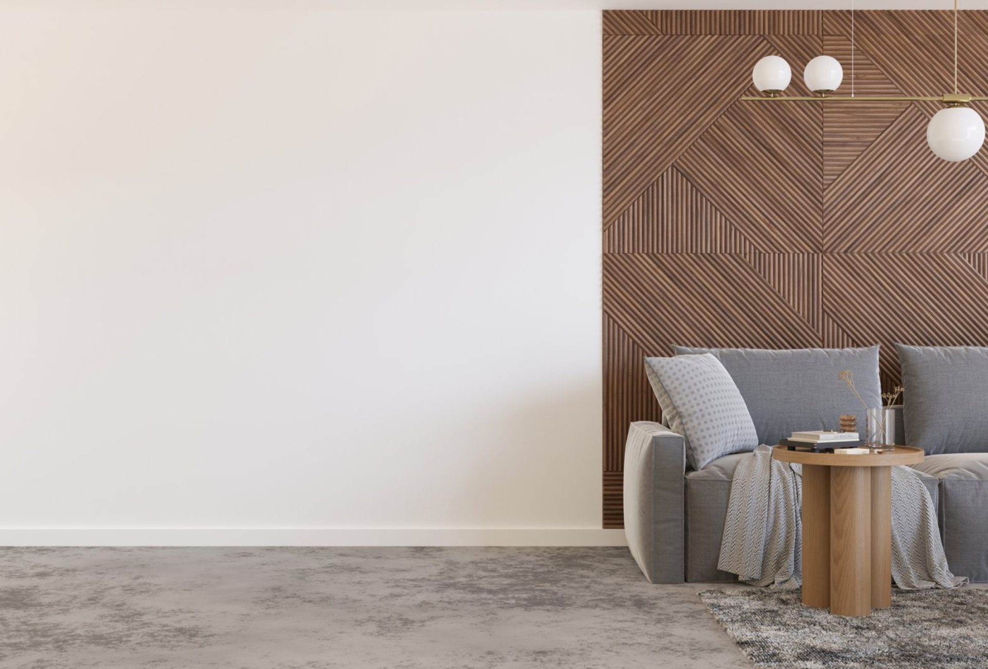
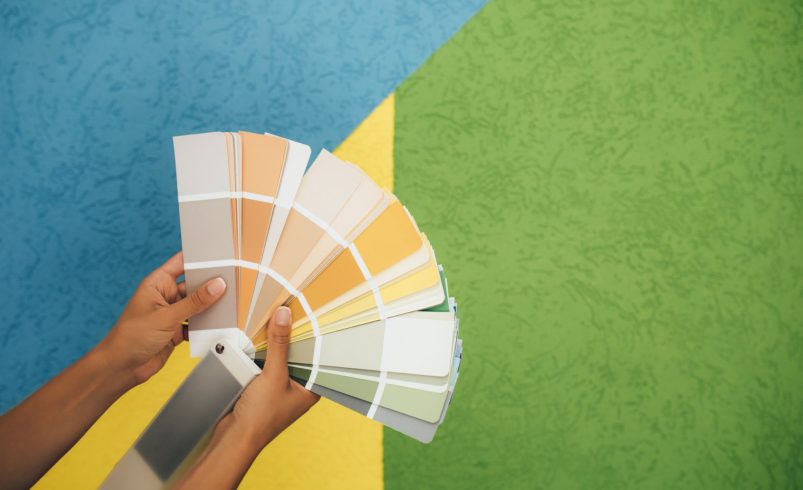

The right paint finish can dramatically enhance the beauty of your chosen color. While selecting the perfect hue is essential, pairing it with the correct finish ensures your walls, trim, and cabinetry stand out and maintain their vibrancy over time. From soft matte tones to glossy accents, understanding how finishes affect color perception helps create a polished, visually stunning home.
1. How Finish Influences Color Perception
- Matte / Flat:
- Absorbs light, giving colors a deep, soft appearance.
- Ideal for muted, sophisticated tones where subtlety is desired.
- Tip: Use on bedrooms or living rooms to make warm or neutral shades feel cozy.
- Eggshell & Satin:
- Slight sheen reflects light, enhancing depth without overwhelming the space.
- Ideal for mid-tones and pastels, giving them vibrancy while maintaining elegance.
- Tip: Perfect for high-traffic areas like hallways, kitchens, and dining rooms.
- Semi-Gloss & Gloss:
- Reflective surfaces make colors appear brighter and more intense.
- Works well for bold colors or accent walls to create drama and visual interest.
- Tip: Use on doors, trim, and cabinetry to make colors “pop” and highlight architectural details.
2. Pairing Finish With Room Lighting
- Natural Light: Glossy and satin finishes reflect sunlight, making colors lively and eye-catching.
- Artificial Light: Matte finishes prevent glare, keeping colors subtle and balanced.
- Layered Lighting: Combining ceiling lights, task lights, and accent lighting ensures your paint colors look their best all day.
Pro Tip: Test your color in the selected finish at different times of the day to see its true effect.
3. Highlighting Architectural Features
- Use glossy or semi-gloss finishes on trim, crown molding, or wainscoting to make colors stand out.
- Matte walls combined with shiny accents create depth and visual appeal.
- Tip: Accent walls painted in a higher-sheen finish instantly draw attention and energize a space.
4. Enhancing Bold and Neutral Colors
- Bold Colors: High-sheen finishes amplify the intensity of reds, blues, and greens.
- Neutrals: Matte or eggshell finishes soften shades like beige, gray, and taupe while maintaining elegance.
- Tip: Pair bold accents with softer surrounding colors in complementary finishes to maintain balance.
5. Paint Finish and Surface Preparation
- Smooth, properly primed surfaces allow finishes to reflect light evenly.
- Textured walls or imperfections are better suited to matte or eggshell finishes to avoid highlighting flaws.
- Tip: Professional prep ensures your color looks consistent and vibrant across every wall.
6. Chicago Homes: Maximizing Color Pop
- Exterior Walls: Glossy finishes resist weather while intensifying color for curb appeal.
- Interior Walls: Satin and semi-gloss finishes handle Chicago’s seasonal lighting, keeping colors lively.
- Trim and Doors: Use semi-gloss or gloss to make bold choices stand out against softer walls.
Pro Tip: A professional painter ensures finishes are applied evenly for the best visual impact.
7. Final Tips for Making Colors Pop
- Test finishes with paint samples in your room before committing.
- Combine finishes strategically: matte walls, satin trim, and glossy accents.
- Consider lighting, room size, and furniture to enhance the overall effect.
Conclusion
The right paint finish can transform a color from flat to vibrant, subtle to dramatic. By considering room lighting, surface preparation, and the interplay of finishes, you can make your walls, trim, and cabinetry visually stunning. Chicagoland Paint Pro provides expert guidance and professional painting services to help Chicago homeowners select finishes that bring every color to life, ensuring long-lasting beauty and a home that truly pops.