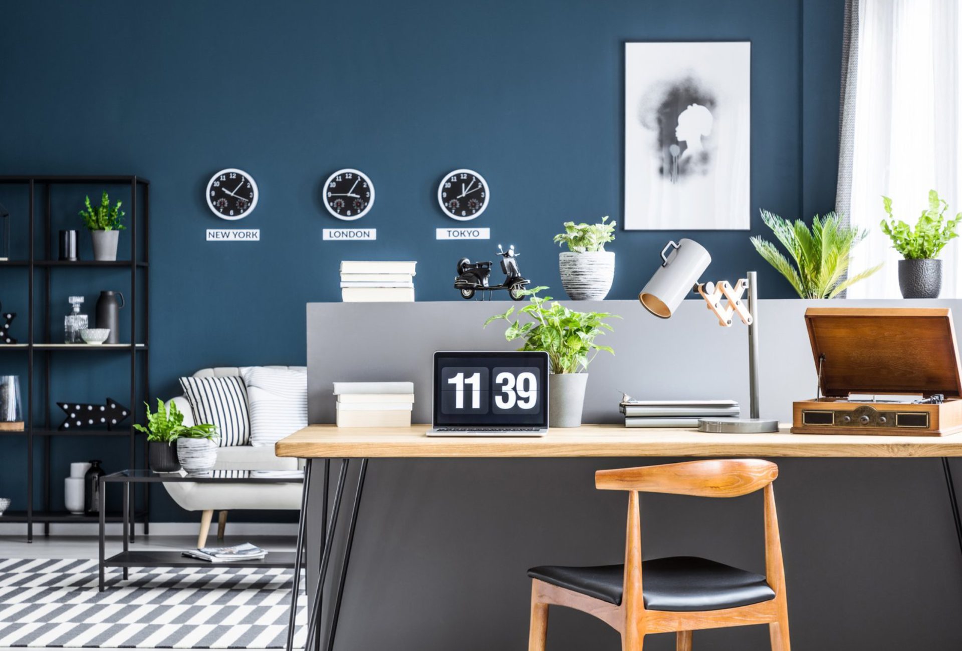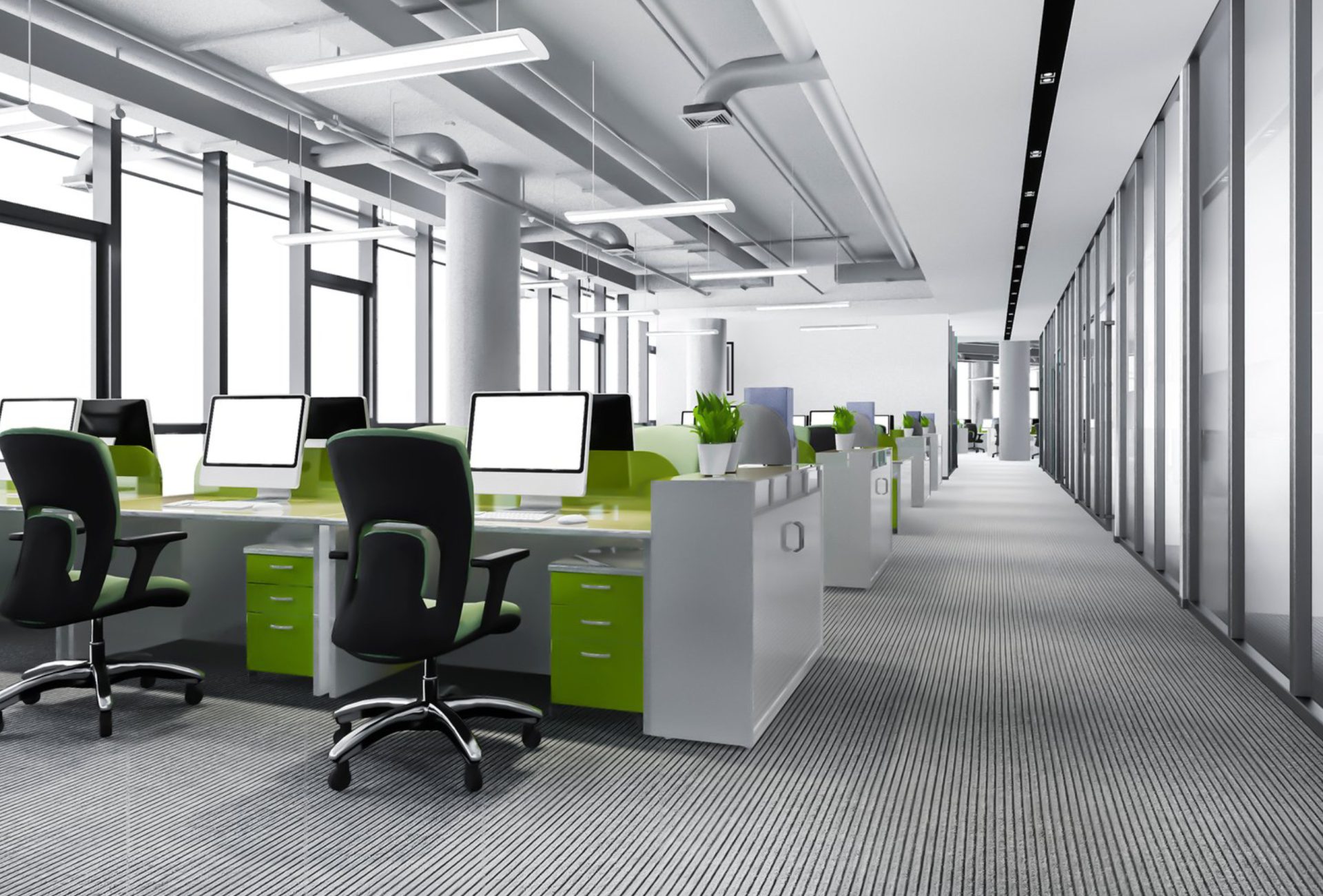





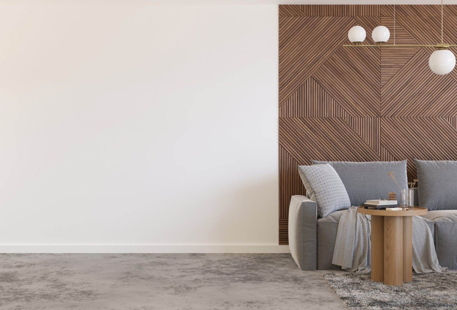


Selecting the right colors for modern office spaces is more than a design choice—it directly affects productivity, creativity, and employee satisfaction. Color influences mood, focus, and the overall perception of a workspace. For commercial painting projects, careful planning ensures that the office is both stylish and functional.
This guide explores how to choose colors that enhance modern office environments while maintaining a professional look.
1. Understand the Psychology of Color
- Blue: Encourages focus, calmness, and productivity; ideal for analytical and detail-oriented tasks.
- Green: Reduces eye strain and fosters a sense of balance and tranquility.
- Yellow: Inspires creativity, energy, and optimism, especially in collaborative areas.
- Gray: Modern, neutral backdrop that pairs well with accents; conveys professionalism.
- White: Brightens spaces, promotes cleanliness, and makes rooms appear larger.
Chicagoland Paint Pro Tip: Match color choices with the function of each office area for maximum impact.
2. Use Accent Walls to Define Spaces
- Collaborative Areas: Bold colors like orange, teal, or chartreuse energize team areas.
- Private Workspaces: Muted tones like soft gray, beige, or pale blue support focus.
- Reception Areas: Create a welcoming atmosphere with sophisticated neutrals and a statement accent wall.
- Meeting Rooms: Darker, muted tones can create a professional, distraction-free environment.
3. Coordinate With Modern Office Design Elements
- Furniture and Decor: Choose wall colors that complement office furniture, flooring, and artwork.
- Open Layouts: Use lighter, airy colors to prevent the space from feeling overwhelming.
- Glass and Metal Accents: Cool tones like gray, blue, and white work well with metal frames and glass partitions.
- Textures and Finishes: Matte walls reduce glare, while semi-gloss trims provide a polished, clean look.
4. Consider Lighting When Selecting Colors
- Natural Light: Colors appear brighter and warmer in sunlight; test paint swatches near windows.
- Artificial Light: Warm lighting can make cool colors feel muted, and cool lighting can enhance blues and grays.
- Consistency Across Floors: Ensure uniformity if multiple floors have the same color scheme to maintain a cohesive aesthetic.
5. Durable Paints for Commercial Use
- High-Traffic Areas: Hallways, lobbies, and kitchens require washable, stain-resistant paints.
- Finish Recommendations:
- Eggshell/Satin: Durable, easy to clean, and ideal for most walls.
- Semi-Gloss: Perfect for doors, trim, and high-touch surfaces.
- Low VOC Paints: Improve indoor air quality and create a safer, healthier workspace.
6. Tips for a Cohesive Modern Office Palette
- Neutral Base, Bold Accents: Keep walls neutral and use accent walls, furniture, or accessories to inject color.
- Consistency Across Spaces: Avoid using too many different colors that disrupt flow.
- Color Flow: Ensure transition colors are harmonious between connected spaces.
- Branding: Subtly incorporate company colors to enhance corporate identity without overwhelming the design.
7. Common Mistakes to Avoid
- Choosing colors based solely on trends without considering functionality
- Ignoring how lighting affects wall colors
- Using dark colors in small spaces, making them feel cramped
- Painting large areas with bold colors that fatigue employees
- Skipping surface prep or using low-quality paint, reducing longevity
8. Final Thoughts
Choosing the right colors for modern office spaces enhances productivity, fosters creativity, and reflects a professional image. By combining an understanding of color psychology, strategic accent walls, coordination with design elements, and durable commercial paints, businesses can create workspaces that are both stylish and functional.
Thoughtful color selection paired with professional painting techniques ensures a lasting, visually appealing environment that supports employee well-being and leaves a positive impression on clients and visitors.