





The colors in your retail store do more than enhance aesthetics—they influence customer behavior, perception, and even sales. Strategic use of paint can attract shoppers, guide them through your store, and create an environment that encourages purchasing.
This guide explores how to select paint colors that maximize retail success while maintaining a stylish and welcoming atmosphere.
1. Understand the Psychology of Color in Retail
- Red: Creates urgency, draws attention, and stimulates appetite—ideal for clearance sections or food retailers.
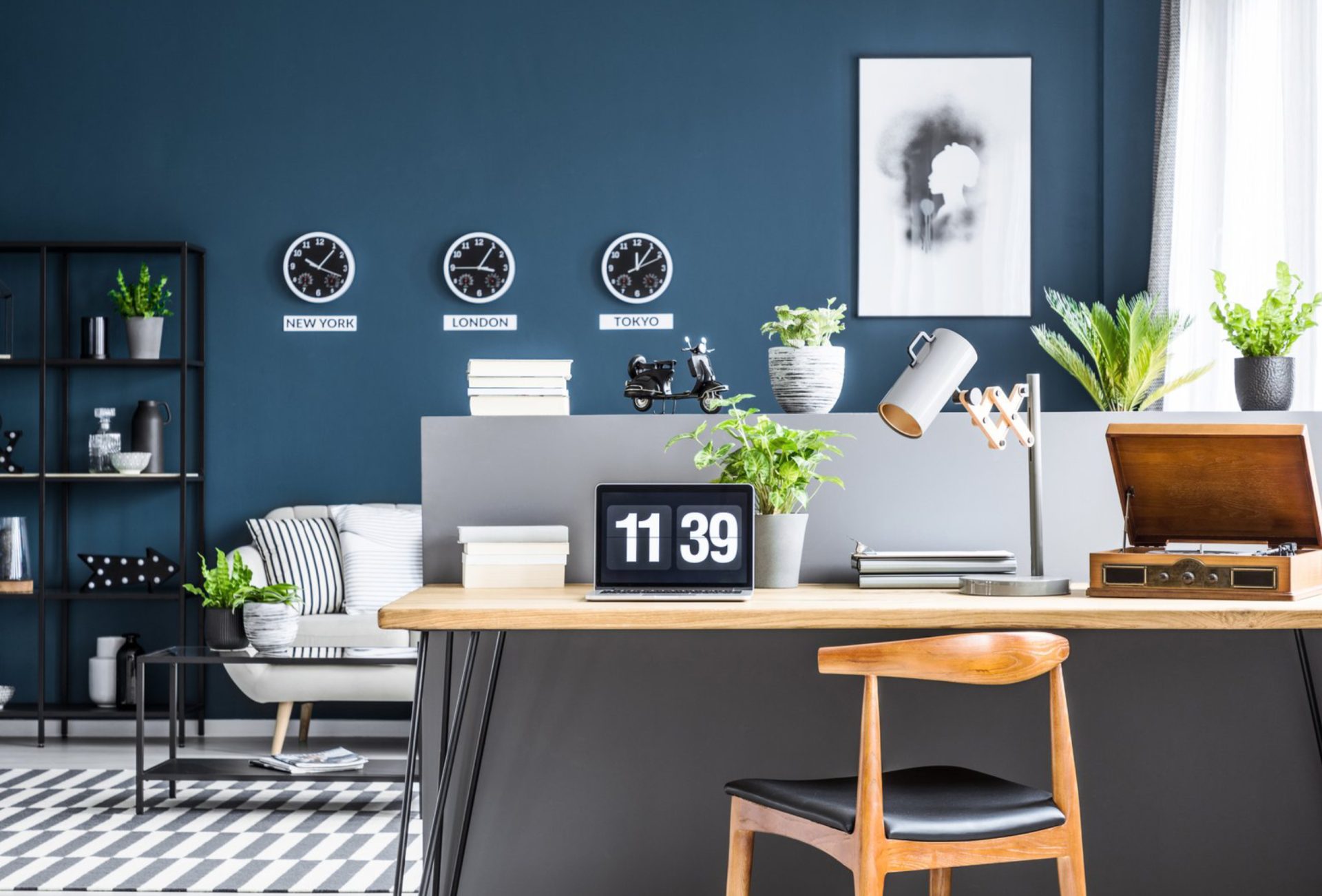
- Blue: Promotes trust, calmness, and a sense of security; works well in professional or high-end stores.
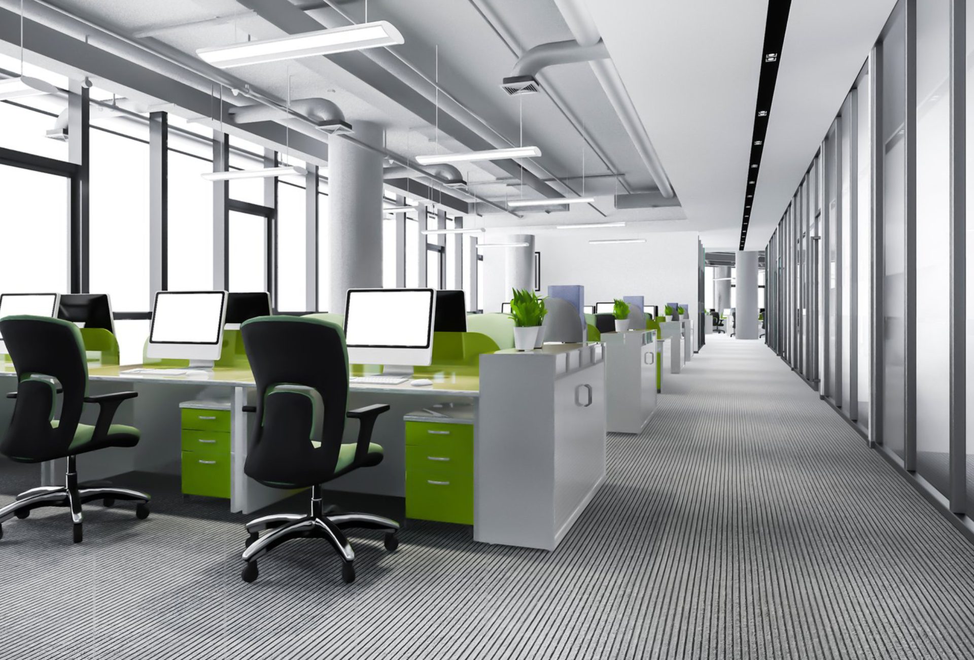
- Green: Evokes freshness, sustainability, and relaxation; perfect for eco-friendly or wellness-oriented stores.
- Yellow: Conveys optimism and energy, attracting attention to displays or promotional areas.
- Neutral Tones: White, gray, and beige create clean, versatile backdrops for products, signage, and displays.
Chicagoland Paint Pro Tip: Combine colors strategically based on your product type, target audience, and store layout.
2. Use Accent Walls and Focal Points
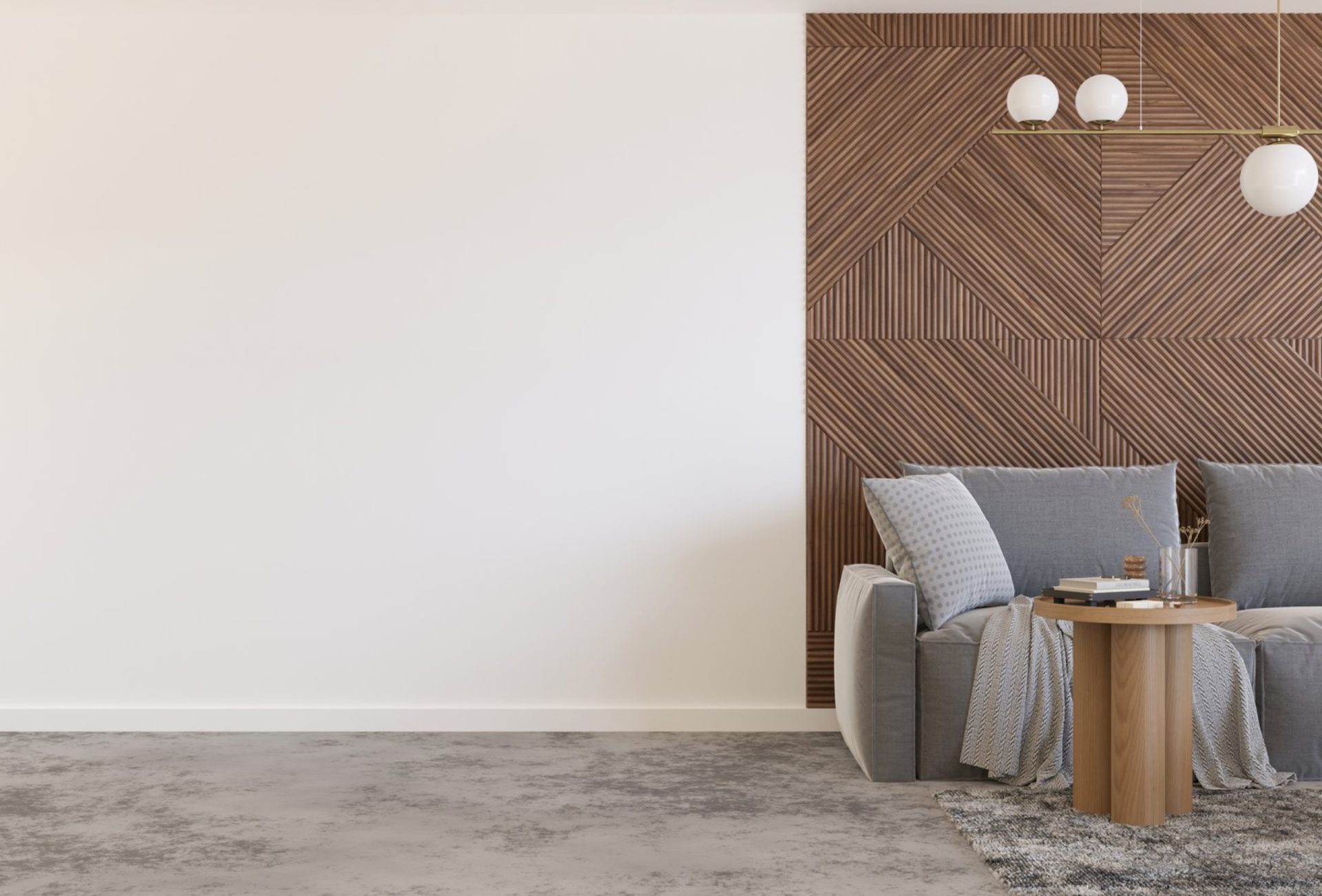
- Feature Walls: Highlight new arrivals, special promotions, or brand-centric areas.
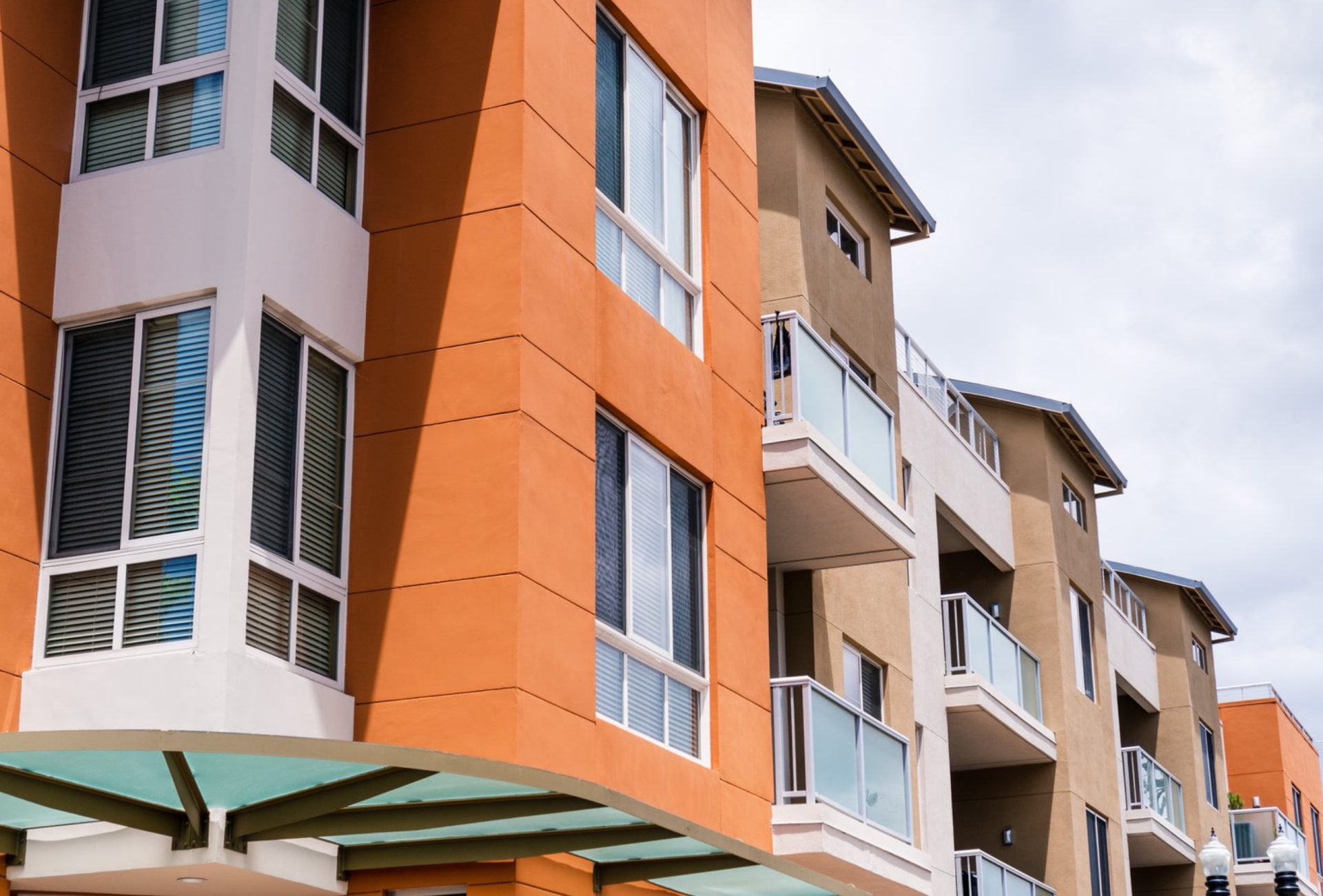
- Contrasting Colors: Draw customers’ attention to focal points without overwhelming the space.
- Balance: Use bold colors sparingly to maintain a clean, professional look.
3. Consider the Store Layout
- Open Floor Plans: Light, airy colors make spaces feel larger and more inviting.
- Small Retail Spaces: Bright neutrals and strategic accent walls can prevent a cramped feeling.
- Lighting: Test paint colors under natural and artificial light; lighting can dramatically alter appearance.
4. High-Quality Paints for Retail Spaces
- Durability: Retail spaces experience heavy foot traffic; use washable, stain-resistant paints.
- Finishes:
- Satin/Eggshell: Walls that need easy cleaning and maintenance.
- Semi-Gloss: Trim, doors, or high-touch surfaces.
- Low VOC Options: Maintain indoor air quality for employees and customers.
5. Align Colors With Branding
- Brand Identity: Incorporate signature colors subtly into walls, accents, or trim.
- Consistency: Ensure color choices reflect your brand across multiple locations.
- Merchandising: Coordinate wall colors with product displays for visual appeal and emphasis.
6. Tips for Effective Retail Store Painting
- Plan in Phases: Paint sections during off-hours to avoid disrupting business.
- Test Swatches: Check colors in different lighting conditions before finalizing.
- Protect Flooring and Fixtures: Use drop cloths and tape to prevent damage during painting.
- Hire Professionals: For large stores, professional painters speed up the process and ensure consistent results.
7. Common Mistakes to Avoid
- Using too many bold colors that confuse customers
- Ignoring the psychology of color for retail behavior
- Skipping surface prep, resulting in uneven finishes
- Painting without considering product placement and display areas
- Choosing low-quality paints that wear quickly under heavy traffic
8. Final Thoughts
Selecting the right paint colors in a retail store is both an art and a science. By considering color psychology, brand identity, store layout, and durable paints, retailers can create spaces that are visually appealing, comfortable, and optimized to increase sales.
Strategic painting not only improves aesthetics but also guides customer behavior, reinforces brand identity, and enhances the overall shopping experience, ultimately boosting revenue and loyalty.