



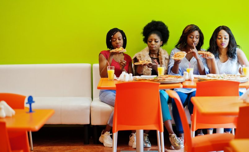

The colors used in your restaurant do more than decorate—they influence appetite, mood, and the overall dining experience. Selecting the right paint colors can subtly encourage diners to linger, feel comfortable, and even order more.
This guide explores food-friendly color schemes and how to apply them effectively in restaurant interiors.
1. Understand the Psychology of Food Colors
- Red: Stimulates appetite and draws attention, ideal for casual or fast-food restaurants.
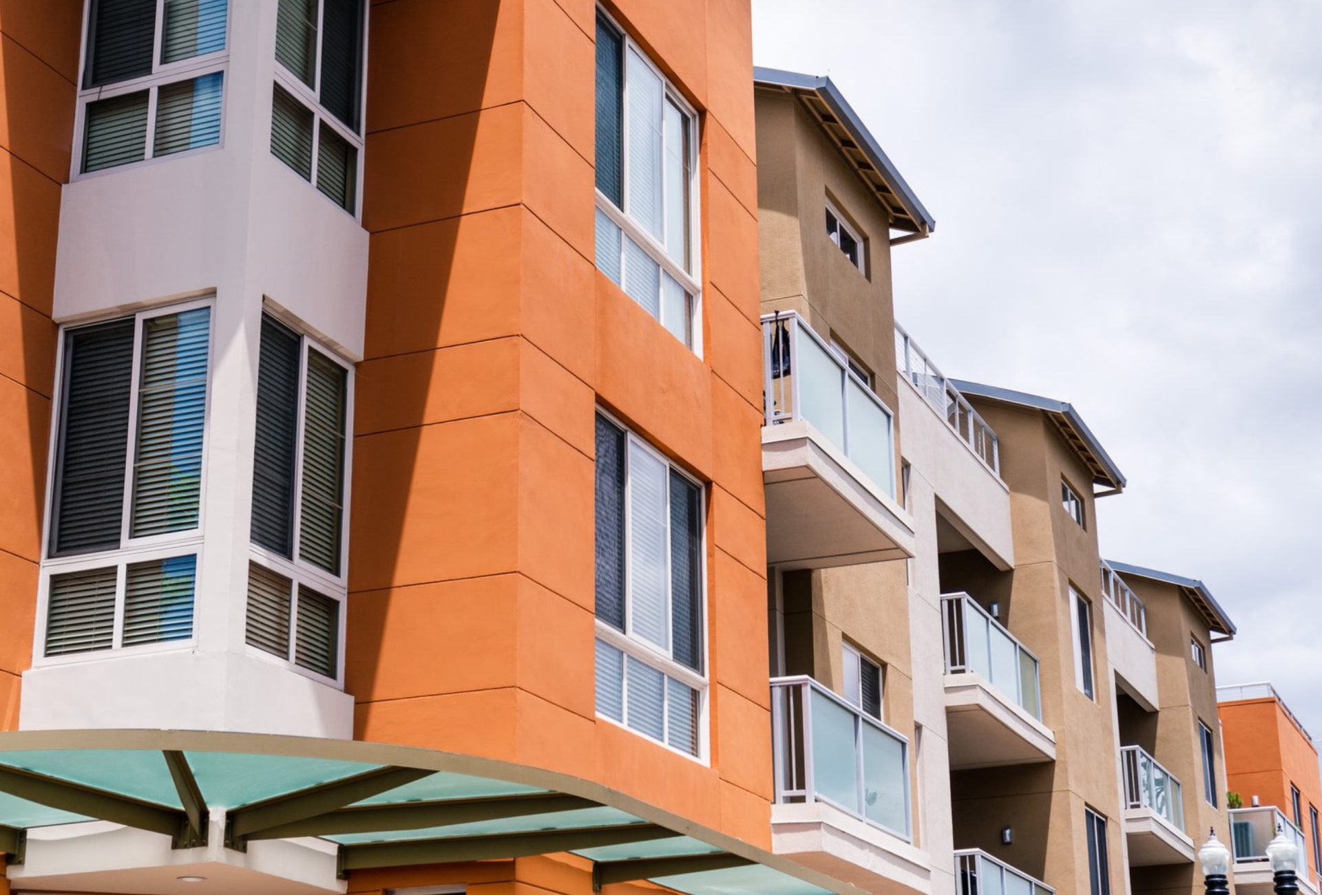
- Orange: Creates warmth and energy, often used in lively dining spaces.
- Yellow: Enhances mood, promotes social interaction, and encourages spending.
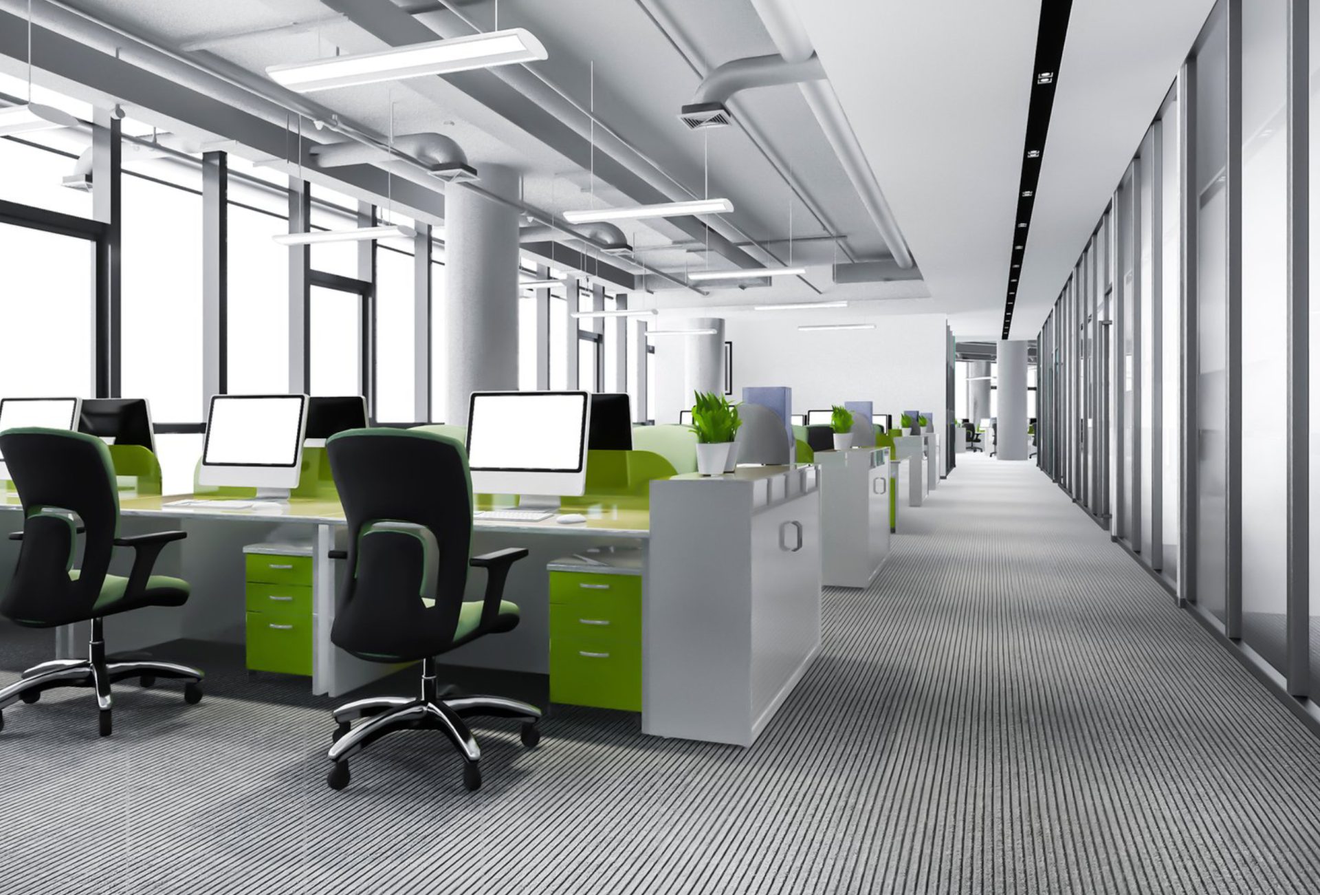
- Green: Suggests freshness and health, perfect for vegan, organic, or farm-to-table restaurants.
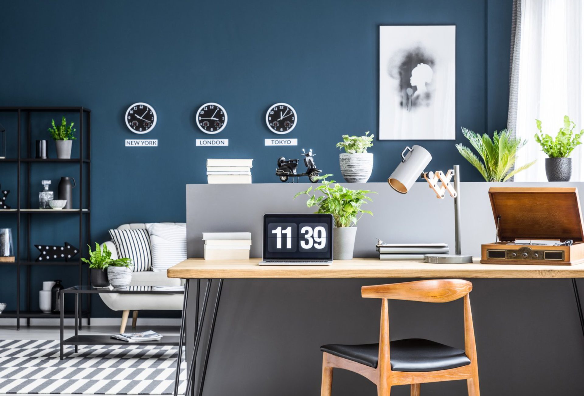
- Blue: Generally suppresses appetite but can convey sophistication and calm in upscale restaurants.
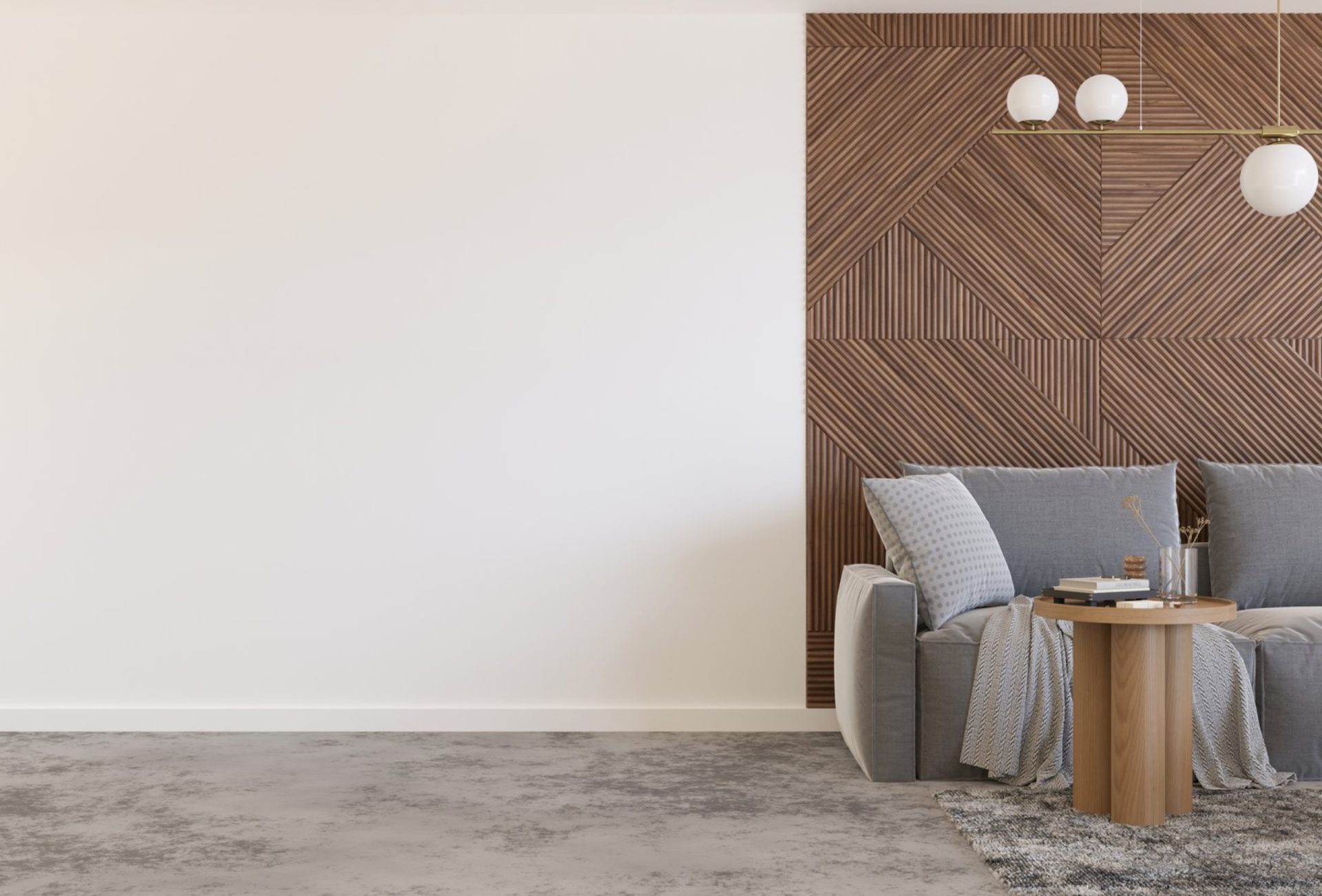
- Neutrals: White, beige, and gray provide versatile backdrops, balancing bolder accent colors.
Chicagoland Paint Pro Tip: Combine a primary neutral with one or two accent colors for a balanced, food-friendly palette.
2. Use Accent Walls to Enhance Dining Areas
- Focus Attention: Highlight special seating areas, dining nooks, or artwork with accent walls.
- Create Depth: Lighter neutral walls combined with a vibrant accent make spaces feel larger and inviting.
- Subtle Branding: Integrate brand colors without overwhelming diners.
3. Coordinate Colors With Lighting
- Natural Light: Light and bright colors enhance sunlit areas.
- Artificial Lighting: Warm lighting pairs with warm wall colors, creating a cozy atmosphere.
- Task Areas: Kitchens or serving counters may benefit from neutral, easy-to-clean shades that hide wear.
4. High-Traffic Considerations
- Durable Paint: Restaurants see spills, stains, and frequent cleaning—choose washable, stain-resistant options.
- Finish Choices:
- Satin/Eggshell: Smooth, cleanable walls with a soft sheen.
- Semi-Gloss: Ideal for trim, doors, or areas near the kitchen.
- Low VOC Options: Safe for staff and diners while meeting environmental standards.
5. Harmonize Colors With Décor
- Furniture and Flooring: Ensure wall colors complement tables, chairs, and flooring materials.
- Art and Signage: Accent colors can highlight artwork or wall menus without clashing.
- Consistency: Use cohesive color schemes throughout the restaurant for a professional look.
6. Budget-Friendly Tips for Painting
- Prioritize Key Areas: Focus on walls diners see first—entryways, main dining areas, and seating zones.
- DIY Accents: Consider painting trim, wainscoting, or small accent walls in-house.
- High-Impact Color Combinations: Use two to three colors strategically rather than painting the entire space multiple shades.
7. Common Mistakes to Avoid
- Choosing colors based solely on trends rather than dining psychology
- Overusing bold, stimulating colors that overwhelm diners
- Ignoring lighting effects, which alter the perception of color
- Skipping prep work, leading to peeling or uneven finishes
- Mismatching wall colors with furniture, décor, or brand identity
8. Final Thoughts
Food-friendly color schemes enhance the dining experience while subtly influencing customer behavior. By combining warm, appetite-stimulating hues with neutral tones, coordinating with lighting, and prioritizing high-traffic areas, restaurant owners can create inviting interiors that encourage repeat visits.
The right paint colors make your restaurant feel welcoming, stylish, and consistent with your brand identity, ultimately improving customer satisfaction and boosting sales.