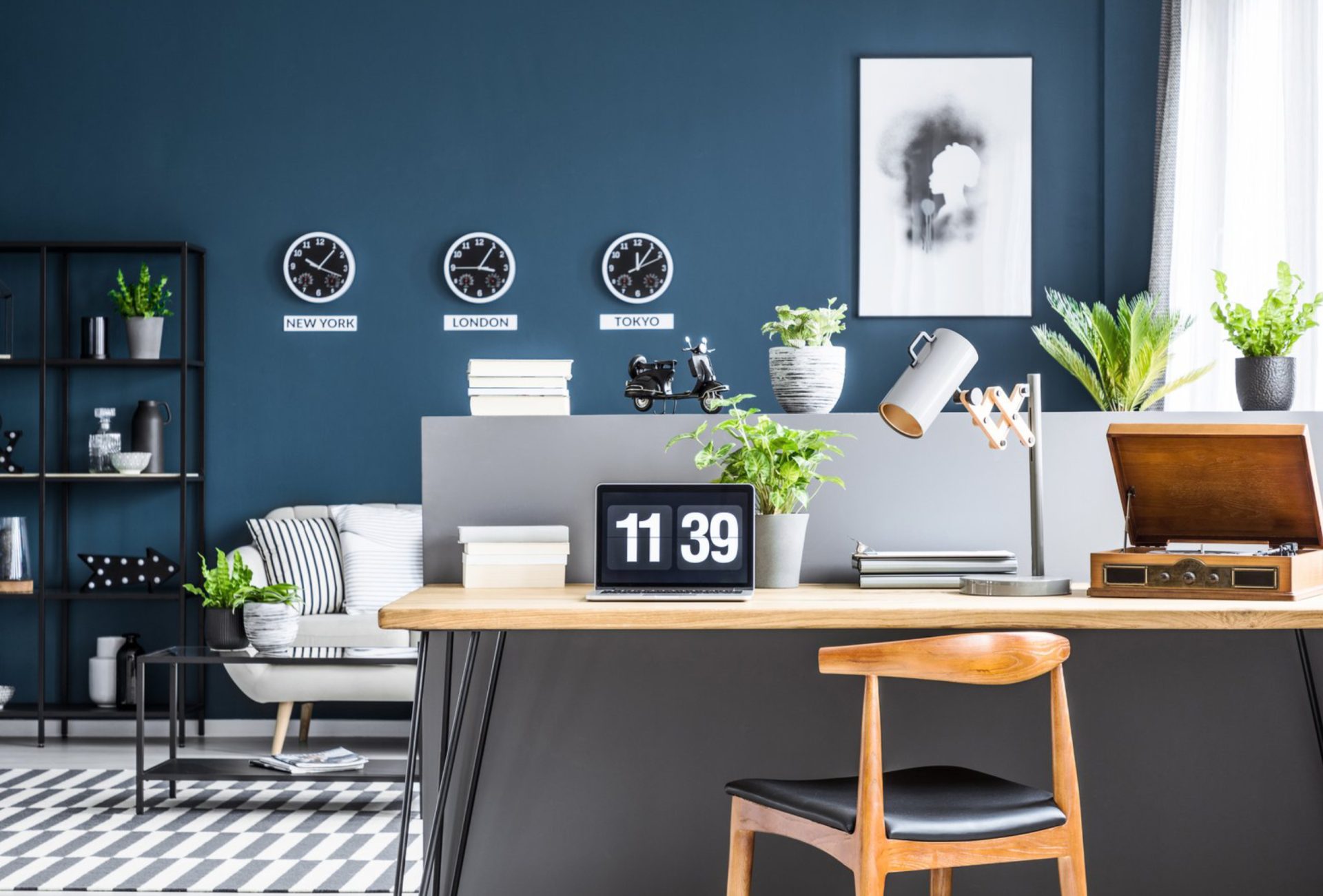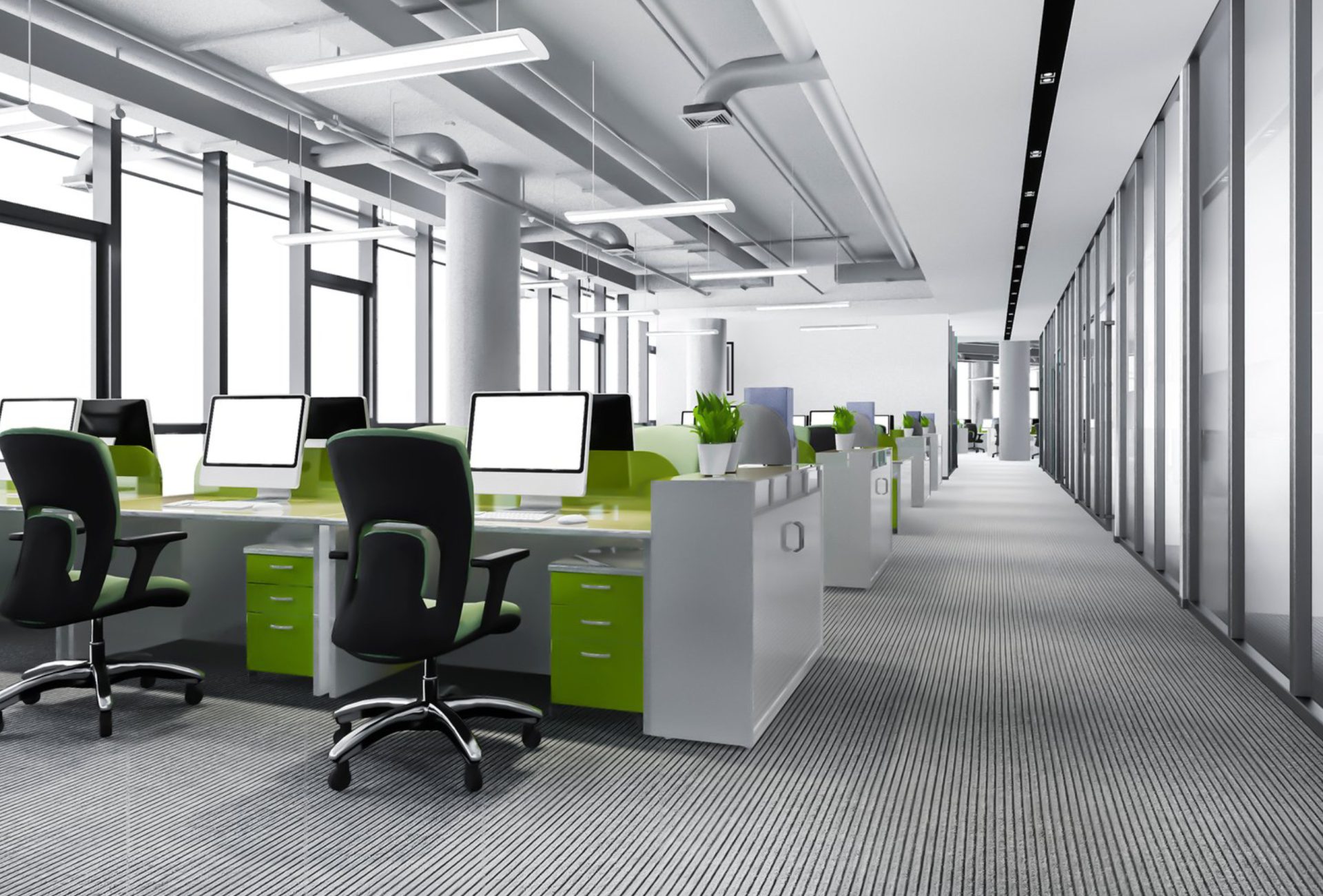





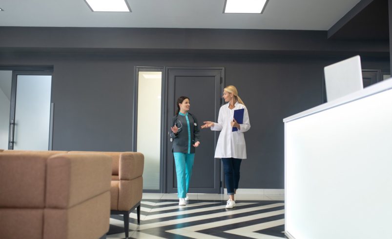

The appearance of a medical office plays a major role in patient perception, staff productivity, and overall brand image. A well-planned paint scheme can transform an ordinary space into a professional, welcoming environment that conveys trust, cleanliness, and care.
This guide outlines how to use paint strategically to create a polished, professional look in your medical office.
1. Start With a Cohesive Color Palette
- Neutral Base Colors: Whites, creams, soft grays, and beige tones create a clean, professional backdrop.
- Accent Colors: Introduce calming blues, greens, or muted pastels for waiting rooms, consultation areas, or corridors.
- Consistent Theme: Ensure that colors in different areas complement each other to maintain visual cohesion.
Pro Tip: Consistency across floors, walls, and trim creates a seamless, professional appearance.
2. Use Color to Define Spaces
- Reception Areas: Warm neutrals with soft accent walls make patients feel welcome.
- Exam Rooms: Soothing colors promote relaxation and reduce stress during appointments.
- Staff Areas: Slightly more energizing tones improve focus and morale.
- Corridors and Hallways: Light-reflective colors enhance brightness and guide patients smoothly through the office.
3. Pay Attention to Wall Finishes
- Satin or Semi-Gloss: Smooth, easy-to-clean surfaces ideal for high-contact areas.
- Matte Finishes: Reduce glare in patient-focused spaces, creating a comfortable visual environment.
- Durable Coatings: Consider antimicrobial or epoxy-based paints for exam rooms and utility areas.
4. Incorporate Accent Walls and Details
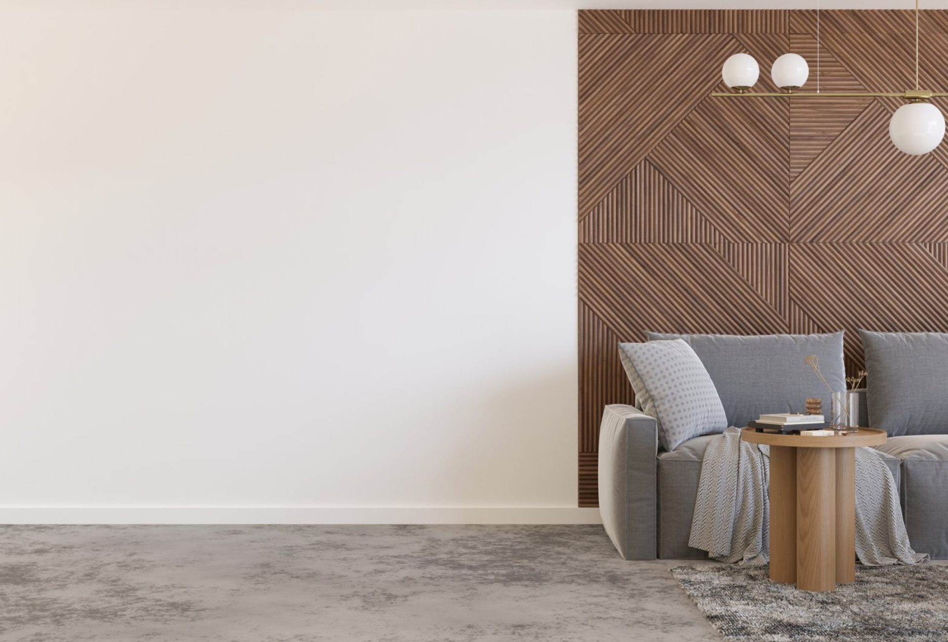
- Strategic Accent Walls: Use subtle shades to highlight reception desks, waiting areas, or consultation rooms.
- Trim and Moldings: Painting trims in slightly contrasting neutral shades adds depth and sophistication.
- Wayfinding and Branding: Incorporate muted brand colors subtly through walls or accent features.
5. Maximize the Impact of Lighting
- Natural Light: Choose colors that reflect daylight for bright, inviting spaces.
- Artificial Lighting: Warm lighting complements warm neutral tones, while cool white enhances blues and greens.
- Avoid Glare: Matte or satin finishes help prevent reflections that can disrupt the professional feel.
6. Balance Aesthetics With Practicality
- High-Traffic Areas: Use durable, washable paints for corridors, exam rooms, and waiting areas.
- Maintenance-Friendly: Smooth finishes make cleaning simple and keep surfaces looking new longer.
- Budget Considerations: Focus premium finishes on areas most visible to patients while using cost-effective options in back-office or storage areas.
7. Common Mistakes to Avoid
- Using too many contrasting colors, creating a chaotic look
- Choosing bright or harsh colors that increase patient anxiety
- Neglecting trim, molding, and accent walls, leading to an unfinished appearance
- Ignoring durability and maintenance needs for high-traffic areas
- Failing to coordinate paint with lighting, furniture, and branding elements
8. Final Thoughts
Creating a professional medical office look through paint requires careful selection of colors, finishes, and accent features. By combining cohesive palettes, durable coatings, and strategic lighting, medical offices can foster a welcoming, trustworthy environment for patients while supporting staff efficiency.
A well-executed paint scheme communicates professionalism, enhances patient confidence, and elevates the overall experience—making it one of the most impactful elements of office design.