





The environment of a medical office has a profound impact on patients’ comfort, staff productivity, and overall experience. One of the most effective ways to create a calming atmosphere is through color. Thoughtful paint selection can reduce stress, improve mood, and make waiting and treatment areas more welcoming.
This guide explores how to choose colors that promote calm in medical offices, from reception areas to exam rooms.
1. Understand the Psychology of Color in Healthcare
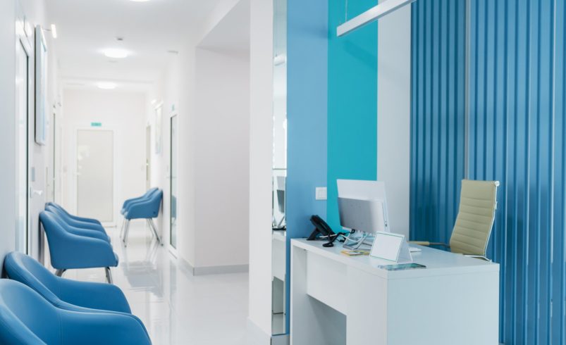
- Blues: Often associated with calm, trust, and reliability. Ideal for waiting areas and consultation rooms.
- Greens: Suggest health, freshness, and balance; perfect for recovery rooms or patient lounges.
- Soft Neutrals: Creams, beiges, and light grays create a clean, professional, and non-distracting backdrop.
- Muted Pastels: Subtle shades of lavender, peach, or aqua add warmth without overstimulation.
Chicagoland Paint Pro Tip: Avoid overly bright or harsh colors, which may increase anxiety or discomfort in patients.
2. Strategically Apply Colors in Different Spaces
- Reception Areas: Use soothing colors to create a welcoming first impression. Accent walls in soft blues or greens can add visual interest.
- Exam Rooms: Neutral, calming tones help patients feel relaxed during procedures.
- Staff Areas: Incorporate energizing colors in break rooms or offices to boost focus and morale.
- Corridors and Hallways: Light, reflective colors improve lighting and reduce stress.
3. Accent Walls and Color Highlights
- Use accent walls to define spaces, showcase artwork, or highlight informational boards without overwhelming patients.
- Consider color coding areas subtly to help with wayfinding, e.g., green for treatment zones, blue for consultation areas.
- Balance bright accents with neutral backgrounds to maintain a calming environment.
4. Durable and Cleanable Paint Choices
- High-Quality Latex Paint: Provides smooth, easy-to-clean walls suitable for healthcare environments.
- Antimicrobial Paints: Reduce bacteria growth and improve hygiene.
- Semi-Gloss or Satin Finishes: Easy to sanitize while maintaining a professional appearance.
5. Consider Lighting Effects
- Natural Light: Amplifies calming colors; soft blues and greens reflect natural light beautifully.
- Artificial Lighting: Warm lighting pairs with warmer neutral tones; cool white lighting enhances soft blues and greens.
- Avoid Glare: Matte or satin finishes prevent reflections that can create discomfort.
6. Budget-Friendly Tips
- Prioritize areas most visible to patients for accent colors.
- Use neutral tones on larger walls to create a clean canvas.
- Incorporate small pops of color through décor and furnishings if a full repaint isn’t feasible.
7. Common Mistakes to Avoid
- Using overly bright or saturated colors that increase stress
- Neglecting high-traffic areas, which may wear quickly without durable paints
- Forgetting to consider lighting, leading to colors appearing harsher than intended
- Overcomplicating color schemes, which can confuse and overwhelm patients
- Ignoring hygiene-friendly paint options in critical areas
8. Final Thoughts
Color plays a pivotal role in creating a calm, welcoming, and professional medical office. By selecting soothing blues, greens, and neutrals, strategically placing accent walls, and choosing durable, hygienic paints, medical offices can foster a positive environment for both patients and staff.
Thoughtful painting decisions improve comfort, enhance professionalism, and contribute to a healing atmosphere—making every visit a more pleasant experience.