



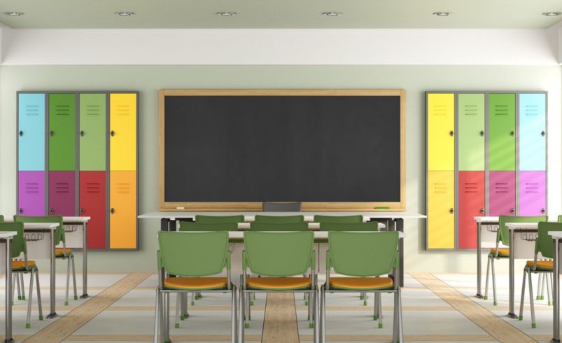

Color is more than decoration—it influences mood, focus, creativity, and even behavior in educational settings. Thoughtful use of color in classrooms, common areas, and activity spaces can enhance the learning environment, improve student engagement, and create a more positive school experience.
This guide explores how to strategically use color in schools to boost learning and create inspiring, functional spaces.
1. The Psychology of Color in Education
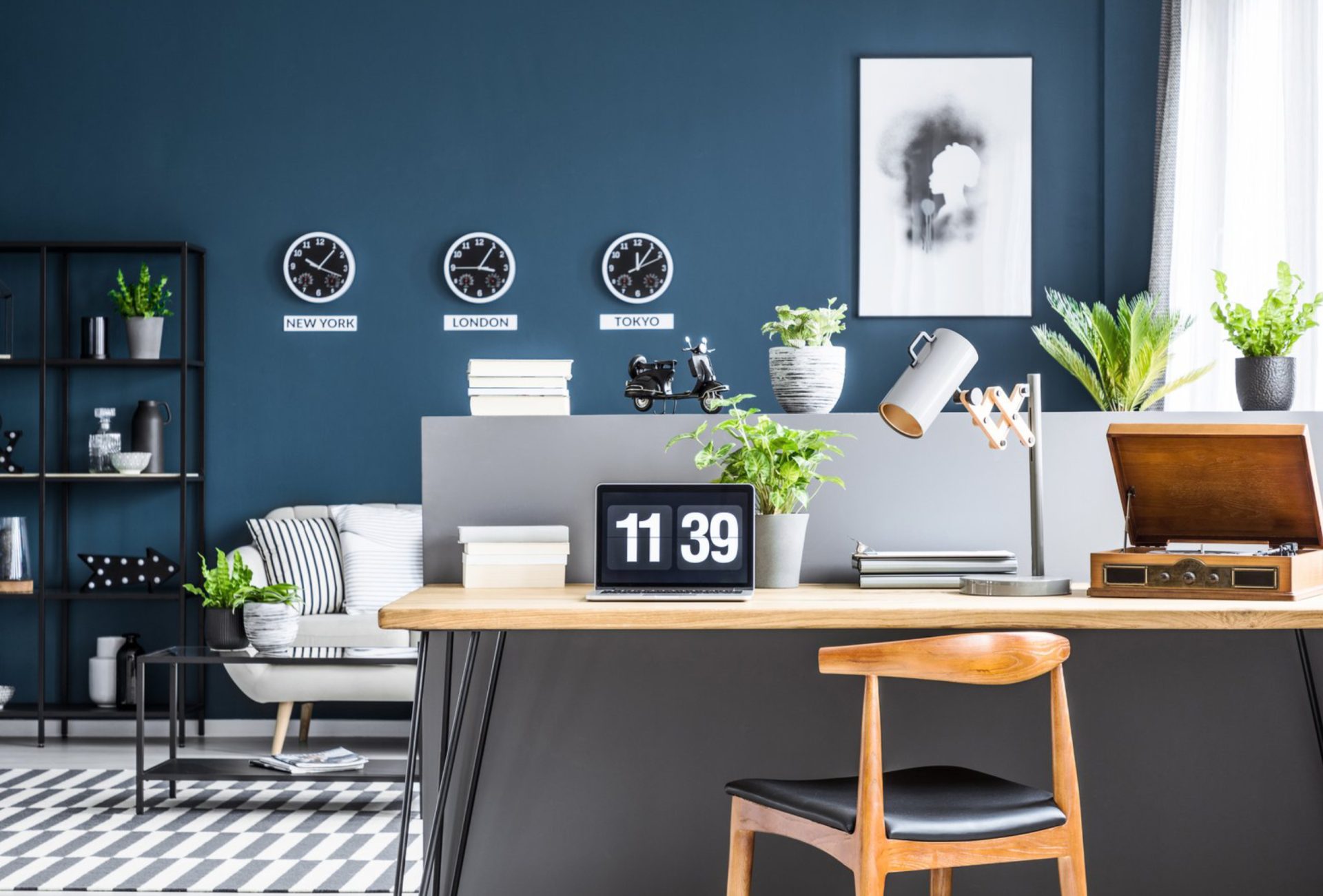
- Blues: Promote calm, concentration, and focus; ideal for classrooms and study areas.
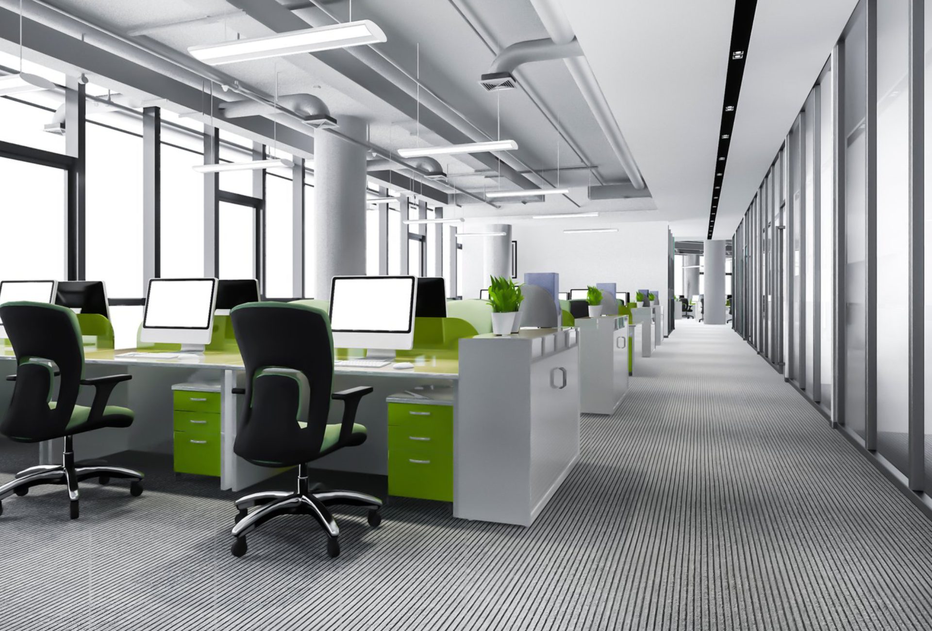
- Greens: Encourage balance, relaxation, and a sense of renewal; great for reading corners or libraries.
- Yellows: Stimulate creativity, optimism, and energy; perfect for art rooms or creative spaces.
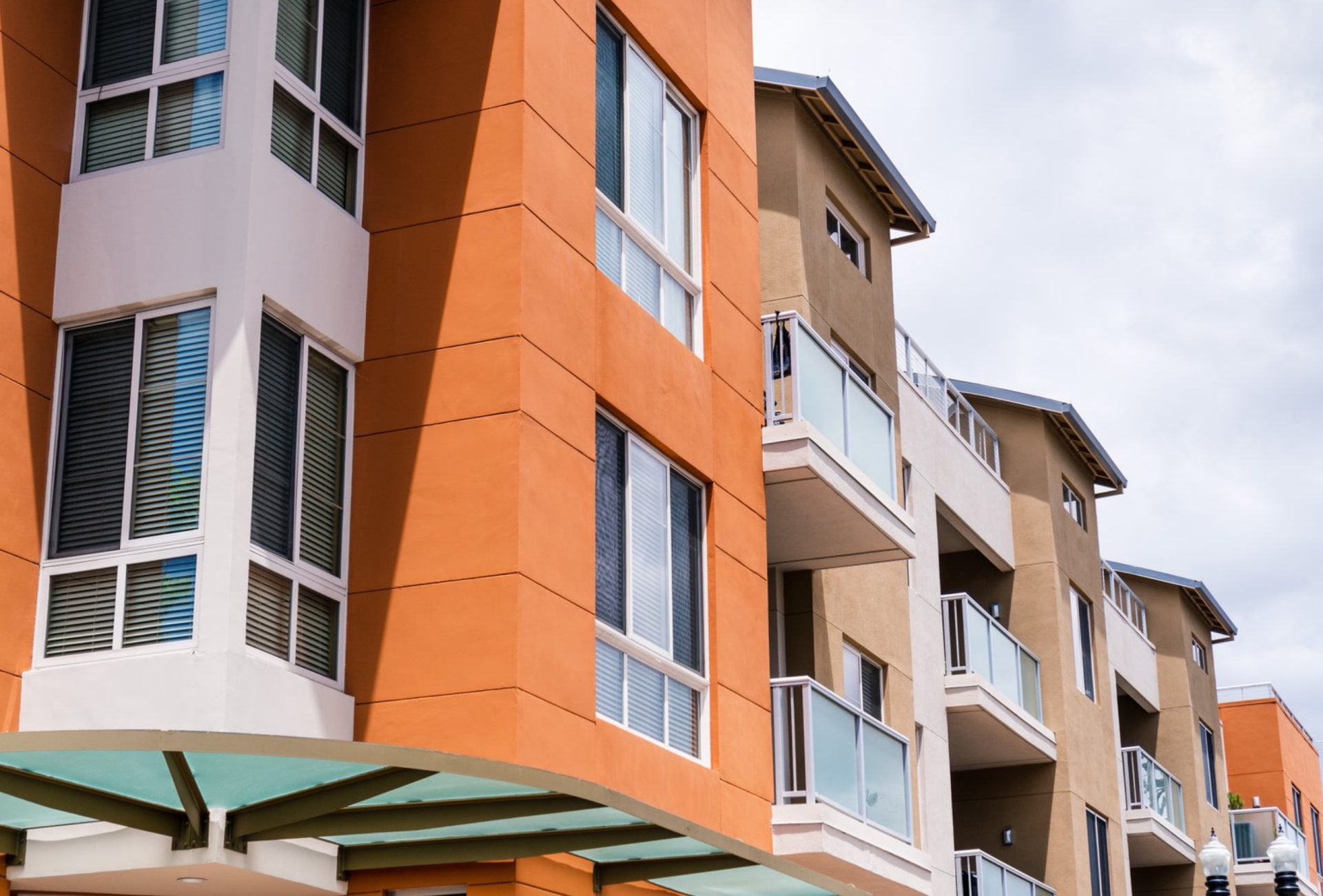
- Oranges and Reds: Encourage social interaction and activity; best used in cafeterias or gyms.
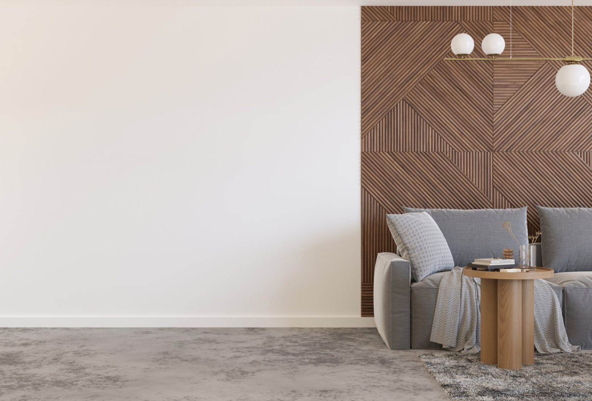
- Neutral Colors: Whites, creams, and soft grays provide a clean, versatile backdrop for learning and décor.
Pro Tip: Avoid overly bright or clashing colors that may overwhelm students or distract attention.
2. Classroom Color Strategies
- Primary Learning Areas: Soft blues and greens support focus and calm during lessons.
- Accent Walls: Use muted yellows or oranges for small areas to boost energy without overstimulation.
- Furniture and Décor Coordination: Choose complementary colors for desks, chairs, and bulletin boards to enhance harmony.
3. Libraries and Study Spaces
- Calming Environment: Soft, muted tones like sage green, soft teal, or light gray promote concentration.
- Accent Areas: Highlight reading nooks or shelving with slightly darker or contrasting shades.
- Lighting Considerations: Ensure natural or artificial lighting complements wall colors to reduce eye strain.
4. Hallways and Common Areas
- Wayfinding with Color: Use consistent color schemes to guide students through corridors and entrances.
- School Identity: Incorporate school colors subtly to boost pride and community spirit.
- Durability: Choose washable, high-traffic paints that resist scuffs and maintain vibrant hues.
5. Cafeterias and Activity Spaces
- Energizing Colors: Bright yellows, oranges, or light reds encourage social interaction and liveliness.
- Balance: Pair vibrant walls with neutral ceilings and trims to prevent overstimulation.
- Practical Considerations: Use durable, stain-resistant paints to handle spills and heavy cleaning.
6. Creative and Specialty Spaces
- Art Rooms and Makerspaces: Bold, inspiring colors like teal, coral, or purple spark creativity.
- Science Labs: Cool, calming tones help reduce stress during experiments and focus attention.
- Music Rooms: Light, reflective colors improve acoustics perception and create an inviting atmosphere.
7. Maintenance and Practical Tips
- Durable Paint Finishes: Satin or semi-gloss finishes withstand frequent cleaning and contact.
- Non-Toxic Options: Low-VOC or zero-VOC paints improve indoor air quality.
- Regular Touch-Ups: Keep leftover paint for quick fixes in high-traffic zones.
- Accent Coordination: Use accent walls and trims to refresh spaces without repainting entire rooms.
8. Common Mistakes to Avoid
- Overusing bright or intense colors that distract students
- Ignoring the effects of lighting on color perception
- Choosing paints that are not durable enough for high-traffic areas
- Neglecting color harmony across adjacent spaces
- Overlooking safety and indoor air quality considerations
9. Final Thoughts
Color is a powerful tool in educational spaces. By strategically selecting colors for classrooms, common areas, libraries, and creative spaces, schools can create environments that support learning, focus, creativity, and student well-being.
A thoughtful color plan not only enhances the aesthetic appeal of a school but also positively impacts mood, engagement, and performance—making it an essential aspect of educational facility design.